We can no longer keep this a secret, because it seems to us that this is very cool news. We are pleased with the current state of development of the eSteem Surfer application - the first and only client for Steem's blockbuster, which runs on Windows, Mac and Linux, and we continue to add new functions gradually, but at the same time we understand that design is something that can be modify endlessly.
Global redesign
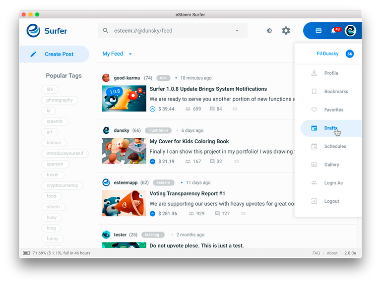
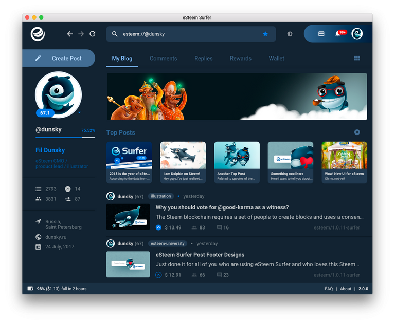
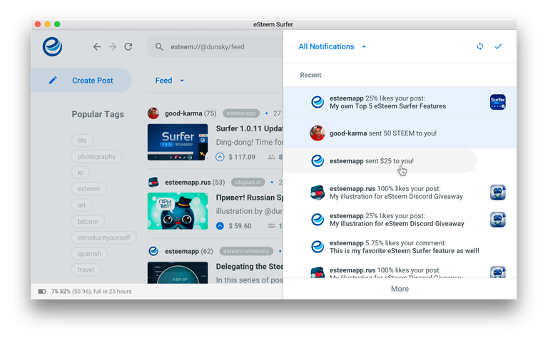
The last few months our eSteem product manager Phil @dunsky started working on a global eSteem Surfer interface redesign to improve the user experience with the application. The beginning of the whole design of eSteem. We will develop various elements of the interface, such as buttons, switches, tooltips, menus, etc. and later we will use them in the mobile version of eSteem and products for the web. There will be one cool style for all of our products.
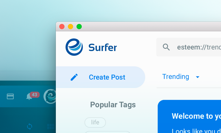
Well, all these words ... Just look at it!

Of course, this is still just an outline from Photoshop, and this release may look a little different, but we will try to keep this new style.

We already have a lot of screens ready and soon we will start making them into a separate branch on our github for the release. If you really like the new version, do not forget to put it on this post so that we can inspire our team and be able to continue working on this project.
Wow @babnik07 Very Great post and a wealth of information I love the craftwork thanks for joining the steemit family because the eSteem Surfer looks to be a brighter Steemit future thanks @garrettwallace
ty )) Good Luck
Thanks as well @babnik07 stay strong family