Knowing how colors affect us has always been one of the needs of the world of advertising and therefore of design. Companies and corporations regularly conduct market studies regarding the psychology of color and how these colors emotionally affect our desires, being a science still in a state of evolution, since advances in this field are still in many cases merely Speculative.

The final gear of the graphic products of the marketing campaigns has to be reproduced in a variety of devices, formats and supports, multimedia or not, that for everything to be successful it is necessary to simplify and not to look for 3 feet to the cat .For this and much more now I bring you to taste of all the public, The 5 colors that more used in advertising.
The science of the study of color, is very advanced thanks to the need of an entire industry, that of Design in general, to simplify something intricate, colors. This study of color has left us theories of the most practical and used and theories like Eva Heller, or wonders like Steganography, a method to encrypt images and messages by means of the mixture of colors, which we speak in Cryptstagram, Share your photos and messages with caution and style.

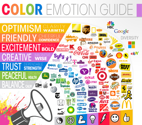
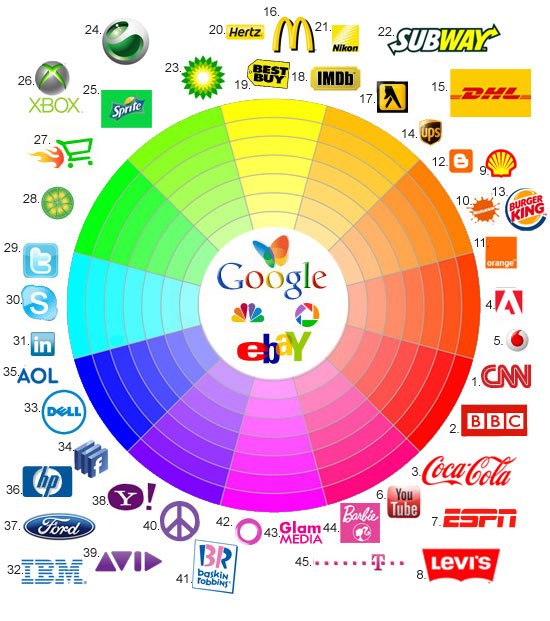
Today I come to bring you a small study of the colors most used to be corporate colors of the most famous brands in the world. These colors are often used to differentiate and make your brand stand out from competitors, as well as to convey an unwritten message to the consumer.
*And these colors are:
- 1.- Red
It is a color that represents power, attraction and manages to maintain the attention of the consumer. It is a sensual and seductive color, is the most used in marketing. It is used in consumer products like drinks and fast food restaurants.
- Blue
It is a color that conveys calm, confidence and relaxes. It is identified by being the color of the sky and water, that makes it more familiar. In dark tones represents elegance and success, and in light tones freshness and youth. It is used in technological products or personal hygiene.
- 3.- Green
It is a color that refers to nature and transmits ecological values. It is a color that is used for health care and good intentions. It is versatile, pleasant and with wave. It is a color that usually always works without error.

- 4.- Yellow
It is a risky color, flashy and bright. It easily captures the attention of the children's market, more in children than girls, but it transmits happiness and much light. It is a color that stands out from the crowd.
- 5.- Orange
Color that is considered as energetic, it is used for the promotion of sports products, energy drinks and vitamins. It is a color that always motivates innovation and youth. One problem with this color is that classic companies use it to give incorrect impressions, sometimes losing credibility.

Thank you very much for your attention. I hope this article is to your liking, Fanny Mendoza. (Fannyamor).

The images shown here were downloaded from the following pages:
-http://almacen.iesealarcos.es/Matematicas/luis/publicidad/psicologia%20color/teoria%20psicocolor/
-https://www.paredro.com/el-color-naranja-como-moda-en-la-publicidad/
-http://cronicaglobal.elespanol.com/creacion/vida-tecky/start-up-fabrica-objetos-voz_75886_102.html
.gif)
Very good I liked it a lot because of that I share it in my profile again and thank you for your support with what little public
Nothing successful for you and you keep progressing within steemit
este articulo promete exitos
Thank you very much for your comment
nice sharing , upvoted
thank you very much
u welcome , visit my posts also dear
Very interesting, I love colours and realise now how big companies use them.
Interesting post
Will follow and upvote
Thank you very much for your comments and for the vote I am also following you