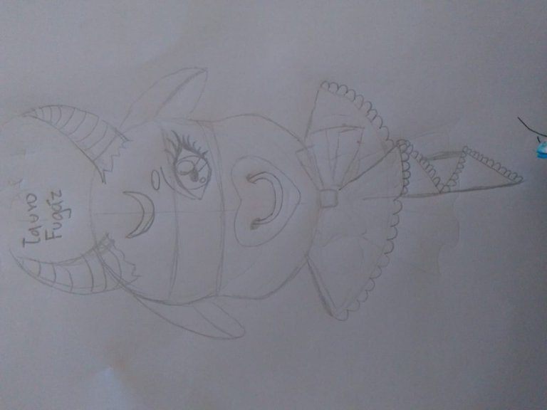
Para iniciar primero hice mi boceto, como apenas estoy aprendiendo a dibujar y no tengo la simetría muy desarrollada solo hice la mitad de ahí le tomé una foto y la importé al programa inkscape.
Después con la herramienta de pluma empiezas a delinear todo el dibujo, como solo hice la mitad al terminar la mitad seleccioné todos los trazos y lo dupliqué para ya obtener una figura completa.
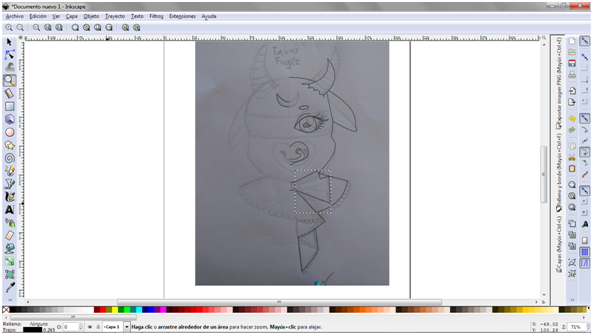
En estos momentos es cuando debes aprovechar para corregir cosas que te disgusten y pulir el boceto, puedes ayudarte de la herramienta de nudos que es la segunda a tu derecha para hacer curvaturas.
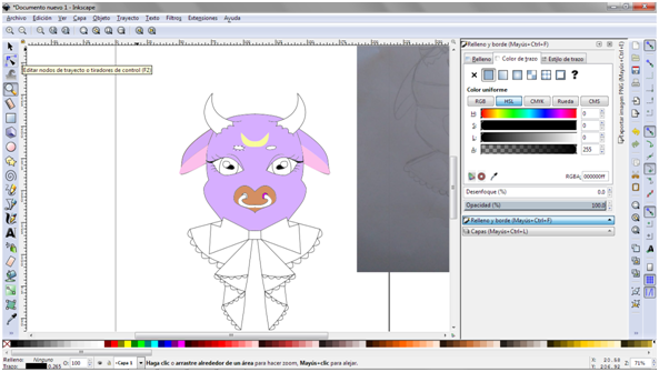
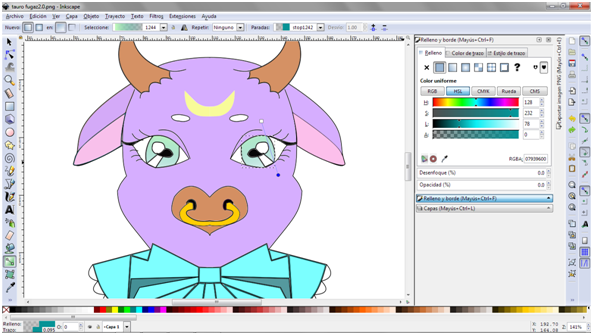
Posteriormente le agregamos color con ayuda de la cubeta y podemos personalizar los tonos de colores.
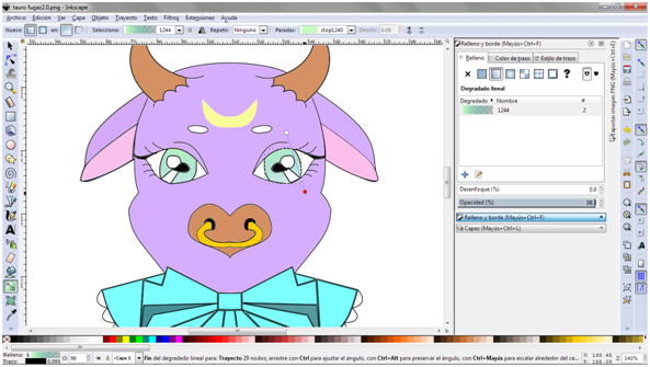
En los ojos hice un difuminado entre dos colores apretando el click derecho y en "relleno y bordes de la figura" y en degradado que es la segunda opción y ahí te aparece para editar los nudos y en el nudo rojo le puedes dar click para ponerle color a el degradado y asi sea entre dos colores.
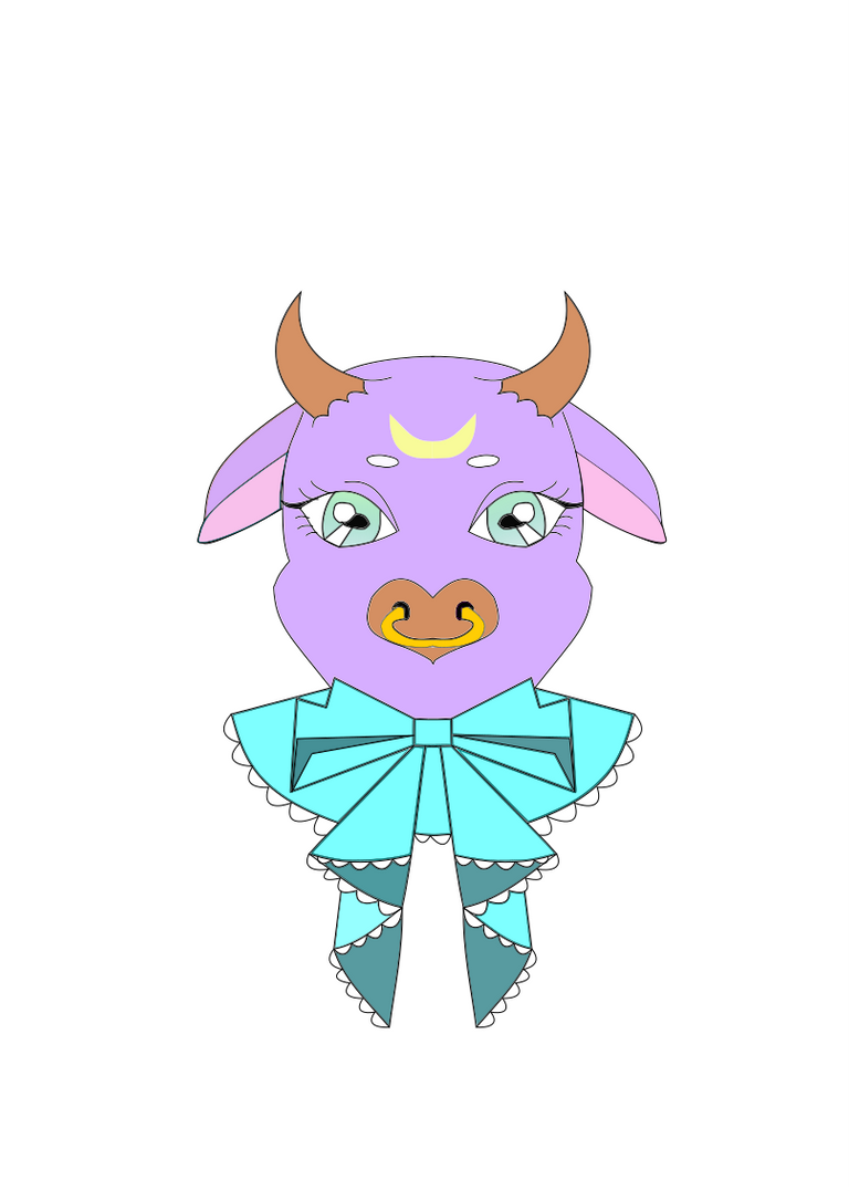
Practicamente eso fue todo lo que hice y este fue el resultado.
Me gusta estar avanzado cada vez un poco mas en esto de dibujar en digital y el diseño, son cosas que me gustan y que sin duda me encantaria ser mejor.
Eso fue todo por el post de hoy espero les haya servido y gustado lo hice con mucho amor y dedicación <3.
Redes sociales: https://linktr.ee/taurofugaz
English
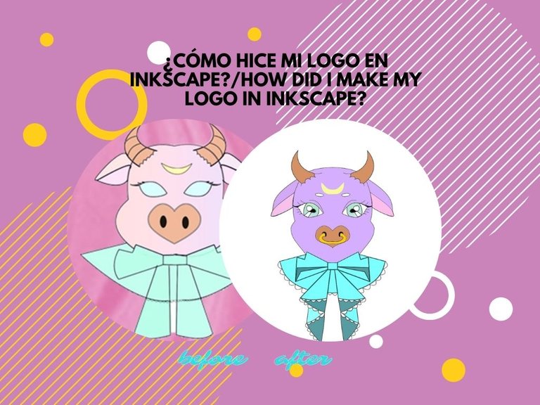
Hello welcome once again to my blog Taurus Fugacious and today I will show you how I made my new blog logo, because yes, we have a new logo and that excites me, just to show you the change I will show you a before and after of my logo.
First I made my sketch, as I'm just learning to draw and I don't have the symmetry very developed I only did half of it, then I took a picture and imported it to the inkscape program.
Then with the pen tool you start to outline the whole drawing, as I only did half of it, when I finished half I selected all the strokes and duplicated it to obtain a complete figure.
In these moments is when you must take advantage to correct things that you dislike and polish the sketch, you can help yourself with the knots tool that is the second to your right to make curvatures.
Then we add color with the help of the bucket and we can customize the color tones.
In the eyes I made a blur between two colors pressing the right click and in "fill and edges of the figure" and in gradient that is the second option and there it appears to edit the knots and in the red knot you can give click to put color to the gradient and so it is between two colors.
Practically that was all I did and this was the result.
I like to be advanced every time a little more in this digital drawing and design, are things that I like and I would certainly love to be better.
That was all for today's post I hope you liked it and I did it with love and dedication <3.
Social networks: https://linktr.ee/taurofugaz
Translated with www.DeepL.com/Translator (free version)
Muy bbueno.
La verdad es que inkscape es una gran herramienta además de que es un proyecto FOSS. Yo también la utilicé para hacer mi avatar y algunas otras cosas.
Un saludo y lindo día.
@tipu curate
Upvoted 👌 (Mana: 56/112) Liquid rewards.
muchas gracias, es muy bueno el programa pero yo aun soy una novata, poco a poco cuando vaya descubriendo nuevas cosas lo compartiré con ustedes <3
Excelente programa de diseño, es uno de lo que utilizo y me encanta. Que bueno lograste realizar tu logo en este programa.
siiiii yo apenas ando empezando pero poquito a poquito jjajjaja
Hola qué bonita ilustración yo también utilizo mucho esta excelente herramienta vectorial. Te deseo el mayor de los éxitos.
Posted using Dapplr
siiiiii justo estaba viendo tu perfil y tienes muy buenosw post <3
El programa que más utilizo es el de GIMP , Inkscape nunca lo pude entender, tal vez no tuve la paciencia para aprenderlo.
No he escuchado de ese, inkscape si es un poco complejo al inicio pero luego ya le vas agarrando la onda