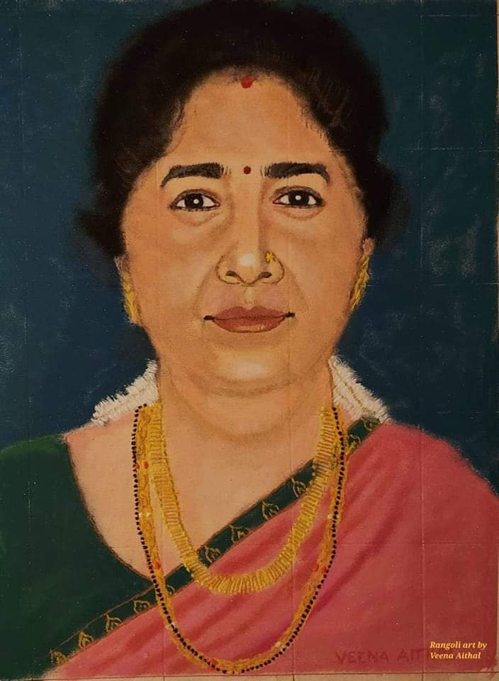
This Rangoli Portrait is drawn using Rangoli Powder on floor. It took me 38 hours to complete it.
Here's a short guide to Color Mixing:
Color mixing is an essential skill for artists that opens up endless possibilities for creative expression.
By understanding the principles of color theory and experimenting with various combinations, you can achieve a wide spectrum of hues and tones, breathing life into your artwork.
In this article, we will explore the art of color mixing, focusing on the creation of specific colors, including skin tones and other vibrant hues.
Understanding Color Theory:
Before diving into the world of color mixing, it's crucial to grasp the fundamentals of color theory.
The primary colors are red, blue, and yellow, and they form the foundation for all other colors. When mixed in specific ratios, these primary colors produce secondary and tertiary colors, creating a vast range of hues.
Creating Skin Tones:
The art of mixing colors to create lifelike skin tones requires a delicate balance of various hues. Here's a common recipe for achieving a basic skin tone:
Start with a base color: Begin with white or a light beige shade as the base color for your skin tone.
Introduce warmth with red and yellow: Add a small amount of red and yellow to the base color. These warm tones help to achieve a more natural complexion.
Fine-tune with orange: To add depth and richness to the skin tone, introduce a touch of orange. This color helps bridge the gap between the warm and cool tones in the skin.
Adjust with white and red: To lighten the skin tone, incorporate additional white. If the tone needs more depth, add a hint of red. Remember to make adjustments gradually, testing the color on a separate surface until you achieve the desired result.
Vibrant Color Mixing:
Beyond skin tones, color mixing allows artists to unleash a vivid array of hues.
Here are a few examples:
Purple: Combine equal parts of blue and red to create a rich purple shade. Adjust the ratios to achieve lighter or darker variations.
Green: Mix yellow and blue in different ratios to obtain a range of greens. More yellow creates a lighter, more vibrant green, while more blue produces a deeper, cooler green.
Orange: Blend equal parts of red and yellow to create a lively orange. For a darker shade, add a touch of brown or black.
Violet: Combine blue and a small amount of red to achieve a stunning violet color. Experiment with varying proportions for different shades of violet.
Gray: Start with white as the base and gradually incorporate small amounts of black. Adjust the ratio to create different tones of gray, from light silver to deep charcoal.
I hope you liked my art and found this short guide useful.