
Welcome to the daily analytical report about the Steem blockchain.
All the information presented in this report are based on the data collected from the blockchain until 2020-03-05 midnight UTC time. The goal of this report is to provide you with a clear view on what is happening daily on the Steem blockchain.
هنا هذا المقال مترجم للعربية
这里 这篇文章翻译成中文 -
ici Ce post est traduit en français -
여기 이 게시물은 한국어로 번역되어 있습니다 -
aquí Este post está traducido al español -
aqui Este post está traduzido para o português -
здесь Этот пост переведен на русский язык -
1. New users

This chart shows the number of newly registered users on the blockchain and how many of them became active. We see that a lot of accounts are registered, but never used.
Warning: this graphic is kind of dynamic! A user can register one day and become active a few days later. Therefore, the number of active users on a specific date may change from day to day.
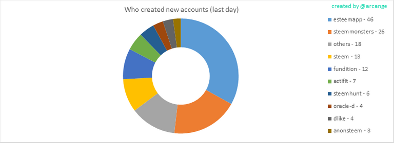
This graph shows who created new accounts during the last day.
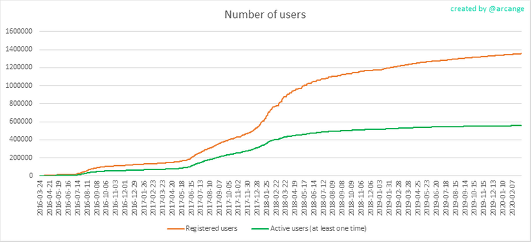
In this graph, the orange line shows the total number of registered accounts.
The green line shows how many of them have been active at least once (by active users, I mean those who made at least one post, comment or upvote). They are included even if they become inactive later.
2. Active users
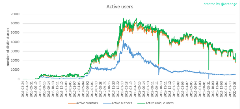
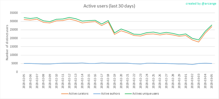
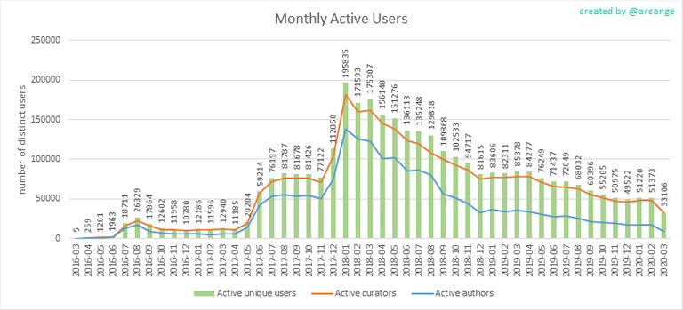
These graphs show the activity of users over time and in more details for the last 30 days. They use the same definition for active user as stated above.
The last graph is a monthly summary of the active users. It allows you to compare values from the Steem blockchain to those one usually published by other social networks.
3. Posts And comments
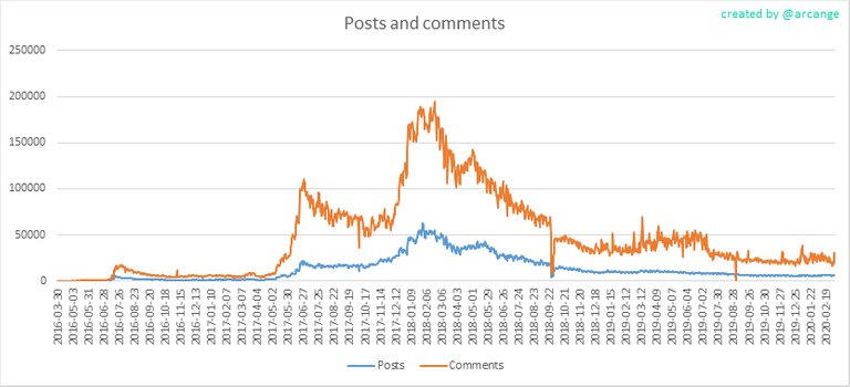

These graphs show the evolution of posts and comments for the whole blockchain lifetime and for the last 30 days.
4. Curation
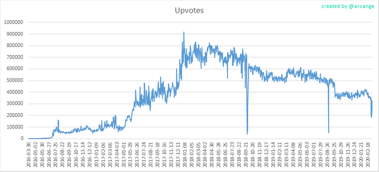
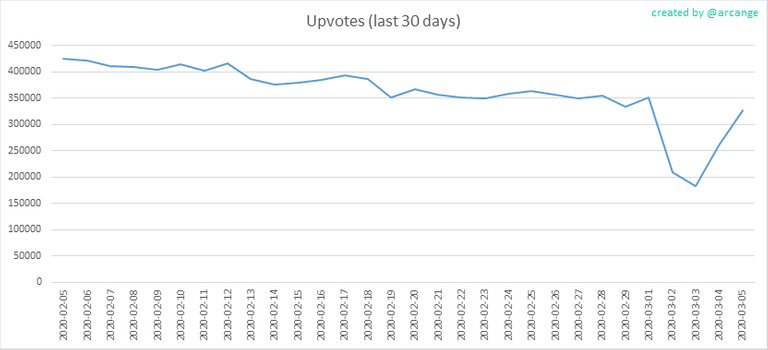
These graphs show the evolution of curation (upvotes) for the whole blockchain lifetime and for the last 30 days.
5. Daily transactions
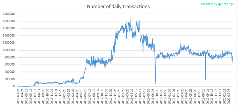
This graph shows the number of daily transactions. This give you an idea of the whole activity on the blockchain.
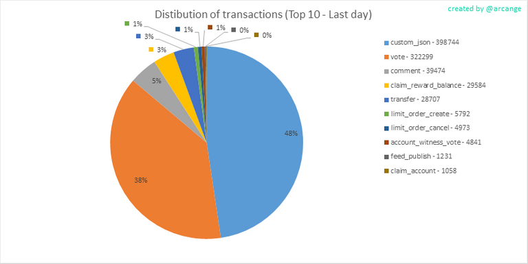
This graph shows the distribution of the top 15 types of transactions by number of operation performed on the blockchain.
6. Categories
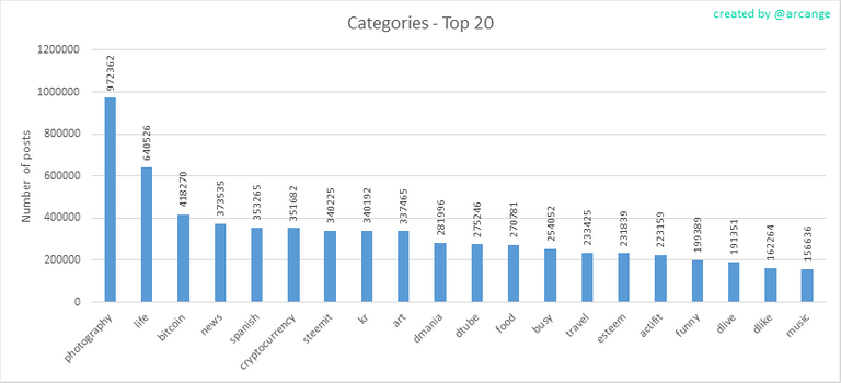
This graph shows the tag has been the most used for publishing posts for the whole blockchain lifetime.
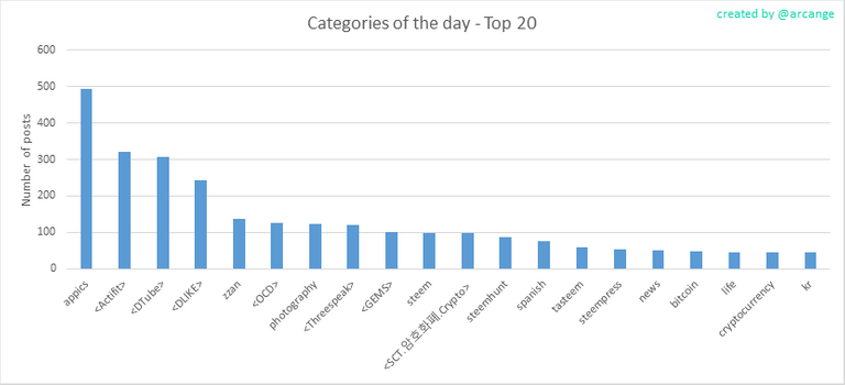
This graph shows the tag has been the most used for publishing posts last day.
7. Distribution
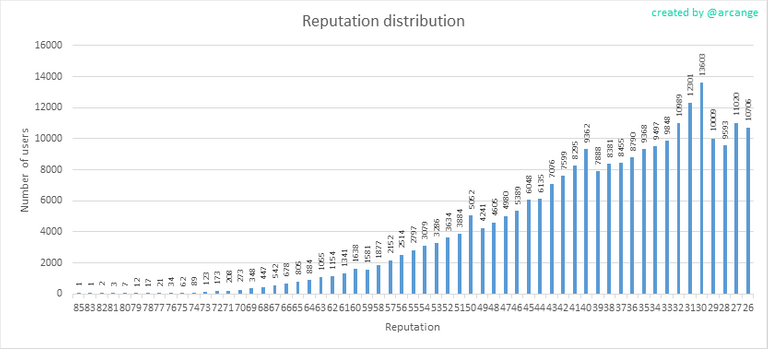
This graph shows the distribution of the reputation among users. Accounts with a reputation lower than 25 have been removed to keep the graph readable.
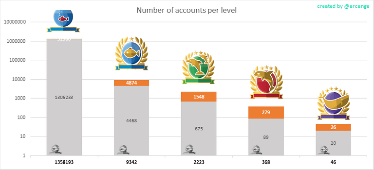
This graph shows the number of users according to their Steem Power.
The grey portion of each column indicates how many accounts are inactive (see above for the definition of inactive).
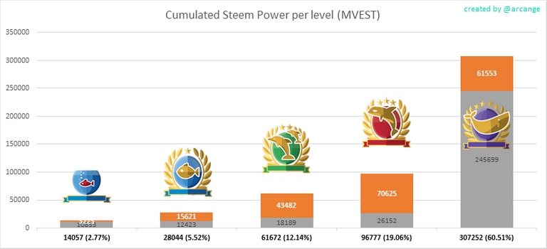
This graph shows the distribution of Steem Power cumulated per account level.
The grey portion of each column indicates unused Steem Power by inactive accounts (see above for the definition of inactive).
Below each column you will also see a ratio to all existing Steem Power.
8. Payout evolution
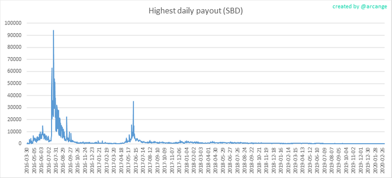
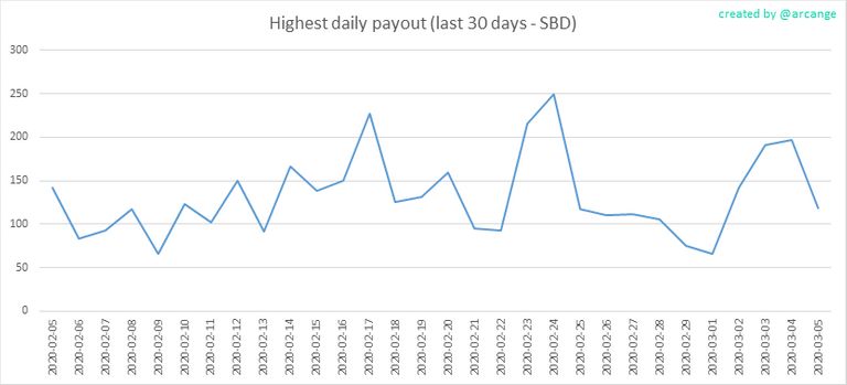
These graphs show the maximum reward paid on a post (or comment) for each day (whole blockchain life and last 30 days).
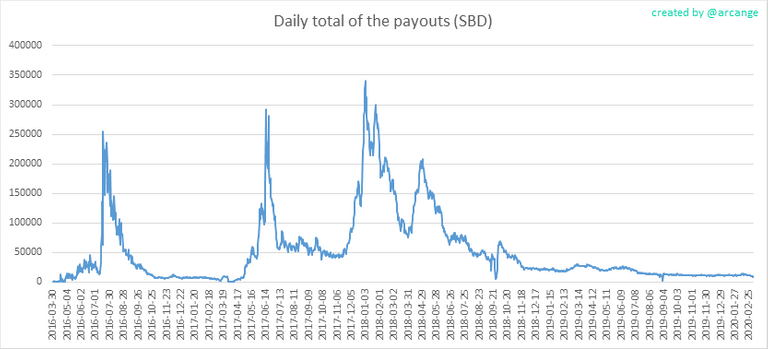
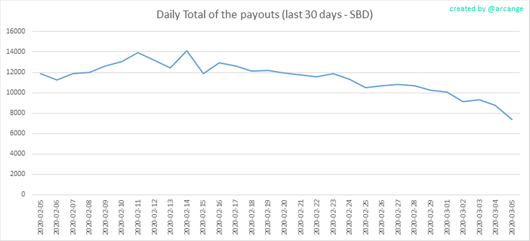
These graphs show the total of the distributed payout (posts and comments) for each day.
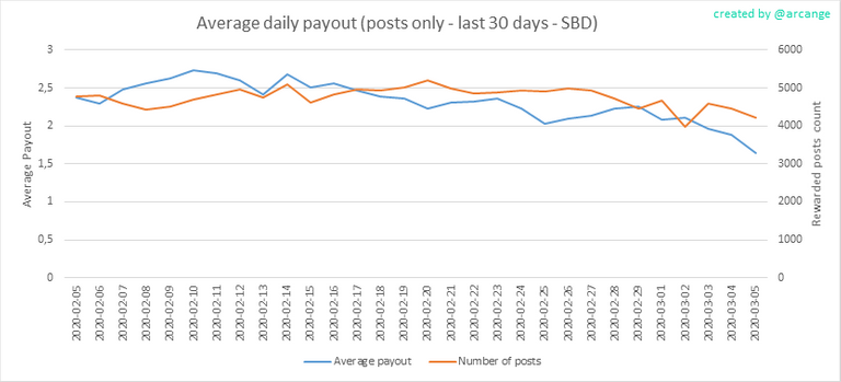

These graphs show the average and median payout per post for the last 30 days.
I hope you find those stats useful. If you would like to see different stats, feel free to drop me a comment. Your feedback is more than welcome.
Thanks for reading.