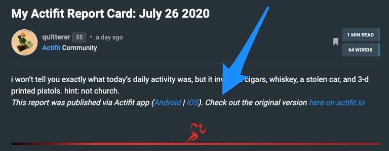
just noticed that @actifit recently started adding marketing copy to my reports, as such:

i understand why they might want this to appear on my reports - it's a logical way to drive traffic to google play, the app store, and actifit's site.
i have no problem with the copy itself.
but, i think placement should be reconsidered.
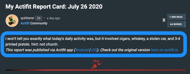
as it is, the copy interferes with my own report copy. notice how it is squashed up against my report, with no line break:

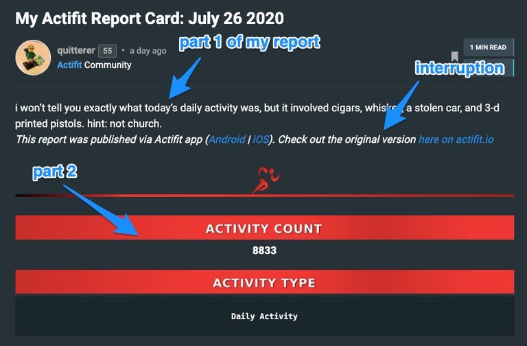
also, notice how it interrupts by inserting itself between my report copy and my activity stats:

while i appreciate this new marketing copy and think it deserves a place, i don't believe its current place is the best place for it to be.
here's my suggestion:
move it to the bottom, beneath the banner where the google play and app store icons are.
that's really where this kind of marketing copy belongs… at the end, after everything has been said.
speaking of the end, this is
the end.
This report was published via Actifit app (Android | iOS). Check out the original version here on actifit.io