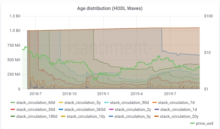
Hodl waves reflect the behaviour of asset hodlers. If a hodler keep holding the asset then it effectively reduces the supply of asset and helps increase the price of the asset. A HODL wave is created when a large amount of tokens transacts on the way up to and through a local price high, becoming recent token (1 day — 1 week old), and then slowly ages into each later band as its new owners HODL.
A HODL wave manifests visually on the chart as a pattern of nested curves caused by each age band becoming suddenly much fatter (taller) at progressively later times from the rally.
Santiment computes these hodl waves for some of the key assets and all the ERC20 tokens.
The image below traces a few of the largest HODL waves for EOS:

A normal behaviour is when hodl waves move up then price also moves up and vice-versa. It is worth watching these hodl waves . Overall there lack of trust by early adopters as can be inferred mostly dowslopping waves. However, recently the HODL waves are either flat or have slight uptrend. So upmove in prices have support from hodlers.
For more details about HODL waves pls refer to Bitcoin Data Science (Pt. 1): HODL Waves by UnChained Capital.
This post has received a 98.64% upvote from @risingbot
Market Analysis sounds effective in the process of Reading Stake Holders Market Behavioural Patterns.@actnearn, These kind of reports are used in
Posted using Partiko Android