Information to help you through some of the financial traps in high inflation countries often found in Africa, but also elsewhere (think Venezuela). Following my first post, I was researching inflation further and came across some interesting data on a small country in Africa, which I would like to present here. By many metrics, Malawi is one of the poorest countries in the world. Although very stable and peaceful, it is under performing on many fronts, despite all the international support it is receiving.

The cover of a recent household survey report conducted by the National Statistics Office. The basis for the current CPI data.
A financial glance at Malawi
While studying public financial figures, I found the following interesting points, which I would like to explain below in more detail.
- Statistical Manipulation of the CPI
- Exponentially Rising Prices
- The country's currency the Malawi Kwacha MWK is performing poorly
- There is a 99% correlation between the CPI and the USD exchange rate.
Statistical Manipulation of the CPI
The country's CPI is heavily weighed with the food - over 50% of the CPI is represented by food. Incidentally this is the index rising the slowest of all the indexes tracked and with all the staple food produced in the country it is least affected by rising exchange rates. By weighing the CPI so heavily with the lowest performing data, the resulting overall CPI is minimized, giving the illusion that price increases are not as bad as they are felt. While the lowest earning people may well spend a good amount on food, it does distort reality somewhat.
Every couple of years the CPI is overhauled and reset to 100. This hides the effects of compounding. In 2012 such an overhaul has taken place (after a national household survey), which was to better represent the new spending habits. This seems fine at face value, but there is little information available how to adjust the CPI figures to them comparable again.
From Malawi's National Statistics Office:
Beginning January 2013 the Consumer Price Indices have been re-based to 2012 using updated household expenditure patterns derived from the 2010/2011 Integrated Household Survey. Technical documentation on the new series will be available on request.
The mentioned technical documentation is not available online.

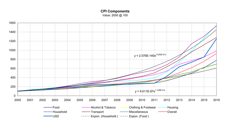
A graph showing Malawi's CPI indexes on an annual basis
Exponentially Rising Prices
The new CPI series were adjusted to the old 2012 CPI tables in order to be comparable. Some mistakes were found in the tables, which were corrected were possible. The figures start at a price value of 100 in the year 2000. The USD exchange rate was adjusted to 100 in 2000 in order to compare it with the CPI figures on the same graph. A number of interesting observations were made:
The overall CPI closely tracks the food CPI, which may not quite represent the facts of everyday life unless you are well below the poverty lines.
In a period of only 16 years even the lowest index has increased about 7 fold in price. Prices have at minimum increased by a factor of 7 in only 16 years and as much as 15! Put differently the value to the currency has been eroded by over 85%. The cash under your pillow would have lost 85% of its purchasing power in a best case scenario. The worst case is more like a loss of about 94% in value. Or you would be left with only 6% of the value after 16 years. The difference has been a contribution to finance the government's trade and spending deficit.
The two trend lines show the lower and upper limits of the CPI. The exponent is the annual increase and have been on average between 13% and 16% on an annual basis between 2000 and 2016. To put this into context, if you want to save some money, you need to save by that much more every year, just to break even with inflation. You have to work this amount more just to stop going under.
The USD exchange rate closely tracks the CPI. More about that below.
All lines follow an exponential trend. This is unsustainable and will ultimately end in disaster if left unchecked and without the right sort of intervention. If you think that 13 or 16% are not that much, please work out how that number compounds over just a few years. Just look at how the CPI numbers increase from 100 in just a few years. Who would not want to receive that sort of interest on a savings account? This compounding effect is well explained by in Chapter 3 of The Crash Course by Chris Martenson.

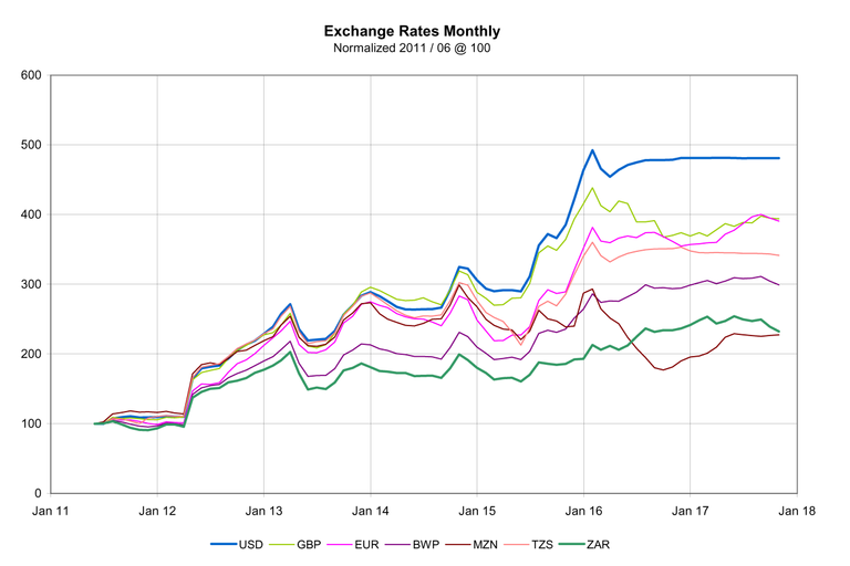
A graph showing monthly exchange rates of a selected number of currencies. Source: RBM
Poor Performance of the Malawi Kwacha
The nation's currency has little stability and performs poorly even against regional ones. The reserve Bank of Malawi publishes statistics, including daily exchange rates for relevant currencies. The local ones available on the key influential overseas currencies were graphed. All exchange rates were normalized to a value of 100 in June 2011 in order to make them comparable.
- Of the shown currencies, none performs worse than the Malawi Kwacha. Even the worst performing two currently are valued at double compared to the Kwacha of 2011.
- The USD seems to be the best performing currency from the perspective of Malawi. This may be attributed to the fact that the country's economy is largely dominated by the US Dollar. It is the reference currency, with may goods and services being prices in USD.
- The Kwacha has lost about 80% of its purchasing power against the USD in only 6 years; Even against the South African Rand and the Mozambique Metical the Kwacha has lost more than half its purchasing power in this time.
Finally this begs the question of how much the exchange rates influence the CPI and inflation?

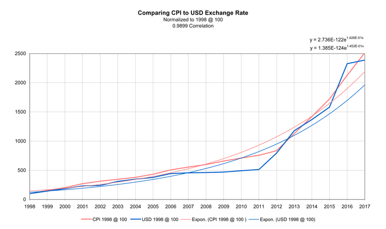
Graph showing the close correlation of the USD and the Malawi CPI. Source: RBM and NSO
Correlation between USD and the CPI
The above graph shows the close correlation between the USD and the MWK - nearly 99%. This would seems to suggest that the main factor of inflation is the exchange rate between the two currencies. In an open market the exchange rate is determined through supply and demand, which ultimately is affected by how much money the government makes available. One of the few possibilities the government can finance its large trade deficit, is through taxation of its citizens. The easiest tax to impose is inflation, as it is quiet, creeping and goes mostly unnoticed, especially by uneducated- and those people without financial literacy. Money is created to pay for the deficit. This only works up to a point and normally ends up in runaway- or hyper inflation (see what happened and is happening again in Zimbabawe).
This close correlation also shows that any national initiatives which may have been tried only had a minimal influence on inflation. The first and effectively only factor on inflation has been the value (or rather the lack thereof) of the Malawi Kwacha.
The two trend lines show the exponential nature of the data and give an indication of the compounded annual increase of 14-15%.
Conclusion
Malawi is in a bad financial state. Without a fundamental rethinking about some of the policies and strategies employed nothing will change.
The only solution for the country is to reduce its trade and spending deficit, by spending money appropriately and creating a positive climate to attract investments. Investments will grow the industrial and service sector to ultimately increase productivity and exports. The country has a large population, but low education levels. The education sector needs to be improved that a capable workforce is available to generate wealth and value. At the moment the country seems to be stuck in a downward spiral, which may not end well.
I have got very interested and want to dig deeper into these stats. Maybe I will do a comparison with other countries or look at some other country data in future. Thanks for reading and please leave comments and questions if you have any.
Resources:
http://www.rbm.mw/
http://www.nsomalawi.mw/
https://www.peakprosperity.com/crashcourse
Congratulations @infoblog! You have received a personal award!
Click on the badge to view your Board of Honor.