
Flexbox Basics
Flexbox (or Flexible Box Layout Module) was designed to give web designers an easier way to build their html layouts. Here I will give you basic flexbox layout examples to learn from and build off. Learn the differences between flexbox vs grid.
This is not a complete guide to flexbox, but in this article I will teach you the properties you must know.
In addition, I wrote an article on the 12 Exciting New Magic CSS3 Selectors You Need To Know In 2017 you may also find useful.
As you may already know, before flexbox, web designers relied heavily on floating divs with percentage widths to achieve their desired layout - as explained in this Tutsplus article.
Flexbox Container
First, in order to declare an element as flexbox, add “display: flex” to its properties.
[css]
display: flex;
}
[/css]
align-items
Second, in the container, define how you want the children to align using the “align-items” selector. #container {
[css]
align-items: flex-start | flex-end | center | stretch | baseline;
display: flex;
}
[/css]
#container {
Here are visual representations of the different align-item values:
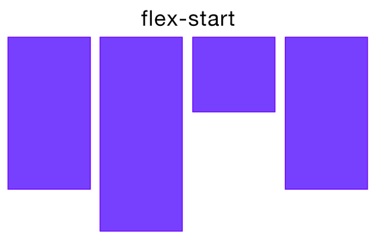
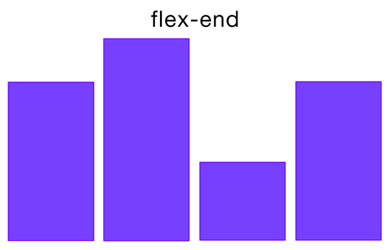
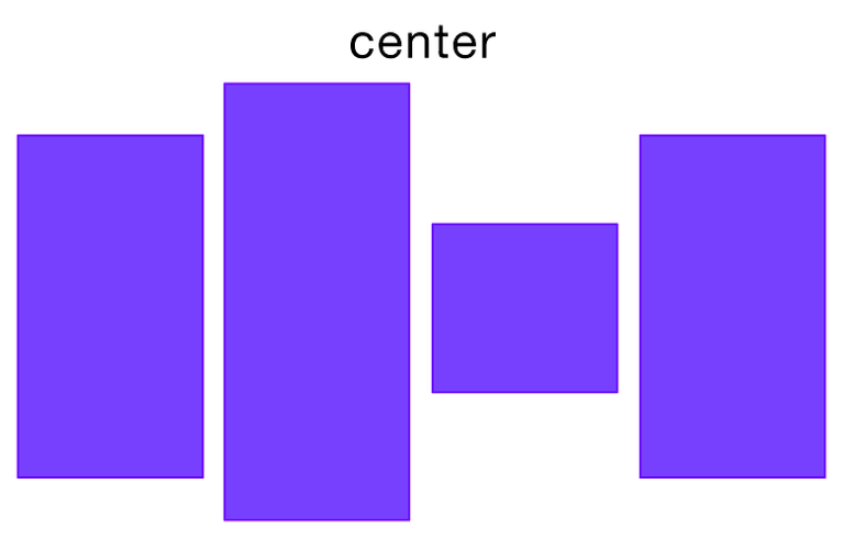
align-items: center will keep each child centered vertically throughout the row of columns.
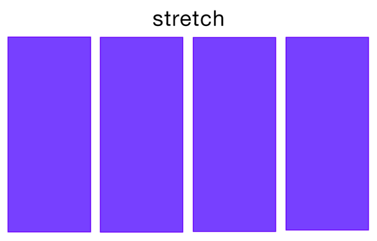
align-items: stretch will stretch each child to the container’s height. Stretch is the initial value for align-items.
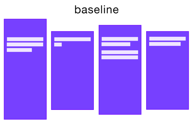
align-items: baseline sets the children to align themselves to keep the start of the content aligned together at the top.
Play around with these settings in this flexbox playground I setup for you. Also, be sure to change the container's align-items value to one of the values shown above. To do this, click on the "Edit on Codepen" link in the upper-right hand corner of the preview box below.
[codepen_embed height="265" theme_id="0" slug_hash="YEBwXP" default_tab="result" user="tommyhare"]See the Pen <a href='https://codepen.io/tommyhare/pen/YEBwXP/'>Flexbox Item Align Example</a> by Thomas Hare (<a href='https://codepen.io/tommyhare'>@tommyhare</a>) on <a href='https://codepen.io'>CodePen</a>.[/codepen_embed]
See more details about align-items at the Mozilla Developer docs.
Also: Traditional uses of float, clear and vertical-align don’t have affect on flex items.
align-self
Now, when you need custom alignment on a specific child in a container, use align-self. Align-self will overwrite the container's align-item value on the specific child.
[css]
align-self: flex-start | flex-end | center | stretch | baseline;
}
[/css]
#container > #child-3 {
See more information about align-self at the Mozilla Developer docs.
justify-content
Keep in mind, you may need to bookmark this page to refer back to these values. Provided that, it can be daunting to try and remember these values.
Luckily the distributed alignment values below are the most common used.
Distributed alignment values:
[css]
justify-content: space-between | space-around | space-evenly | stretch;
}
[/css]
#container {
- flexbox space-between items will give you an even spacing between elements in your container.
- space-around will give you even spacing around elements in your container, including space around the container's left and right sides.
- space-evenly items are evenly distributed in the container, giving the exactly same space between elements.
- stretch items stretch to keep equal height children inside the container.
[css]
justify-content: center | start | end | flex-start | flex-end | left | right;
}
[/css]
#container {
Baseline alignment values:
[css]
justify-content: baseline | first baseline | last baseline;
}
[/css]
#container {
Read more about justify-content at the Mozilla Developer docs.
Benefits to Using Flexbox
A major benefit to using it is for easy alignment. Notably, it takes the guess work out of element positioning.
Look:
Take this type of flexbox layout example

You can create this layout with the code below.
Here is the HTML:
[html]
<div id="container">
<div id="header"></div>
<div id="article">
<div class="content"></div>
<div class="footer"></div>
</div>
<div id="sidebar"></div>
<div id="footer"></div>
</div>
[/html]
…and the CSS
[css]
body {
padding: 10px;
}
display: flex;
flex-wrap: wrap;
}
margin: 10px;
}#container {
#container > div {
height: 80px;
width: 100%;
}#header {
background-color: #3F4CFF;
width: 68%;
}
height: 400px;
}
height: 60px;
margin-top: 10px;
}
flex: 1;
width: 35%;
}#article {
#article > .content {
background-color: #3F4CFF;
#article > .footer {
background-color: #3F4CFF;
#sidebar {
background-color: #3F4CFF;
height: 80px;
width: 100%;
}
[/css]#footer {
background-color: #3F4CFF;
The output of this should resemble this:
[codepen_embed height="450" theme_id="1" slug_hash="YEBwXP" default_tab="result" user="tommyhare"]See the Pen Flexbox Item Align Example by Thomas Hare (@tommyhare) on CodePen.[/codepen_embed]
Because this is a newer web technology, it may or may not render correctly in your browser. See if your browser supports Flexbox.
As of December 2017, Mozilla Firefox and Google Chrome are the two major browsers to support the CSS Flexible Box Layout Module.
What’s the benefit?
Because I am using flexbox, the sidebar width and height do not need to be set.
Both height and width of the sidebar scale with the main content.
Before, by using the CSS float method, this wasn’t possible and it was a pain to get the sidebar to match the main content’s height.
For example:
Say you had a larger sidebar and a page with a small amount of content, the page would end up looking something like this:

Flexbox VS Grid
To begin with, the CSS grid was first introduced as a W3C Working Draft on November 6, 2012. Now, nearly 10 years later it's classified as Candidate Recommendation since May 9, 2017. Here's the current status of the CSS Grid Layout assigned by W3C.
Further, checking on caniuse CSS grid layout, it's supported by mainly Mozilla Firefox and Google Chrome.
One of the main differences with CSS grid is the ability to map out both columns and rows. In the same fashion, create a grid display by adding "display: grid" to the container element's CSS.
Like this:
[css]
display: grid;
}
[/css]
#container {
Here's an example of what CSS grid layouts have the ability to build. Notice, there are both rows and columns.
CSS grids will give you more control over your content layout.

Basic CSS Grid Attributes
- CSS grid template rows will define height of rows. Example: grid-template-rows: 100px auto 100px;
- CSS grid template columns will define width of columns. Example: grid-template-columns: 200px 100px 200px;
- grid row gap will give you spacing between rows. Example: grid-row-gap: 25px;
- grid column gap will give spacing between your columns. Example: grid-column-gap: 10px;
- grid gap will set both row and column gaps. Example: grid-gap: 15px;
This is a visual representation of what grid-column-row and grid-column-gap affect in a grid display.
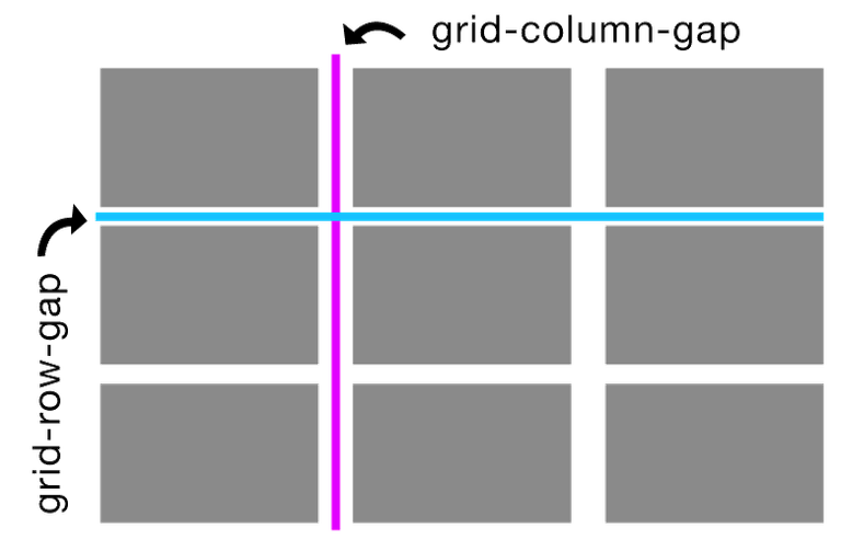
If you would rather just declare one same CSS grid gap for both columns and rows, you would use the grid-gap attribute instead.
Grid Item Alignments
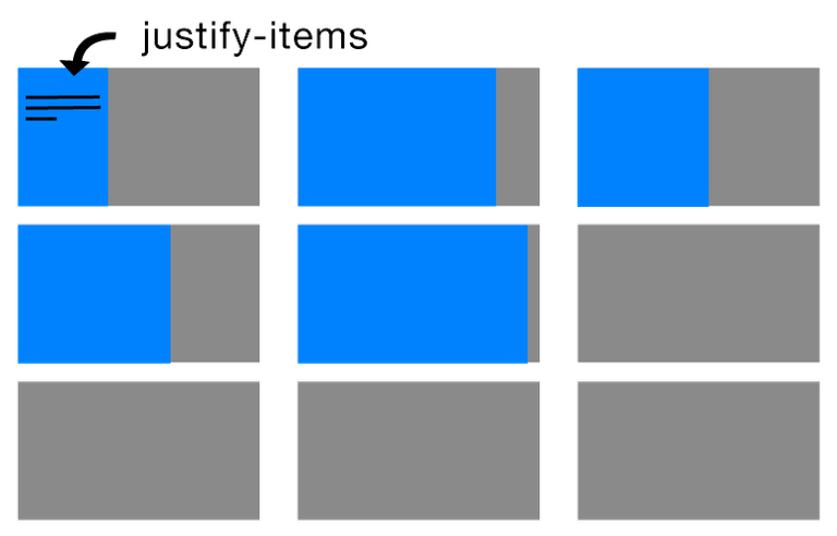
justify-items
This selector will give you the ability to align your content horizontally inside your container's cells.
[css]
display: grid;
justify-items: start | end | center | stretch;
}
[/css]
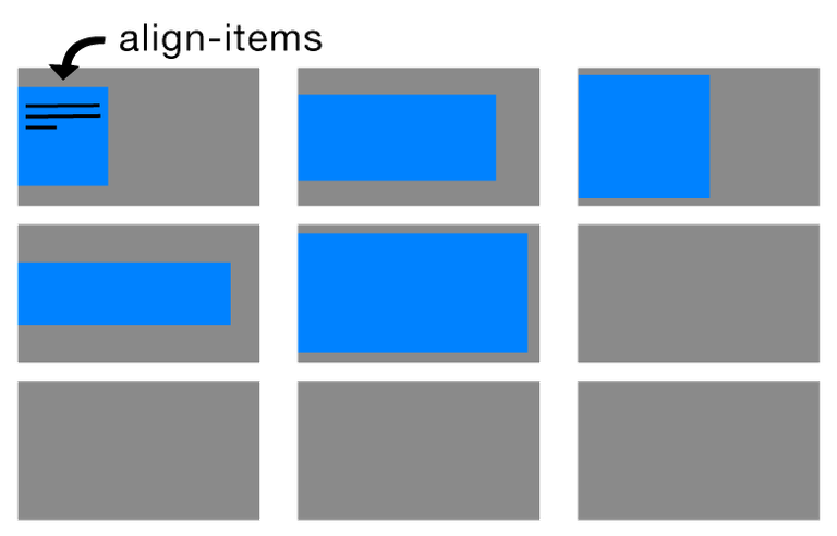
align-items
Much like justify-items, this selector will give you the ability to align your content. However, rather than aligning your content horizontally, you are now aligning vertically. Much the same, the terms for alignment work in the same manner, just vertically.
#container {
[css]
align-items: start | end | center | stretch;
}
[/css]
Building Layouts With CSS Grid
A simple 3 column grid's CSS would look something like this: This will create column widths of 25% - 50% - 25%. #container {
[css]
display: grid;
grid-template-columns: 25% 50% 25%;
grid-gap: 10px;
}
#container {
background-color: #444;
}
[/css]#container > div {
color: #FFF;
This CSS grid code will give you a layout like this:

Summing Up:
Flexbox was created to make layout design easier for web designers. Along with, lots of CSS frameworks like Bootstrap V4 are beginning to adapt it.
With that being said, it's a valuable skill for you to learn.
Use this article to develop a quick understanding of how it works and how to design layouts using flexbox. Equally important, you will learn the difference between it and the CSS grid layout - find out basic use cases for each in your projects.
Leave a comment on your thoughts about the direction of Flexbox. Do you believe other browsers will adopt flexbox or phase it out in favor of the more precise CSS grid?
Posted from my blog with SteemPress : https://divto.com/guide-learning-flexbox-layout-examples/
Hi @chamillion, I'm @checky ! While checking the mentions made in this post I noticed that @tommyhare doesn't exist on Steem. Maybe you made a typo ?
If you found this comment useful, consider upvoting it to help keep this bot running. You can see a list of all available commands by replying with
!help.