A View to the Past (Pt.2)
Our strategy for this project, as you might have already figured out, was to create heavy amount of charming designs that would create the appealing and engagement of the user. Not to say, also for having a better and more rewarding user experience.
Every time you have an idea, it is better for you and your client to call up on a sketch that will give some fundamental part of the content. This way, you will save a lot of time, effort and frustration.

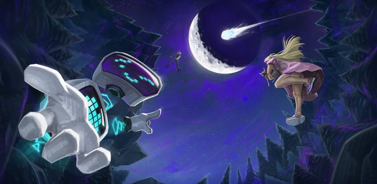
A good way to start with the heavy artworks (and my personal favorite approach... and the one that makes the most sense) was to create few drafts of the whole composition, with plain base colors (just for te sake of showing the feeling and atmosphere of it).
This was a particular technique that I love, which is based in doing all the job with one single square brush and keeping it simple, yet attractive. Adding very saturated colors on the edges of the shapes and keeping the whole composition very minimalistic. By this, we make sure we will keep it very readable.
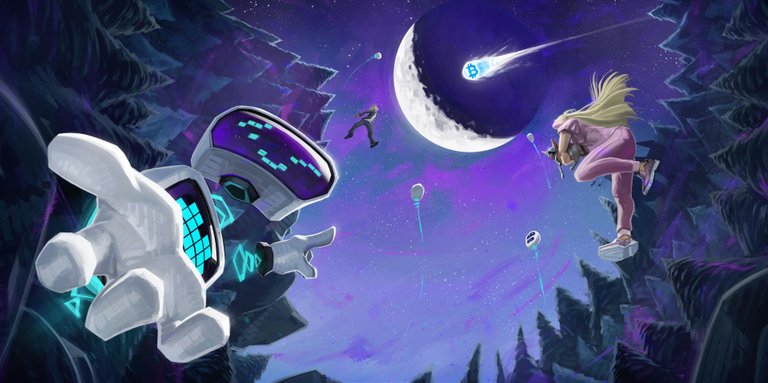
Something funny that happened on the production of this artwork, was that due to different culture origins of the client and mine, there been few slight changes from the original idea.

Some of these changes were okay, while others were harming the composition. But in the end the result wasn't bad at all.
The change that was funny at most was the need of taking away the skirt of the girl and making her wearing some pants. Which honestly don't look as good as the skirt did. Then another of the iterations were to change the comet by adding three comments that completely broke the composition. I won't be showing it now but rather in the next post.
(All the images in this post are my own creation and therefore I own their rights)

Hey! es grandioso verte! como te trata la vida?
Hehehhe los clientes y sus cosas, note lo de la falda y acordé el diseño de la chica que tuviste que tapar.