Hi Everybody !
As I promised before I am bringing you now the process that made this Wyvern to become alive. Which were my thoughts at the moment i was creating it and a very faithful guide on how to achieve the same results.
Of course let me say that this wasn't that easy as you may see on the process... it had many back and forth and it was plenty of stressful, and frustration moments.
This was a very new stage for me regarding to arts due that I've never tried such technique and achieved such results. This is my very first time ever to achieve such quality in my work within such controlled system.
My new system is pretty complex: it has more than fifteen steps that are almost error-free in order to achieve a very high quality in an artwork
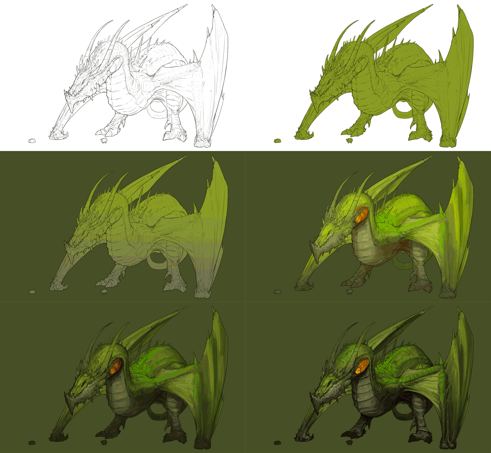
But I will bring sumarize those fifteen steps onto only 5: (1)Lineart, (2)Color palette, (3) Base painting, (4)Atmospheric occlusion and degradation and (5)Rendering!
There will be many missing things such as the design and composition part, which would probably be the most important ones because they define the base of the whole artwork. And in order to make you understand how important is to have a solid base, imagine a very tall building that has no foundations... in the end or in the middle, it will collapse...
...WELL ART AIN'T DIFFERENT!
It just looks more magical and extraordinary, but the truth is that art is like any other skill and profession. Therefore it has to be done with a system and with some precautions.
Let's get into this!
**
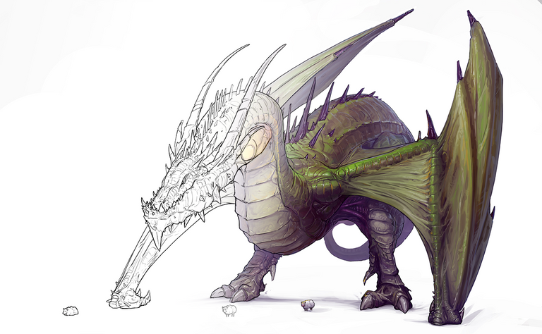
1. The Lineart
 We are not getting into the hard realm of design and composition here yet one important highlight I wanna shout as a confession from my unfaithful trickster soul is that I don't draw things right forward from my mind or design sheet previously made.
Sometimes I got several sketch-cleaning passages, and some others I got only one.
For instance I am working with a REALLY big illustration at the moment and it took me as many as FOUR cleaning passages (Plus design and some fixing here and there that you see only after you finished the goddamn lineart).
Yet now we have a very solid lineart with as many details as I could add and imagine for this one.
**
2. The Color Palette
Since we have our lineart set up, we can start thinking about color. And for this I HIGHLY recommend to have something ready since before start painting.
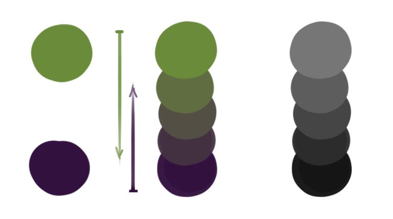
This is something that learned recently in order to make something look very aesthetic and clean as output: make your light tones with one color and your shadows with another, preferably the opposite temperature color (if your lights are warm, pick a cool shadow and otherwise).
For this particular piece, I asked my wife which color would be nice for a dragon... "Green" She said, so I found the tone of green that would suit at most and tried with a very dark violet for the shadows.
This is already a very good and solid starter for the next step, the...
3. Base Painting
Once we found our fixed color palette, we are ready to give a beginning to our artwork's painting step.
What I usually do here is to make a mask for the character and add some background color to help the eye to not do weird stuff at the moment of painting.
I step by step discover the creature. Adding more detail and following the lineart (which was the main idea and base for the whole artwork).
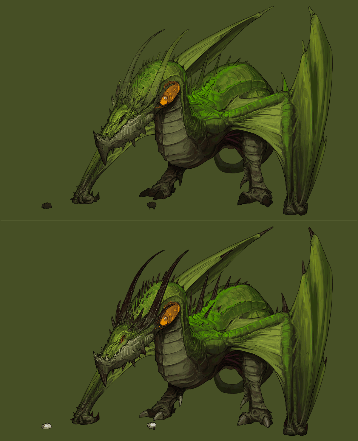
Something that I thought I wouldn't mention at all is the fact that I tend to start with less than 50% value colors both for lights and shadows. Yet here I didn't do it since the beginning due that it was a very new technique for me (You can see how I try to fix it later by making everything darker).
And then it's matter of adding more information onto the creature. A little bit of polishing.
You can also spot here how I left the addition of the horns and claws for the end. I knew since the beginning that those little bastards would add a lot of contrast to the whole piece, so I didn't bother since the beginning to lose time with them.
After a while I ended up polishing the whole thing a little bit more to check if everythingwas fitting well.
4. Atmospheric Occlusion & Atmospheric Degradation
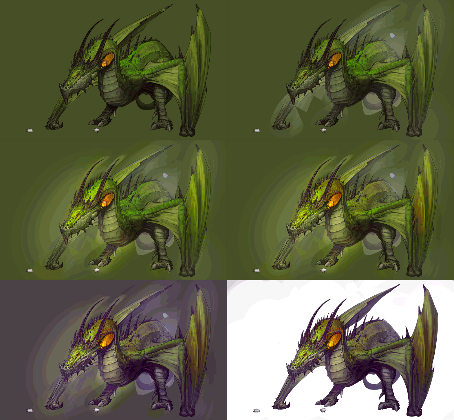 Atmospheric occlusion and degradation are things that, in terms that we all can understand, make shit look awesome.
See, we humans are used to see things into an atmosphere full of air (oxygen, nitrogen and shit ton of other gases and particles). This air shifts the tones of everything into a (more likely) desaturated and bluish (because of the blue sky, so it would be red if it s a red sunset, for instance) palette the further it is (or deeper into this atmosphere called air).
This is why things look more appealing and natural once we shift them into the atmospheric tone.
Regarding to the occlusion, I think is a little bit advanced. But picture this: every little corner of the subject (in this case the dragon) has a texture, a texture that pops out and pops in. When this happens, the area itself suffers a phenomenon called occlusion. And this occlusion is basically that light doesn't reach the corners of that texture that is deepest onto the subject
This dark value dyes itself with the ambient color around. And this is also why shadows dye towards the colors of the atmosphere.
After that, I decided it was time for getting rid of that muddy background and start discovering the silhouette once again.
5. Rendering
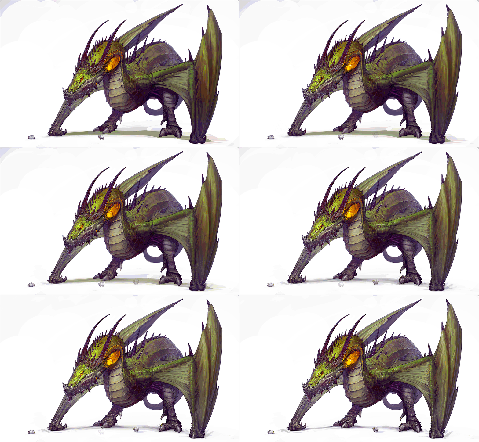 This is the stage that takes probably the 80% of the time of the painting. Even tho' Here I am showing you the artwork with some rendering done over it.
The level of detail that you want to achieve truly depends on you. To be honest I am more than happy with the one I achieved for this.
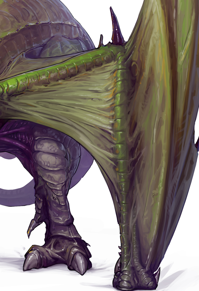
This is also a stage where to fix the contrast overall levels, the color balance, the values that may not be working so well and (in the case of this particular artwork) to add even more highlights all around the place !
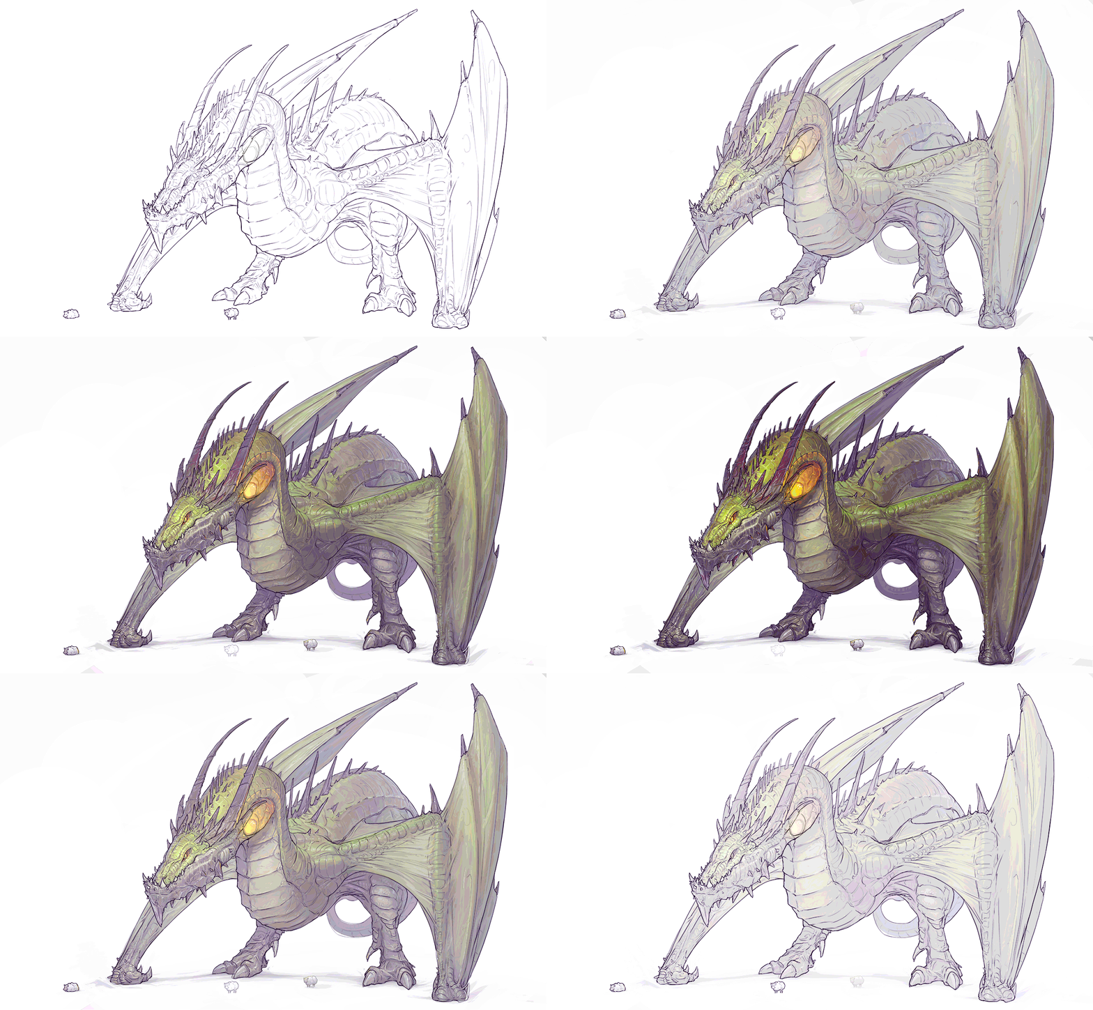
Something that we can observe as well in this artwork is something that I started to do with particularly this one, and that is to respect the lines.
Because I must be honest...
...as you have seen in previous posts I expose my problem with lineart. Which I always had (And I kinda still have).
This is a very serious problem when it relates to professional artists, because the line of your artwork speaks about you and your experience: you can't just fake a good lineart on a paper.
And this is why I want to (proudly) show you how much I followed the base lineart from this artwork since the beginning.
 And that s all peeps!
Thanks a lot for your support and I see you in the next one!
(All the images are my own creation and therefore I own their rights)
I always try to listen to the ideas of my fellow followers to improve my posts and to give something back to the community... therefor: What would you like the next posts to be about? What should I talk about? What kind of painting? Would you like some tutorials about arts, about cooking? Maybe some fresh gaming broadcast? I would love to know!
I apologize if I don't reply to your message. Sometimes I can't find enough time for it. But you can be sure that I will read it!
Bye!




Wow, that is all I can say about that piece! Seriously impressive skills you have there. I am a dragon fiend, I used to collect the Tudor mint dragons and I think I have 8 or so of them. I also have 2 tattoo dragons, one of which takes half of my back half of my chest and part of my arm. It took well over 60 hours to do!
Do you do many dragons? I also really appreciate how you detail the different levels as you built it up. Thanks for this post.
Thanks for your words man, I m glad you liked it! I plan to do few creatures with this style, just for the sake of having a strong portfolio and more content of mine =)
Yet I am having waaaay a lot of work lately, so it may take some time, but be sure that I will post it here around!
😍 me encanta, realmente eres bueno en ello; trabajare duro para que mis obras lleguen alto también. ✨
Hey Nic! Great educational painting post here! I've got the feeling as if I am on the academic class :)
Thanks @dunsky! I really appreciate it! =)
Wow thanks for the painting tips, really going to try it out someday.
Nice post
Wow awesome post ...thanks for your tips
Wow, that looks insane! Reminds me of the Proto Drake mount in Wow wotlk
Buenas tardes, @anritco
Estamos seleccionando gente con talento en nuestro club.
Somos ya 60 miembros destacados, estructurados por rangos de membresía, con un poder de voto total de más de 35.000SP con nuestro propio trail, otorgando un voto diario a sus miembros que multiplica casi x20 la cuota de delegación que el miembro hubiera realizado.
Si quieres saber más sobre nuestro funcionamiento y sobre cómo acceder al club, pásate por nuestro servidor:
https://discord.gg/E6xkvwJ
Saludos.