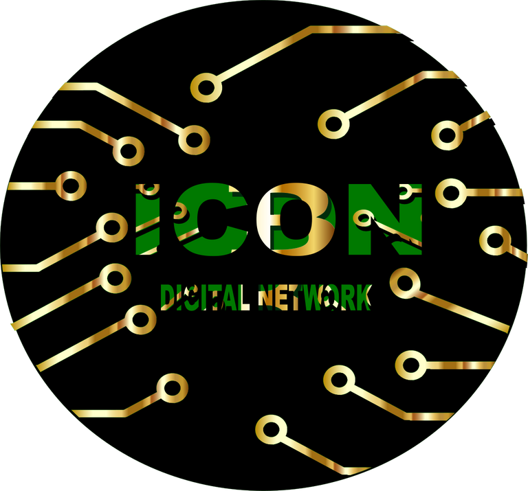
Greetings this is my participation in the contest
 https://steemit.com/art/@cetb2008/icon-digital-network-logo
You are viewing a single comment's thread from:
Greetings this is my participation in the contest
 https://steemit.com/art/@cetb2008/icon-digital-network-logo
I especially like the circular feel of things coming together to connect in your image. The O feels a bit distorted by the chunky pattern in the letter, and part of network feels a bit lost because of the black that is the background in the letters as well. I do like the way the gold bits are varied in shade, giving lots of texture, and the way they intrude on into the letters. Thanks for participating @cetb2008. I like where you are going with this.
Thank you