IEC asked a few artists to make limited edition posters to sell & we split the profits. Win-win!
I’ve done a few of these shows for various nonprofits & it is always a great way to support each other.
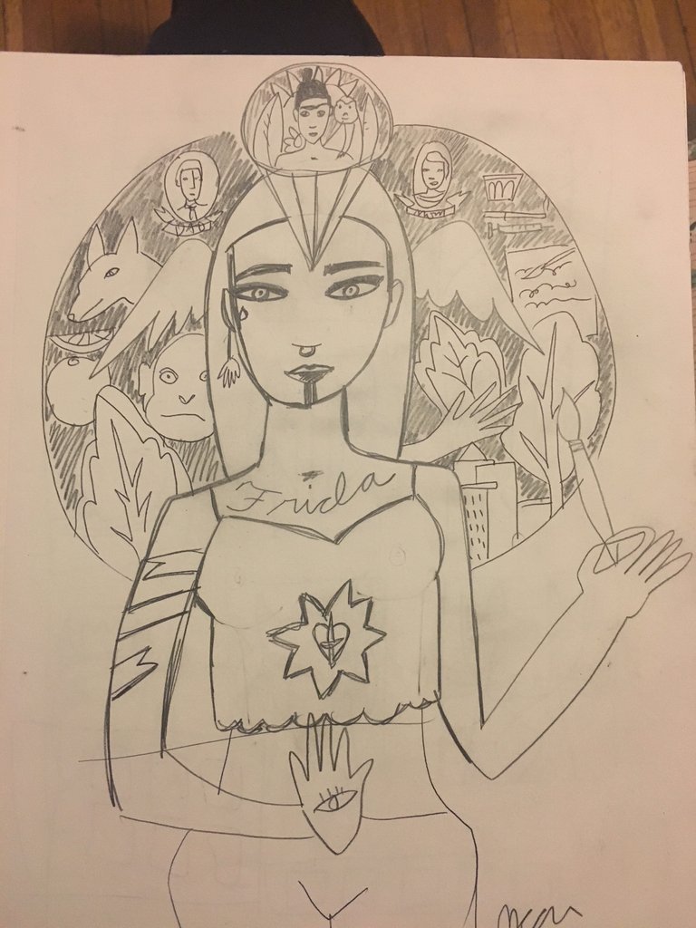
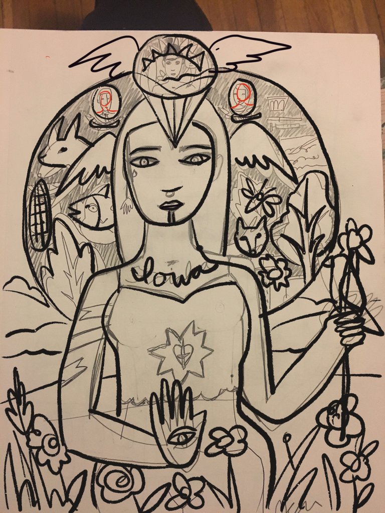
I took a sketchbook idea and reworked it for this poster to include the feeling of a protector of water, land & animals.
The IEC is a hard working crew managing farmland, watersheds, healthy habitats and more.

Sketchbook idea

Reworking design

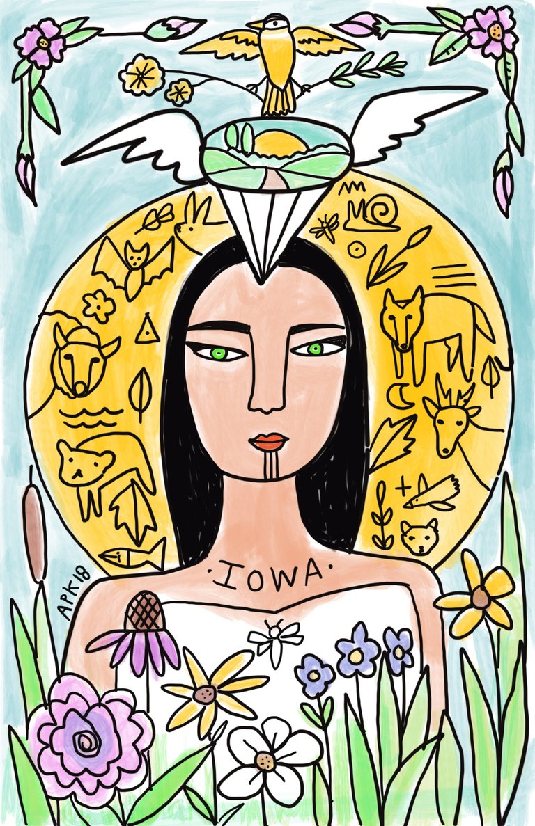
Refine design, added watercolor

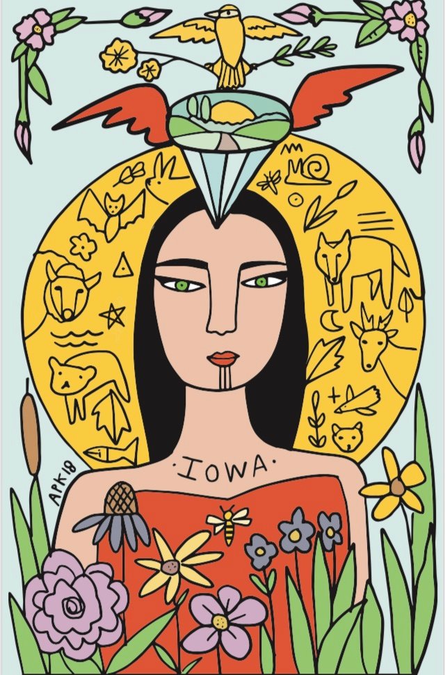
Final product! What should I call her?
I’m newish to digital art & it sort of feels like cheating but it is fun. I started playing with this design Monday night & turned it in Tuesday morning. The digital process made it quick work. They will be printed at 11”x17” for $10. at the event.
As Ever,
Amy @colormecalamity
"I’m newish to digital art & it sort of feels like cheating but it is fun."
My thoughts exactly! I had to take a digital tools class when I was at PNCA a couple years back and I did love it, however, there is just something about tangible pigment, or charcoal, or pen, just getting gritty with it that is lacking in DT. I respect those that do it, and I love a lot of work I see but I'm too much of a tactile queen when it comes drawing and painting.
Rock on!
Exactly. It’s the lack of texture of paper too. I’ve had convos w/ folks on discord who have never used messy, beautiful art tools! I was ready to send over a box. : )
Thank you!