Lettering challenge 2

This is my second lettering project. I'm excited to share my results and some tips for you. Now that I think about it, the best thing to do to get better at lettering is keeping a habit of creating at least three times a week.
Project description
For this week's challenge I had to refine a previous lettering project, something I had done at least a few months or even a year or more ago. Since I don't have many years or months of experience in lettering, I just did a project two times, improving some things in the second try.
Materials
For this project I used:
- A Leuchtturm dotted notebook size A5 or half letter for the first attempt
- A Fabriano dotted notebook letter size for the final project
- A 0.6 fine point black marker
- 2B pencil
- Eraser and pencil sharpener
Choosing what to letter
I used a quote that I had written down in one notebook, unfortunately I didn't jot down the author and I'm not sure were I heard it...The thing is, anytime I hear something that resonates with me, I write it down. It might have come from a video, because I follow a lot of youtube channels. It might have been my own thought actually. I truly don't remember.
Anyway the quote is translated from spanish and it goes something like this:
"Have Certainty. Believe in yourself. The potential is there. Start now."
I love this quote, despite it's choppiness, because it sums up how I got into Steemit. I thought so much about joining and I was scared of not having enough to share, but finally I did it. I am so happy I did, because since joining Steemit I have been more productive than ever, and my freelance career is picking up. Right now, I've met very encouraging Steemians like @rocking-dave, @shinyforest, @yabapmatt and @embity, to name a few, and I really hope to meet much more artists, designers and kindred spirits along the way.
First try
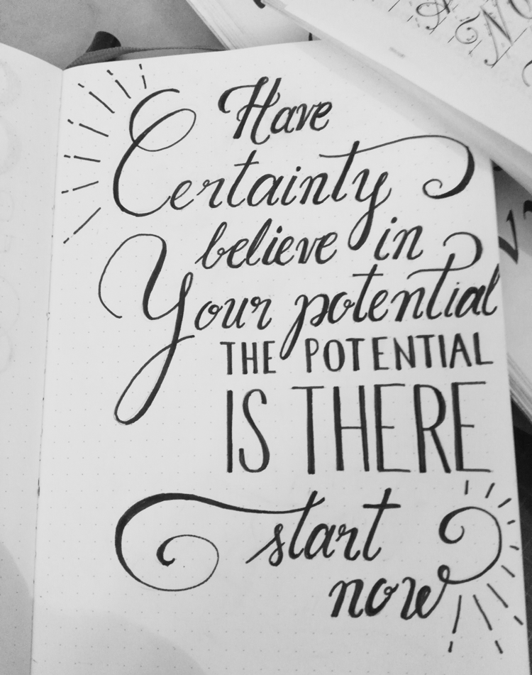
I quickly jumped into the first iteration and got a not so great result, so in the second round I focused on improvement.

How to figure out what to improve?
There are a few things that need to look pretty tight when drawing type, some of those are:
- Keeping the thickness of letters consistent.
- Maintaining an optically refined letter-spacing. This means that some letters need less space between their partnering letters and others need more space. For example, an "i" will need less space before and after, while a letter like "k" might need extra room on both sides.
- Making harmonic letter alternates and flourishes. Flourishes are ornamental features given to some letters. For example, that weird curve that comes out of the "t" in the word "start" is a sort of flourish and it doesn't look harmonious at all, so, that is something I wanted to fix in the second try.
- Keeping straight lines for the sans serif font.
Second try
On the second try I changed some things:
- I used a bigger paper size to feel more comfortable drawing and switched from A5 to letter
- I used the first lettering beneath the second paper to trace the quote while I fixed the spacing and other details
- I tried to keep the same inclination in the ascenders in the letters "t,l and b"
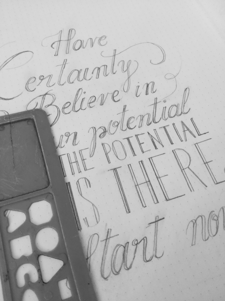
- I drew some of the letters using a ruler for straighter lines
- Finally, I kept in mind all the things in the improvement section
I started the second artwork making sure the pencil sketch was as perfect as possible

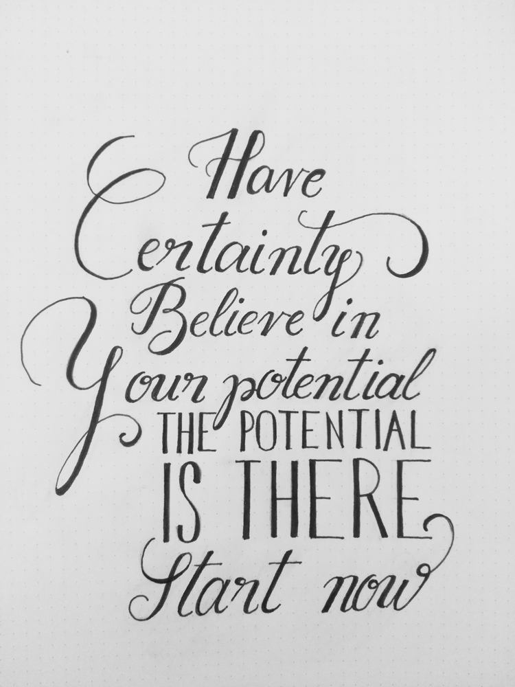
Then I went over everything with the marker and tried to fix the outlines, thicks and thins, inclinations, etc. and got this final result

Overall it took me at least 4 hours to make the second one and I'm pretty happy with the result. Here I show the after on the left and before on the right (I'm left-handed) that made sense to me ;)

What would I have done differently?
Next time I will change some stuff up that I think will help anybody get better at lettering:
- Use tracing paper to fix word and letter-spacing before going over with the marker
- Stick the work to a wall and look at it from afar to make sure everything is straight
- Use a finer point marker, like 0.1 for the outlines to avoid shakiness in the lines
- Practice letters that are more challenging on a separate notebook
If you are an experienced letterer tell me what you would've done differently? Leave your tips in the comments section below. I would appreciate it if you help me to improve my skillz. If you want to start lettering with me please post a link to your projects below so I can give you some beginner's feedback. I would love to see your projects.
I'm not sure if my images uploaded correctly, but I've been working on this post for hours and some of them wouldn't preview. I will be working on this post throughout the week to make sure the images become visible.
Thank you for visiting my post and have a great weekend.
Hey @creativista, everything is visible and I really like your post. I always admired the persons who are drawing strength and learning from their own experience. You are doing that in a brilliant way, and I especially like the way you made connection between attempt one and two - so than anyone may learn from the mistakes you made. I wish you many good works and I hope you will continue to post about your advancement :-)
Thank you for your wishes @hidden84. Your words mean a lot to me. There is nothing that makes me happier than to add a new skill to my toolbox. Calligraphy is something I've always wanted to learn. I practiced and practiced but never felt confident about the result, it was too difficult for me for some reason. Today, with the forgiveness of lettering (drawing letters) and the ability to use rulers, dotted paper and other tools that make everything more flexible and easy I want to make progress and also help anyone interested to get better with me. Happy Sunday!
Cool project! l love lettering myself,
upvoted and following to see more of your work! :)
Great, that makes two of us ;). I'll be posting these projects weekly, so expect to see more. Thank you for following @allangraves!
I've found that www.reddit.com/r/calligraphy is a really great resource (of course it'd be great to see the same community develop on Steemit)
As for you work -- keep at it! The human hand is subject to so many quirks of muscle memory, comfort, and control that it is no wonder that consistency is difficult to achieve
Thanks for the resource @bypic, I'll make sure to check it out. I think it would be awesome to build a community of letterers and calligraphers on Steemit. And I agree with you, practice makes progress, so I will keep practicing and hopefully look back at this work with fondness. I do feel more comfortable with lettering than calligraphy. I just can't make the nibs do what I want. That takes years of experience. The best calligraphers I've watched are incredibly accurate. My hands and muscles don't move that way ;)
Nibs are creatures with their own minds, indeed! We'll all come to proficiency I know it
@OriginalWorks
Nice !!! i really like .
Thank you @mro! And thanks for your support! I will be posting lettering works every week. I'm excited to see how these projects will look in a few months :)
I can tell you that it will look perfect !!
Thanks @MrO!
Very nice! Your handlettering so beautiful. 😊👍. Hope you like my art 💟
Thank you @platonicform. I'll make sure to check out your posts ;)
Nice ! I really like.
Thank you @josuegonzalez
Finally I had a chance to read your wonderful post! Fantastic attempts, I must confess that I like both versions very much! I was never very good at lettering, I always mess up the spaces between letters, or have this one letter which will mutate strangely and ruin the rest of my artwork :) So I'm impressed with your precision and patience. And the quote resonated with me today, because I started morning with some heavy thoughts about all the things I would like to create, but I feel overpowered and discouraged. And your beautiful message is very uplifting :) Thank you Ana, I can't wait to see more from you!
Love,
Klaudia