Hi steemians, this is me again presenting one of my most precious hobbies: drawing. In this occassion I choose an actor that besides the fact I like him a lot, he plays one of the most iconic superheroes in MARVEL universe. He is nothing more and nothing less than Steve Rogers, the Captain America.
Particularly, I like the actor more than the superhero, so I decided to draw him without his costume, with the look he had in the last installment of Avengers: Infinity War, where he sports a bushy beard that does not disadvantage him at all.
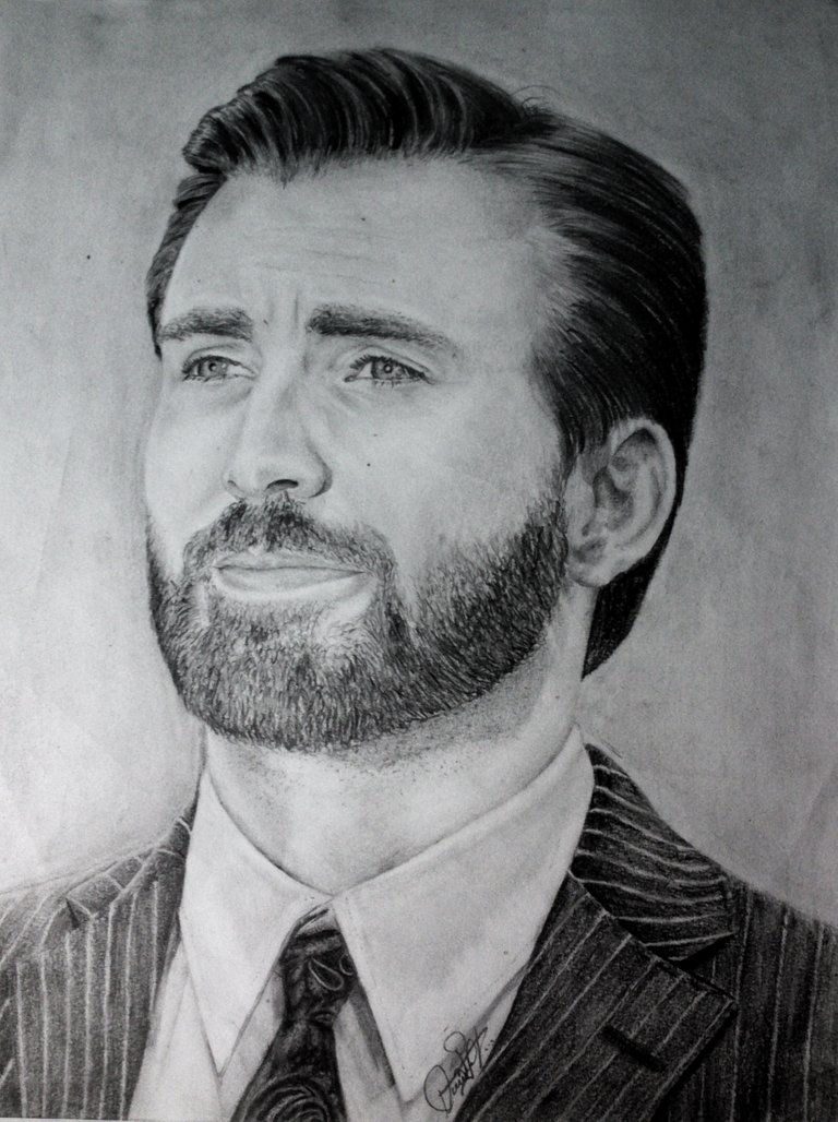
Drawing realized with graphite in a sheet of paper. Size A4.
As always, I am going to divide the process into steps, so that you can better appreciate all the stages through which the drawing passed.

Step 1
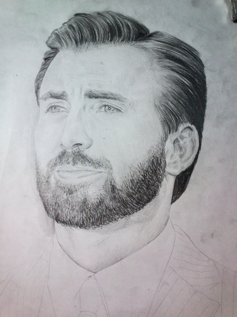
First of all, I drew the sketch; there I did guide strokes, putting more details in those zones that I thought they could be more complicated to develop. The graphite should be clear to make it easier to cover or erase.
It is important to calculate the dimensions well in this step because later, it will be more difficult to erase and redo areas that have not been equal to the original.
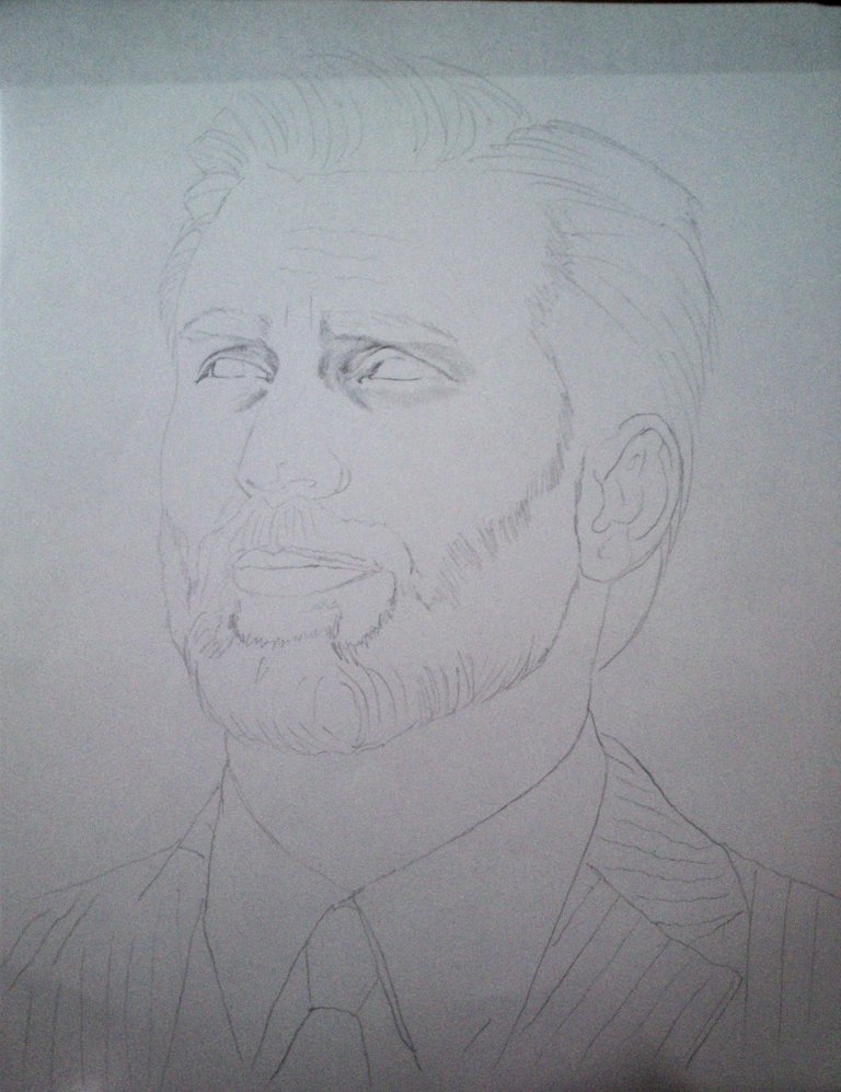
Step 2
The eyes were my next goal. If I catch the look first, I feel that I take a weight off, Hehe. From them, I went to the periphery drawing the eyebrows, the nose, the lips and the ears. Then, I gave shade to the skin of the face playing with the chiaroscuro.
The Chiaroscuro, in the drawing, is the contrast between the shades and the light in the objects or the skin (as is the case) due to the reliefs that these possess. In this technique, no lines are used, but powder graphite which diffuses as necessary. In the mouth and nose, this technique is also used.
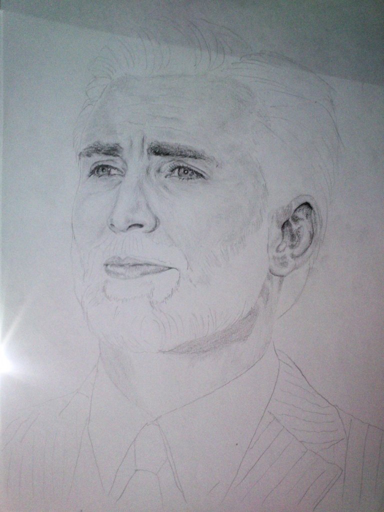
Step 3
For the beard and mustache, I made very short strokes and scattered at the beginning to make it more uniform.
This part seemed a bit stressful because it reminded me the pointillism. I do not like that technique. Hehe
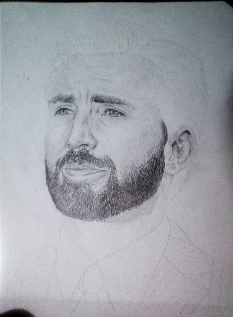
Step 4
The hair is simple when it is straight, so it was entertaining to draw it. Give reflections, brightness, etc. It does not give many problems as long as it is not long or curly (or both).
Step 5
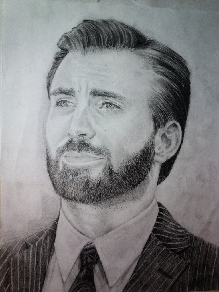
For the blazer, I used a pencil 6B with which I achieved the dark tone I needed. The design of the tie was more difficult than I thought and I was not entirely convinced of the result. On the shirt, the shadows were very subtle.
At this point I used the eraser to highlight the areas with the highest incidence of light. Also remove excess graphite in certain areas. After doing it, I blurred.
After this step, I thought it was finished, so I set out to select and organize the photos I would include in the post. When I compared more closely the "final result" with the original, I noticed many details and had to retouch the drawing. Don't forget to be as critical as you can with your work.
Finally
The final result and comparison with the original image:
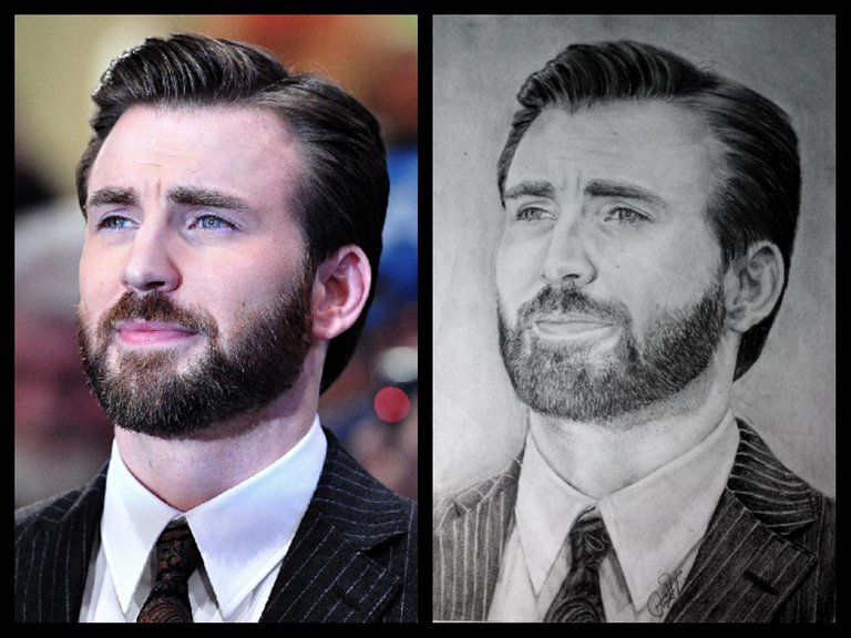

This drawing required a lot of time and dedication. I liked it a lot, but there are still many things that I need to improve. I hope to achieve a better result the next time.
I think we should demand more each time. The more we demand of ourselves, the more we will be able to give.
Excelente trabajo @davt014, me gusta mucho como lo detallaste. Saludos
Gran trabajo esta muy bien tu retrato saludos desde Cumana Edo. Sucre. Venezuela
Oh. Gracias, Blackmen . Saludos, paisano sucrense. :)