
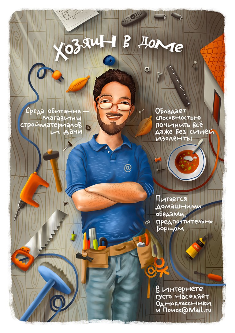
Recently I've been telling about few other illustrations done for the same commercial order. Meet another typical mail.ru client - House Owner. They've got some texts about each character so I've just found this guy at Shutterstock and started the sketching.

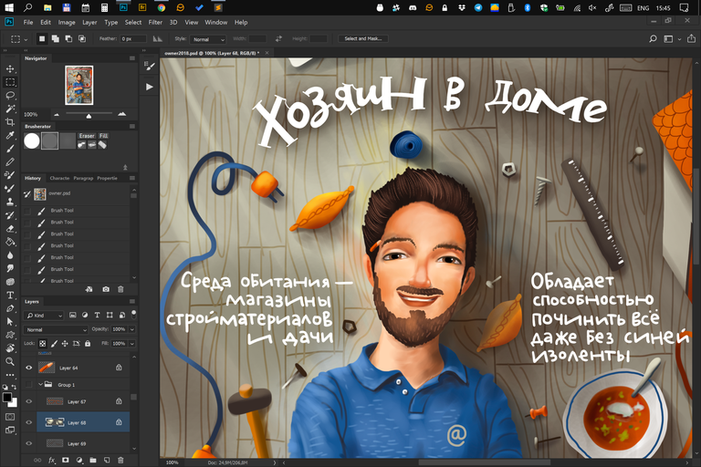
Just found out the sketch was way much better than the final result. I would prefer to have such a character instead but my client asked me to make it less cartoonish and not so cute.
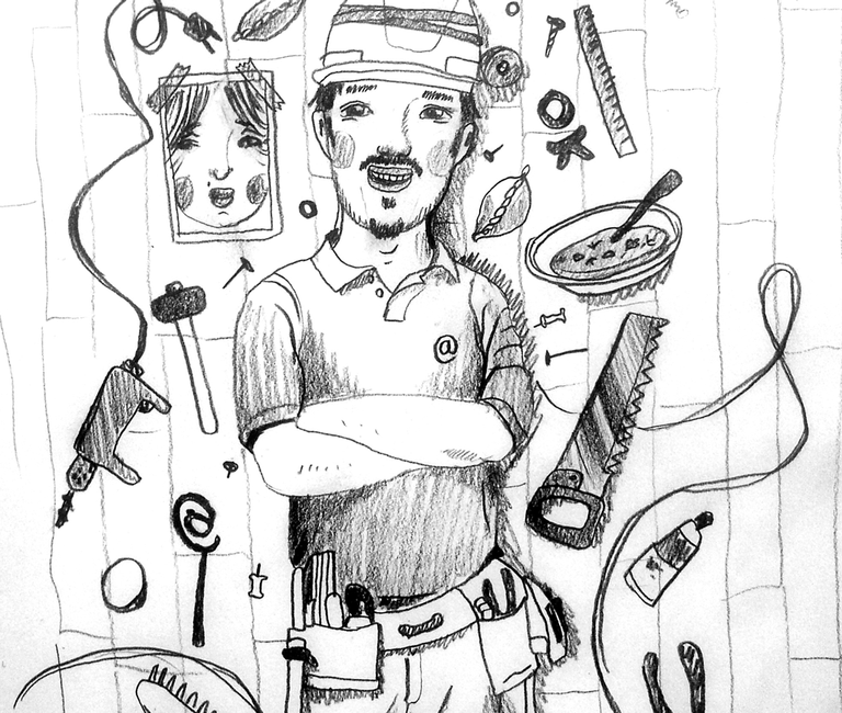
No glasses. They've asked me to make him look a little bit older as well by the way. More smiling and smart.
Russian text: House Owner. Settlement location: Construction materials malls and outside holidays camps. Special ability: fixing everything even without using BlueTack adhesive tape. Home food eater. Prefers borsch. Mostly settled at ok.ru and questions.mail.ru
| Post digest for the same commission order: | |
|---|---|
 | First illustration about typical yogi girl is still there. |
 | Sport Lover. Science mentions two species: first form is located at gyms and second is at gymbars.... |
I can see how your first idea had more personality, but how the latter one ended up maybe being a better fit for the ad. They might want the guy to be more "normal" so the focus is on the business. IDK. Nice work @dunksy!
Yeah, that's absolutely true. I understand there is always some risk for big companies like mail.ru to be not understood properly if they will let me use 100% of my style in more "serious" advertisings. Thanks a lot, Matt!
Помимо самой иллюстрации, улыбку вызывает описание. Эт что-то :D
Это копирайтеры придумывали всё :)
#Cool friends*
Cool pictures :)
Haha :) Nice joke!
Nice post you photos