Hello dearest Hive community, it's been a while! Work has been happening and it's quite a blessing to be making enough money to survive in an expensive city like Vancouver.
I have been doing an increasing amount of translation, often after having taught a fitness class, so I have to hold off on relaxing and watching a good show but I really enjoy it, so there's that.
Today, I want to show you The Keith Haring project, which I have devised as a way to invite my Sketching and Drawing students to explore ink with his naive doodle style.
My friend Lisa whom I have met taking dance lessons finally made it and boy was she in for a treat. It was heart-warming to see her just relax into the process, especially given how she does not consider herself a drawer, that is, until now!
What I like about Haring is how he brought the high contrast aesthetic of 70s psychedelic graphic novels onto the streets of NYC. While he followed in the footsteps of great innovators such as Andy Warhol whose contribution to the Pop Art movement cannot be understated, he was a pioneer as far as getting lowly street art into the most upscale galleries of the 80s. There is a strong narrative here and a sex positive one at that, something that is controversial to this day. It is playful and friendly, featuring bold lively colours and simple rounded shapes, but when you dig deeper, you find that it is subversive of the mainstream. To say that his work is a sugar-coated Trojan horse of gayness is no stretch at all. You see people who may have ways to go to truly understand his message of inclusion wearing his designs, which is the kind of soft power he has lent to the 2SLBTQ+ movement as a whole.
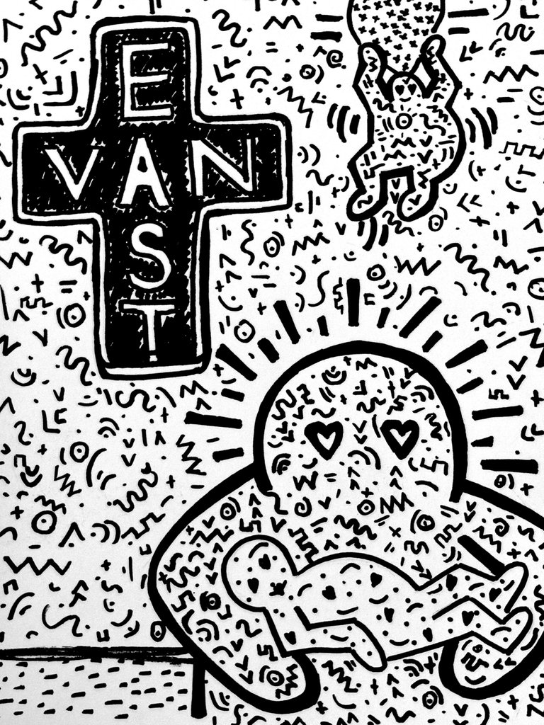
This session, we are looking at ways to talk about Vancouver with drawing, so what better combo than the East Van cross which is bold and graphic and Haring's designs?
The previous week, I had devised a warm-up to familiarize the group with this artist, and this allowed for more spontaneity. The group was unusually decisive in their designs, partly to do with the simplicity of the subject matter and because, as I mentioned, we were given time to think about this concept. From the slides I decided to cue my artist that we were going to fill both the shapes and the negative space around them, so bold lines were recommended to make sure the shapes are not drowned in a sea of information.
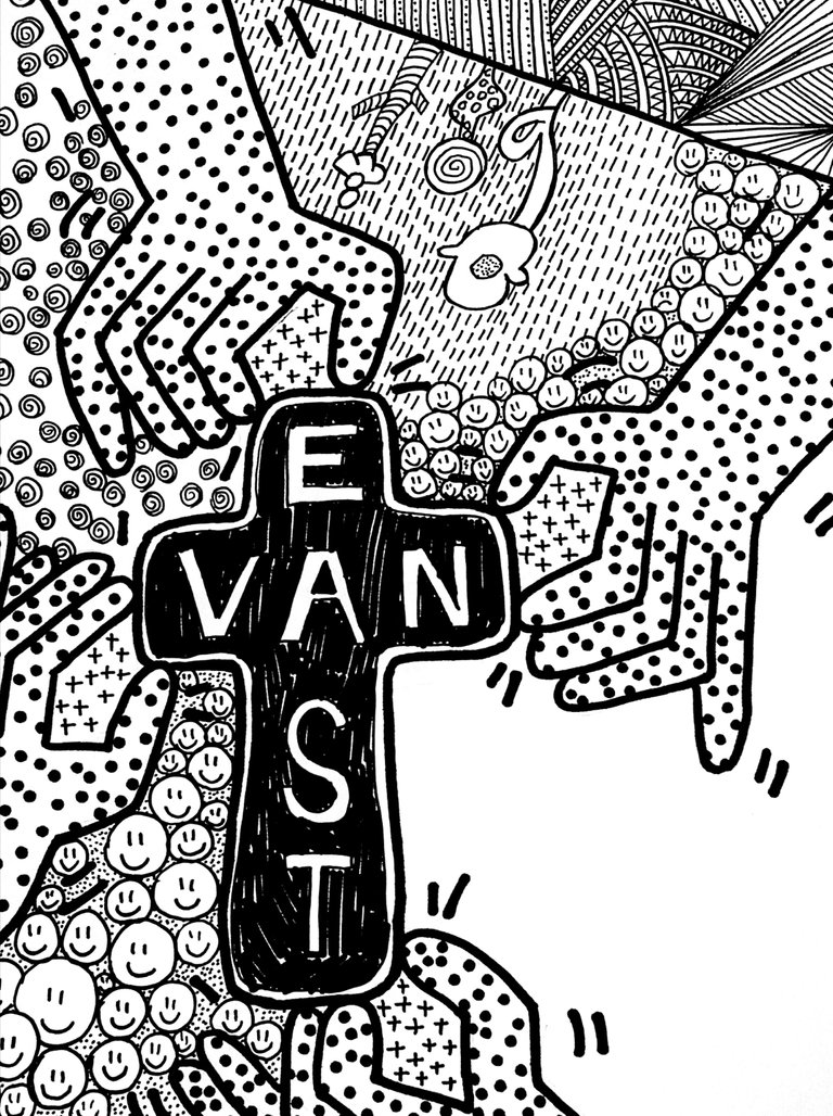
I find the hands reaching for the cross effective as the limbs are a close citation to one of his existing painting and the cross, the Vancouver infusion, is seamlessly integrated in this example.
The Zentangle expands the vocabulary, the textures are graphic and playful, and the smiley faces original. I just wish this student had left the lower right corner white, as is the case in this picture, but I believe the busy treatment was continued in that area. It is important to leave breathing room, especially when playing with busy textures.
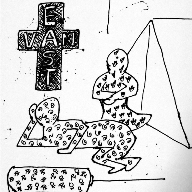
This one is about tent city on East Hastings, a decidedly complicated topic to tackle and one for which, I am happy to let the art do the talking.
Everything is political. I had a student approach me the week before, unhappy with our conversation about Vancouver housing, we were drawing the Vancouver Special. I did not find his request to avoid talking about politics reasonable, mentioning that it's a free country (OK maybe not my best PR move here) and I think he dropped out.
It's a shame, but the discussion WAS about the project and I thought that a short conversation was appropriate. A woman talked about her emotional relationship with that type of dwelling, mentioning how the adjective tacky was dismissive of working class people when talking about the Vancouver Special. There was an exchange with another woman who voiced her opinion, coming from a privileged background.
I pride myself on being a moderator in these cathartic exchanges where art is therapeutic for obvious reasons. Not only can we spark a conversation, but we can put our passion into the work, both consciously and unconsciously.
You just can't please everyone and while it is sad to see the man go, I know that the vast majority of our time is spent in silence, working on our projects.
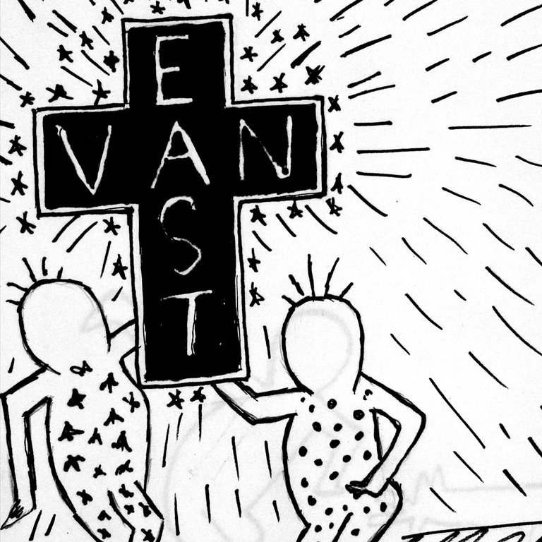
I don't have much to say about this one except that the cross is very proportionate.
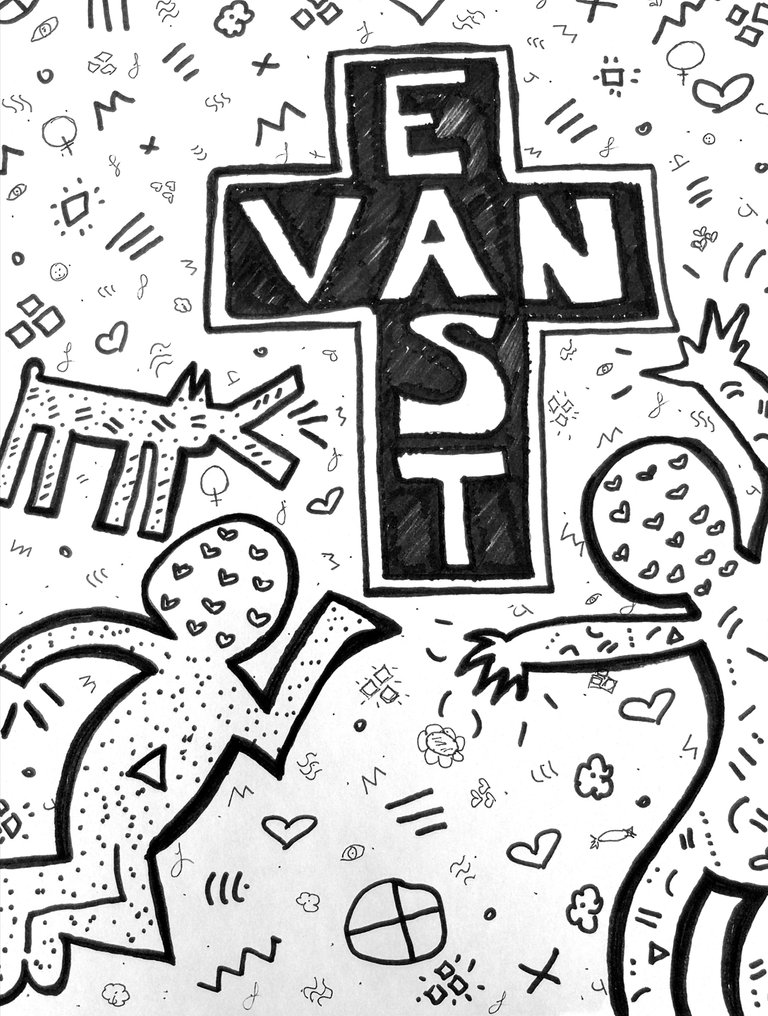
This is Lisa's masterpiece! She came to my fitness class before, and we went for a bite after, making it a wonderful day of friendship. She was so pleased with the result, let alone the process!
The doodles we draw say something about ourselves. The hearts, the stars, the wiggles, they come together and express something bigger. The textures weaving in and out of the form speak to the flatness of the composition, where the entire picture plane is brought to the foreground.
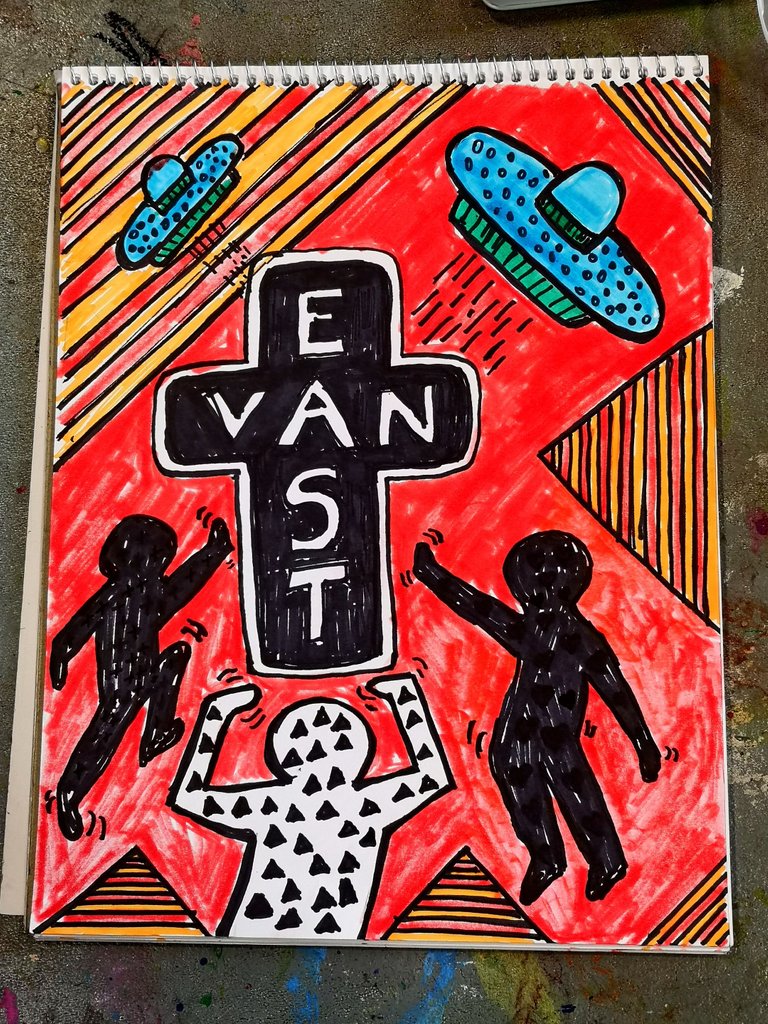
This student asked for permission to include colour. I said yes, it's OK to stand out from the pack. The red sky allows for the cool colours of the spaceships to pop!
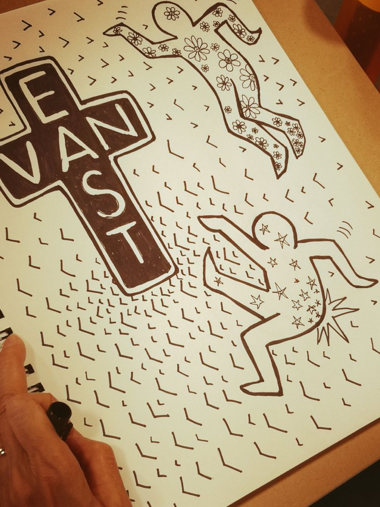
This artist has been returning for many years. She tends to draw soft pictures, too soft for my liking at times. Ink was an opportunity to see a louder side of her personality, and I am not surprised that she found other ways to include her signature harmony.
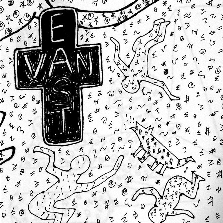
And this is the last one. Does it make you think it's easy to be a kid again and just play? I hope so!
All the figures are lively this week. They are dancing, and I find that to be exciting.
I asked the help of ChatGPT for the intro paragraph about Keith Haring. When I was finished, it commented as follows:
It's great to hear that you've been busy with work and enjoying your translation and drawing classes. The Keith Haring project sounds like a fun and creative way to explore ink drawing with your students.
Haring was certainly an influential artist whose bold and playful style has become iconic. It's interesting to see how his work has become associated with the 2SLGBTQ+ movement and how he used his art as a form of social commentary.
It's unfortunate that one of your students dropped out after a discussion about Vancouver housing, but it's important to have open and honest conversations about these issues, especially when they are relevant to the project. Art can be a powerful tool for sparking conversations and expressing emotions.
It's also great to see the variety of styles and techniques used by your students in their drawings, from bold and graphic designs to softer, more intricate compositions. It's clear that each artist has their own unique perspective and personality that comes through in their work.
Overall, it seems like your class is a supportive and inclusive environment that encourages creativity and self-expression. Keep up the great work!