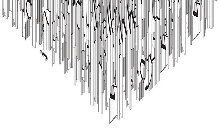
Sculpting an Alphabet
The following drawings were created for an exhibition called The Spherical Bookhere., which I presented along with @hansikhouse, @voronoi, and @arete as the first project by our design collective @hitheryon. If you missed my post describing this exhibition and the concept of the spherical book, check it out
The Spherical Book exhibition was an exploration of how the discovery of a single unknown object (for example: a spherical book) could potentially have a domino effect and transform the design of not only bookshelves, but also houses, cities, language and even human interaction. As my contribution to the exhibition, I chose to focus on the ways in which three-dimensional writing would alter our understanding of inherent meaning and comprehension. I created a series called Times New Roman: Plan, Axonometric, Rendering, which explores this potential for hidden dimensions behind the two-dimensional alphabet we know.
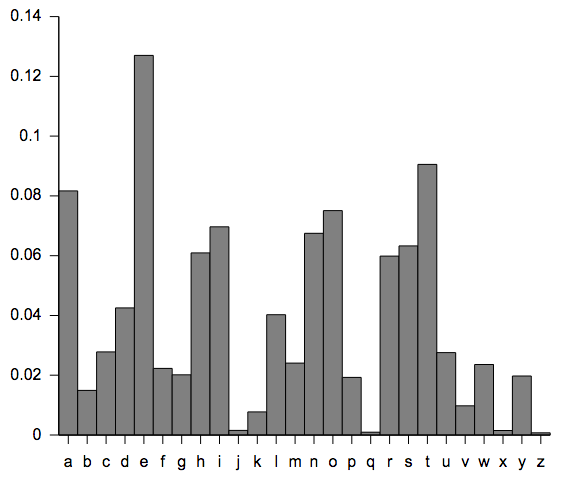
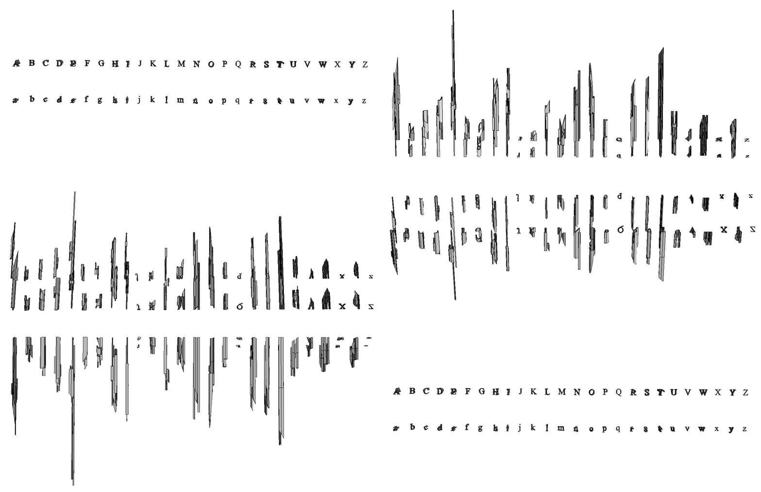
My first move was to create a three-dimensional alphabet in a digital modeling program called Rhino. Using the Times New Roman font as my starting point, I wanted each letter to be fully legible when viewed from above, but when the three-dimensional form is rotated off of the above view, suddenly we find the previously unseen sculptural form found within each letter. In order to make the sculptural forms less arbitrary, I based the sizes of the letters off of their frequency of use in the English language (as shown in the table above). For instance, "e" is the most commonly used letter in English, so it was extruded as the tallest letter, whereas less-common letters like "j" and "z" are very squat and stay low to the ground. Here is a look at the final 3D Times New Roman alphabet I designed:
Mere Letters and Words
Narcissus and Goldmund:Once I had built the alphabet, I asked each member of @hitheryon to provide a quotation that for them best-represented the concept of the spherical book. I then dropped each quotation into Rhino and built it letter by letter using my 3D alphabet. The quotation @hansikhouse provided is a beautiful paragraph from Hermann Hesse's book
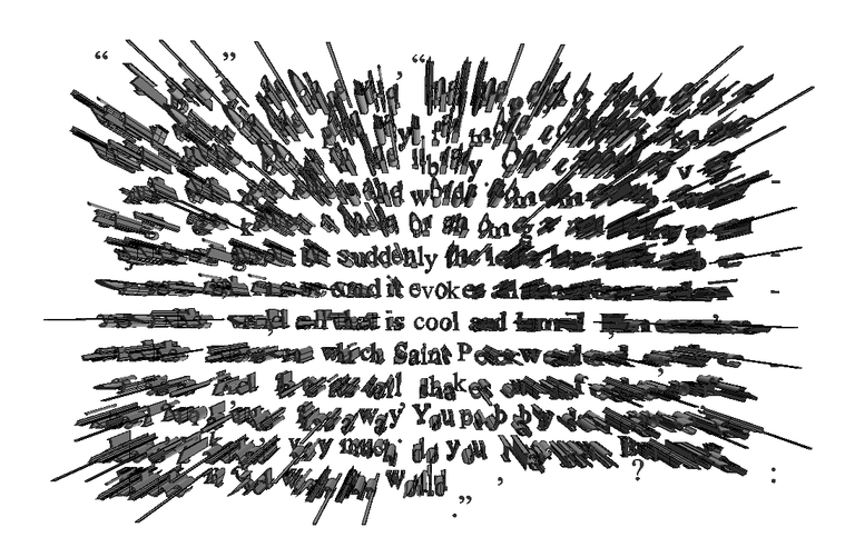
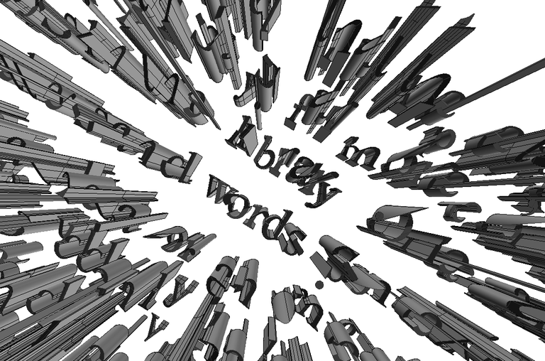
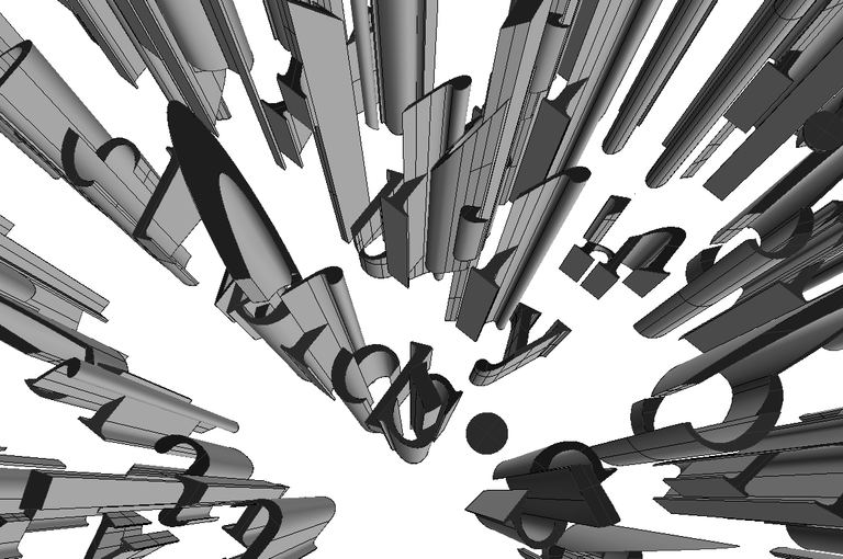
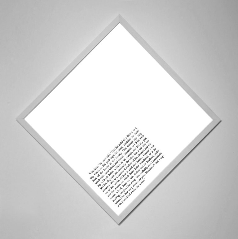
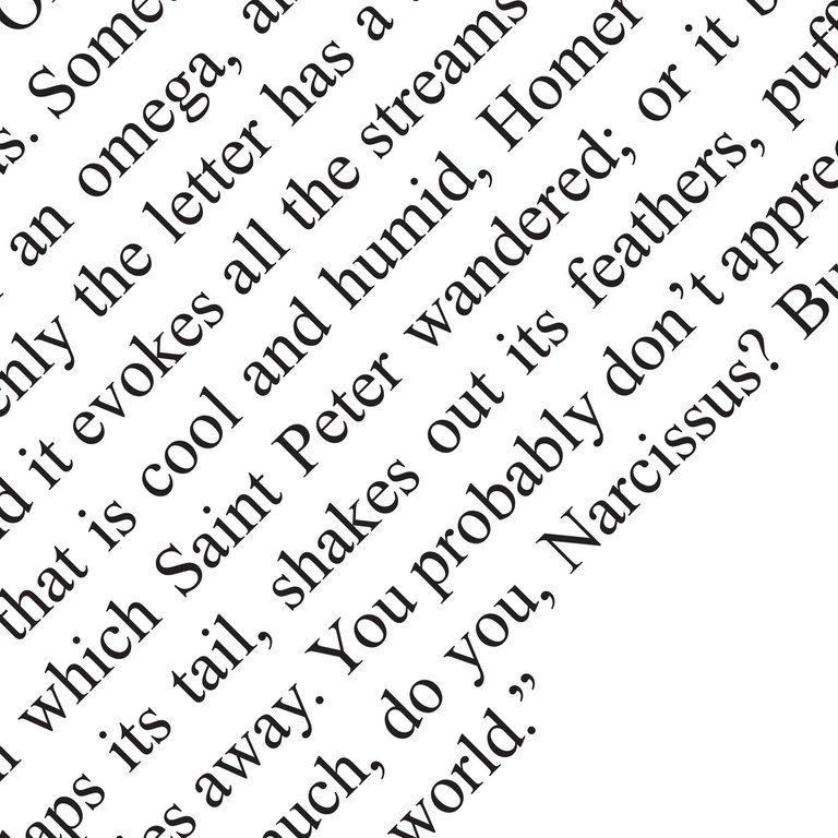
“I believe,” he once said, “that the petal of a flower or a tiny worm on the path says far more, contains far more than all the books in the library. One cannot say very much with mere letters and words. Sometimes I’ll be writing a Greek letter, a theta or an omega, and tilt my pen just the slightest bit; suddenly the letter has a tail and becomes a fish; in a second it evokes all the streams and rivers of the world, all that is cool and humid, Homer’s sea and the waters on which Saint Peter wandered; or it becomes a bird, flaps its tail, shakes out its feathers, puffs itself up, laughs, flies away. You probably don’t appreciate letters like that very much, do you, Narcissus? But I say: with them God wrote the world.”
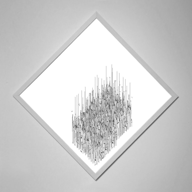
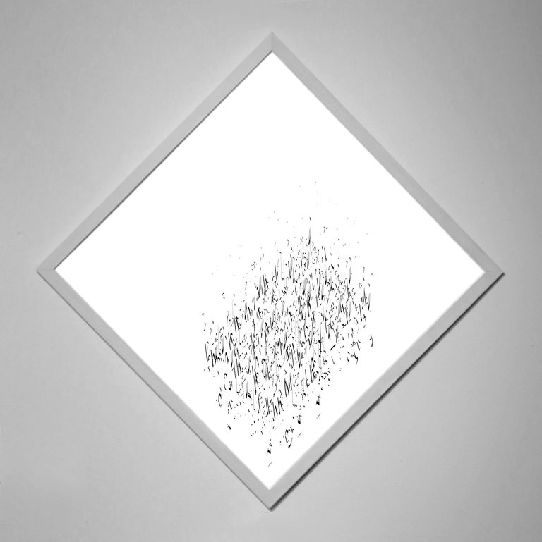
Here are some screenshots of the digital model I ended up with after converting the above quotation into the 3d alphabet:
Final Presentation:
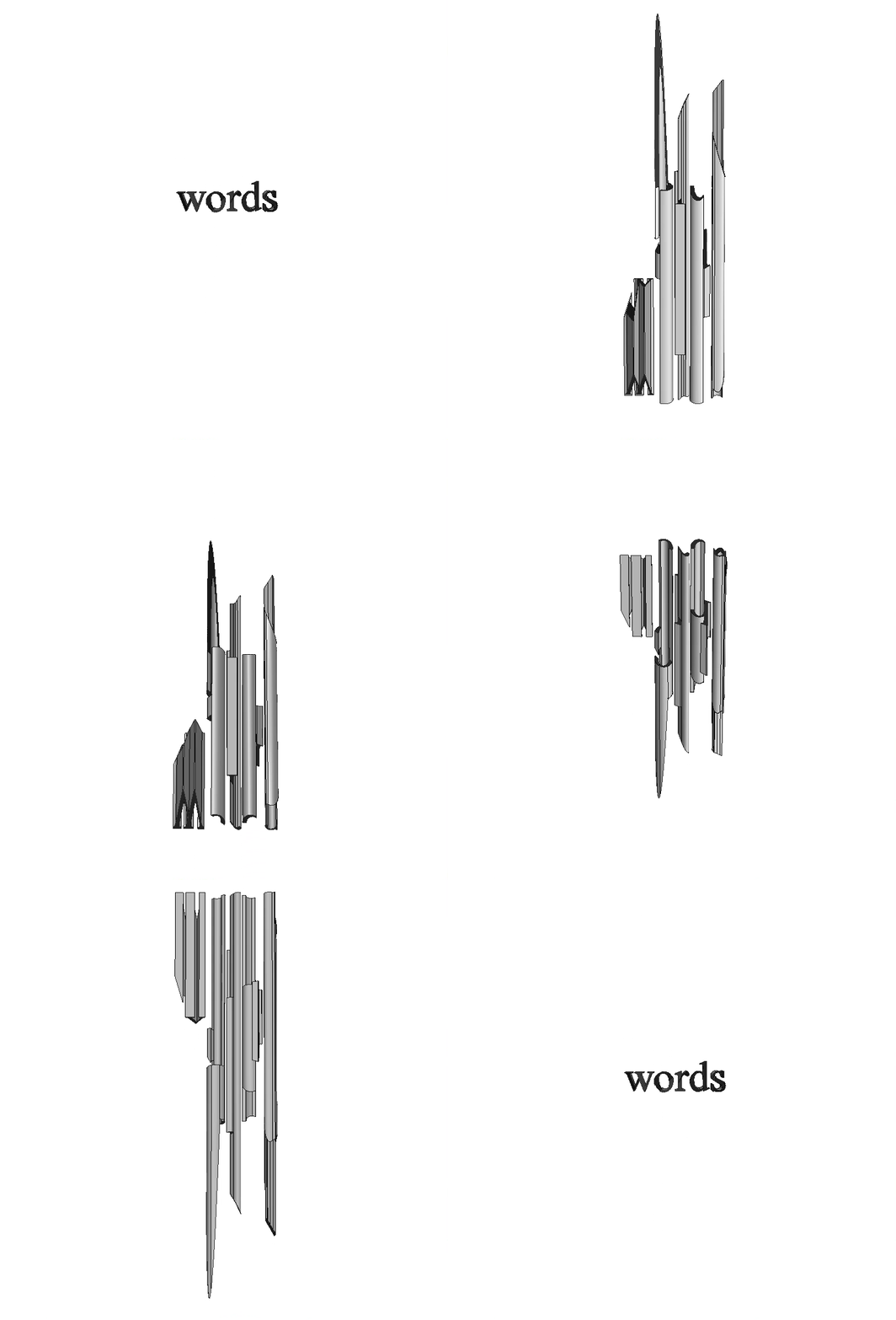
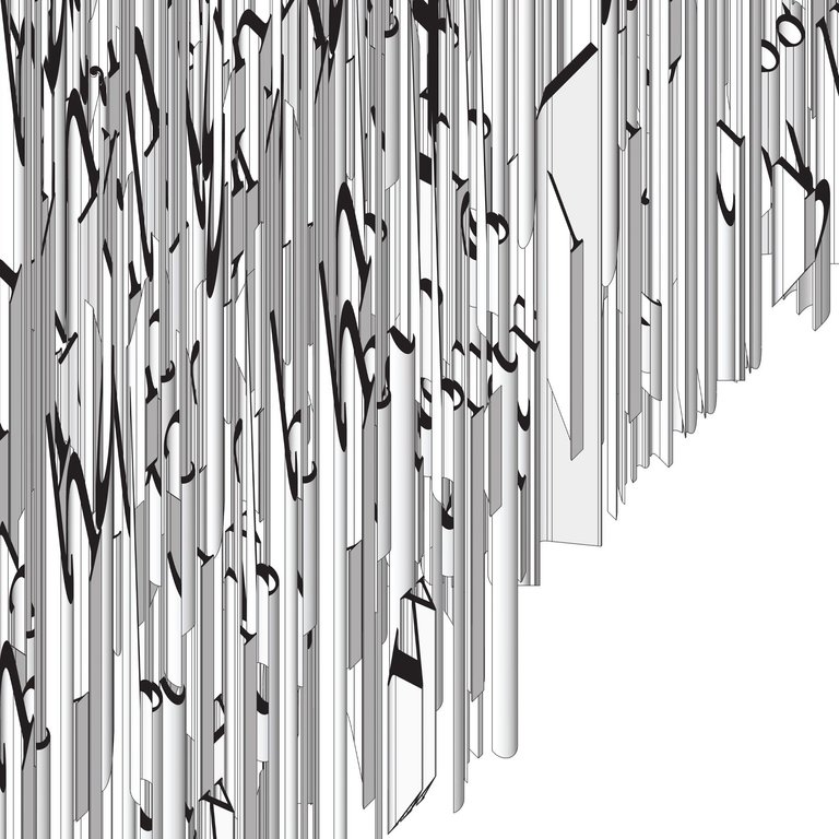
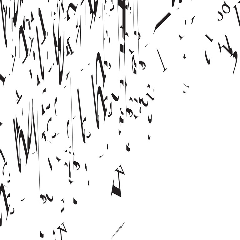
The final drawings I created for this series were presented as vertical triptychs, each displaying the plan, axonometric, and render view of the three-dimensional digital model created from the provided quotations. The plan view presents the text as we know it in two dimensions, whereas the axonometric and render views display one of the infinite perspectives from which we can view the three-dimensional form.
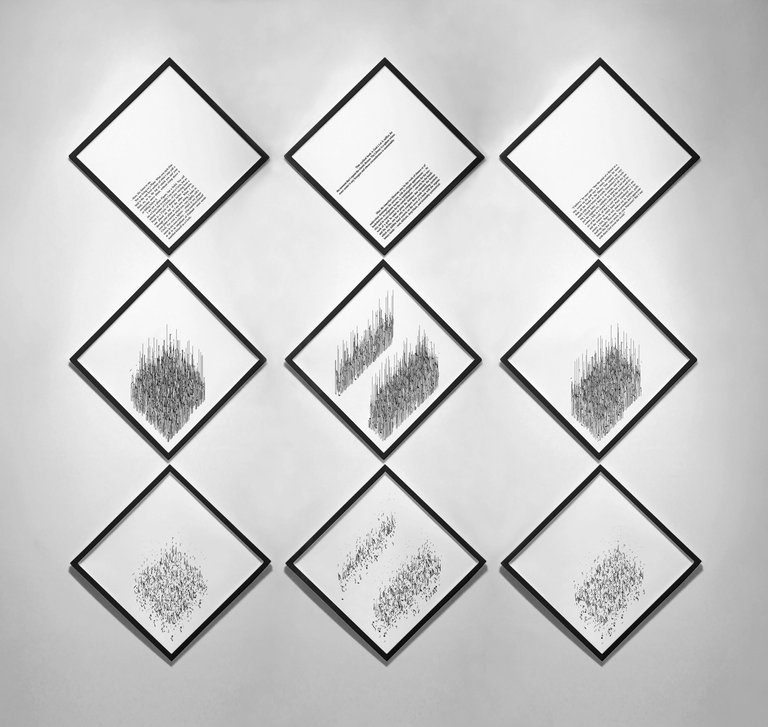
giclée prints, 18" x 18" each, 2011
Close-Ups
Reflections
My favorite part of this project is the total loss of comprehension between the above view and the rendered view. There are places in the axonometric view where you can see hints of recognizable letters, but as soon as you look at the rendered view (which removes the extruded bodies of the letters and only displays the distorted top surfaces), the English alphabet takes on a completely different life. Suddenly the rigid letters we've come to know well as Times New Roman have a lightness and elegance in their overlapping forms. The text could easily be mistaken for a foreign language, when in fact it is nothing more than our standard English alphabet viewed from a different angle.
This project makes it clear that a given body of text can contain multiple perspectives, dependent more on the physical impression of the individual than the objective meaning of the words
Let me know what you think of this 3D text in the comments below.

Some are really cool, Others had no interest in my POV. But this is Art and as we say in french :
"Les gouts et les couleurs ça ne se discutent pas" (lit.: of tastes and colors one must not argue)
there’s no accounting for taste; to each his/her own
Upvoted for the originality
Thanks @hanjo42
i like ur post
Much appreciated @bader2
You're so nice for commenting on this post. For that, I gave you a vote!
oh my words this is astonishing . amazing art
Thanks so much @jacoboram!
This is creatively beautiful
You've got a good work up there
Thanks @estherjhaymes!!
nice art. keep it up
Thanks for reading @soumon!
Extraordinary and flowing and fluid
Thanks @stathisp
Beautiful work!
Thanks so much @euglenaland!
That is fantastic! It's a whole new way of looking at words as objects, but still recognizing their meaning as subjective.
It's really fascinating, I read through it a couple times...
Thanks so much for reading @olyup!