Okay so this will be my first post, it's nothing special for that occasion, just some pictures I've had lying around and i'm depressed at this moment so I got creative as one does(won't be sharing that picture today, this was an older one I did) But I do promise this post is imbued with that same spontaneous creative miserable energy haha
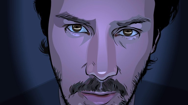
I'm not 100% sure if this counts as a tutorial since I didnt save out the nitty gritty images, but it will give you an idea of how you could attempt to achieve the cel shading style found in A Scanner Darkly(check it out it's awesome)
A Scanner Darkly - Starring the immortal Keanu Reaves 
Okay now for my quick and easy steps!
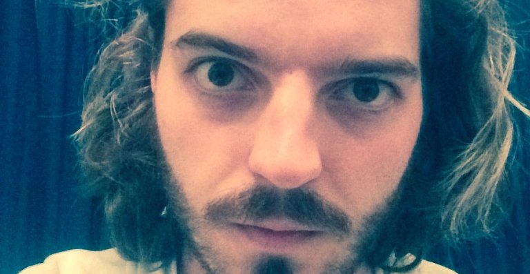
1. Take a photo - Of yourself or find a cool photo of someone you don't know online, try avoid significant others, just cause it's lame when things fall apart and you have to look at their faces everytime you're showing you're old work or getting requests based on those images (As you can see by this shitty photo, the image quality doesn't really matter, One thing I should have done at this stage was colour correction, would have made things much easier)

2. Posterization(Photoshop) - This gives you a very clear path of where to draw and you also get the simplified colour pallet, I usually try get 4 levels of colour in each area(up to you really on the detail you want) you should do different versions for various items (Hair - Eyes - Skin, etc)
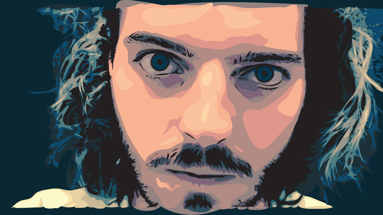
3. Draw & Colour(illustrator + wacom for speed) - I apologize for not having this broken down more but it fairly simple once you get going, just abit tedious.(Especially with crazy hair) Using your step 2 images you can clearly see the darkest parts of your image, colour those in black, this is your top layer (You can also add more detail lines if you feel the need) from there on you basically switch between drawing and the eyedropper tool. Create your base layer by starting with the darkest colours that cover the largest surface area, building the highlights ontop, switching between your step 2 images to get the various sections detail(Of course you could just have one image but it won't look as cool) As you can see my colours are abit fucky at this stage and that's because I didn't colour correct earlier, doing that at this stage just doesn't work as well, but overall once this step is done you may be able to stop, things always look pretty cool.(Crazy!)

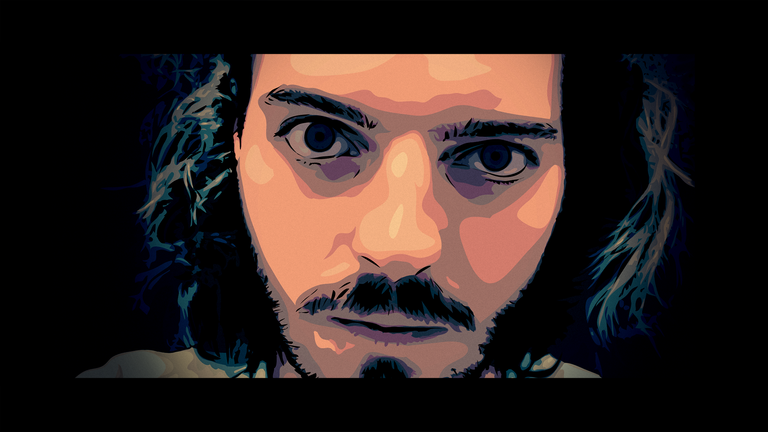
4. Tweaking(Photoshop) - this is all optional, you should have something good after step 3, but if things didn't come out exactly as you envisioned, which is how I felt about mine, you can always do further edits till you are happy. (I actually miss alot of the things I hid in this image that were visible in step 3, unfortunately my desktops screens colours were terrible when I made this, in actual fact if you pick up your phone and take a picture of the step 3 image, that's how I really wanted the step 4 image to look, but oh well haha)

Hey @idntknwstpaskn! This is super rad! I would be keen to try this but am not keen on doing it all with a mouse haha! Upvoted and Resteemed!
Congratulations @idntknwstpaskn! You received a personal award!
Click here to view your Board of Honor
Congratulations @idntknwstpaskn! You received a personal award!
You can view your badges on your Steem Board and compare to others on the Steem Ranking
Vote for @Steemitboard as a witness to get one more award and increased upvotes!