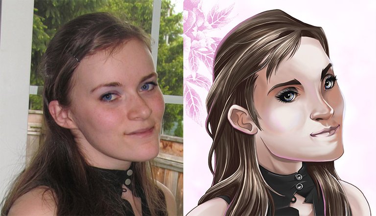
My wife is often the subject of my digital portraits. My nickname for her is September because that's her birth month. For this particular painting I made in 2011 I experimented a lot with my coloring style. For starters, it's not cel-style shaded. I also used a different program for this one: Corel Painter Pro. I would love to revisit and redraw this one some day because I see many areas where there could be improvements. But nevertheless, these are the steps I used to create this.
The Sketch
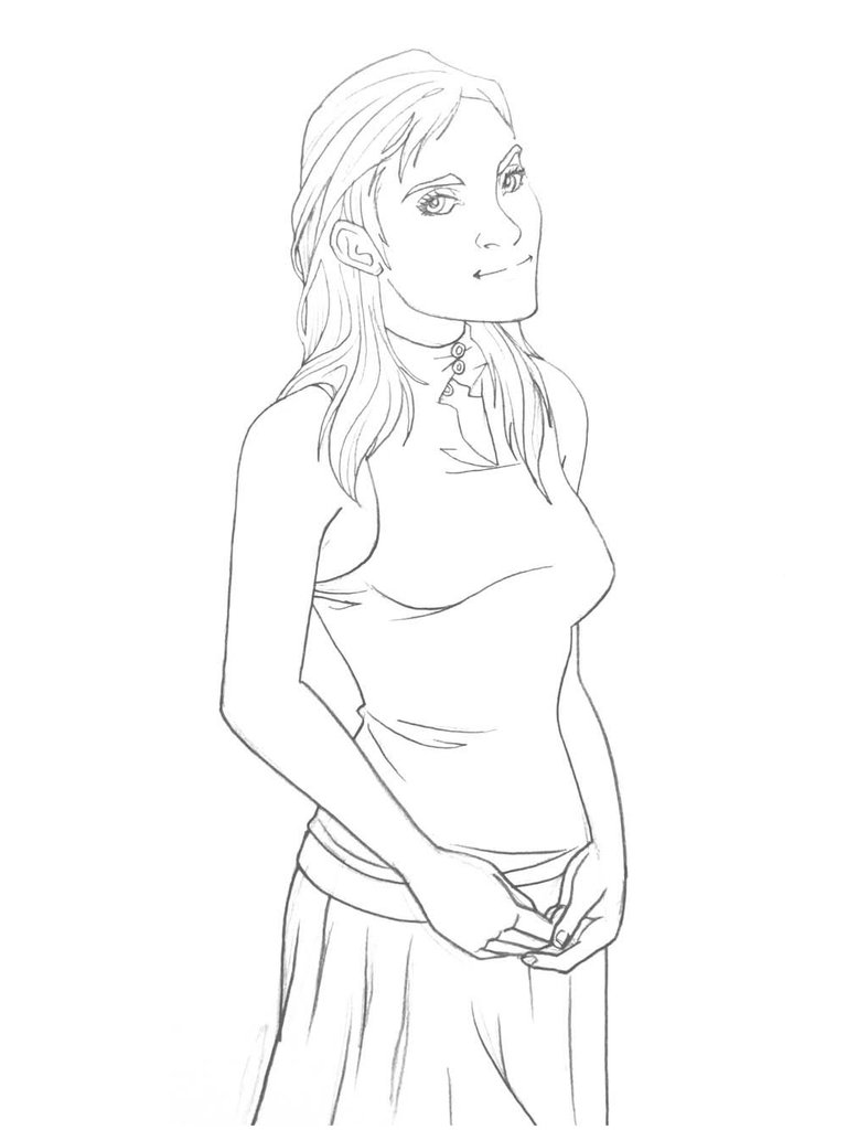
It's no surprise I used a photo reference of my wife. I didn't copy it exactly as I drew her figure and facial features in a stylized fashion. I wanted the look to be semi-realistic, not photo-realistic. I actually drew this one using paper and pencil as this was before Wacom had produced the Mobilestudio Pro.
The Line Art
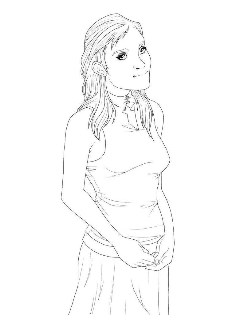
Since I drew the pencil sketch on paper, I had to scan the image so I could use it on my computer. I used Corel Painter Pro for the line art and coloring. I finished in Adobe Photoshop for the background. Looking back I can tell that the lack of smoothing settings meant that some of my lines ended up a little wavy, a problem I don't have any more. No matter how many years I've been drawing, I still don't have the steadiest of hands.
The Flat Colors
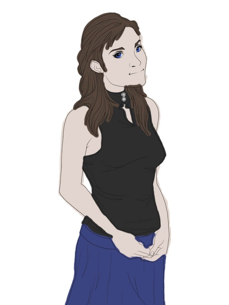
Like some artists do, I simply used a paintbrush to create the basic shapes for each color group on different layers. Instead of having every color perfectly laid out on a single layer, I will work from one group to the next. That is why my colors extend beyond the line art. I will finish each one at a time and then erase the excess when I am done.
The Shading Process
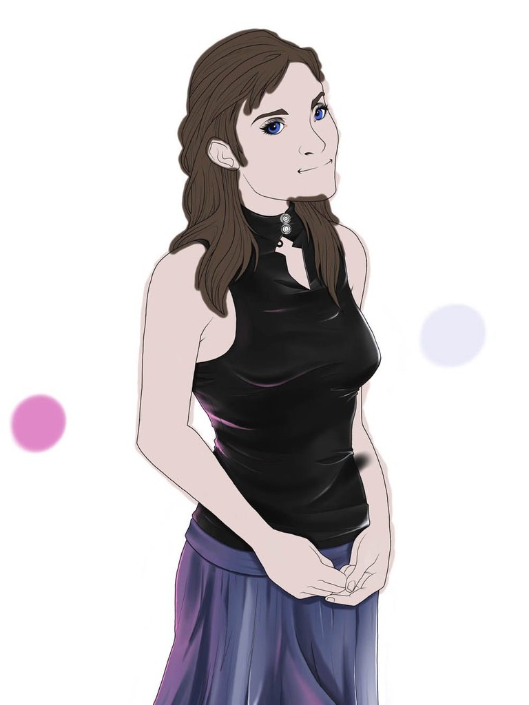
I don't usually do this, but for this piece I gave myself a designated color palette for easy color picking as I add my shadows and highlights. I really loved how using the Wacom Bamboo Fun enabled me to take advantage of the pressure sensitivity to create nice blends in a single stroke.
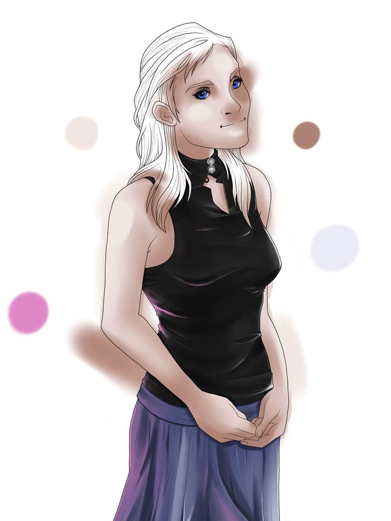
To accurately shade the face, I had to turn off the hair layer. I didn't use my reference photo much for the shading as I attempted to do it from the ground up. Like I said before, I was going with semi-realistic, which is a far departure from my usual style. However, I still have a ways to go before I feel comfortable producing something that is photo-realistic.
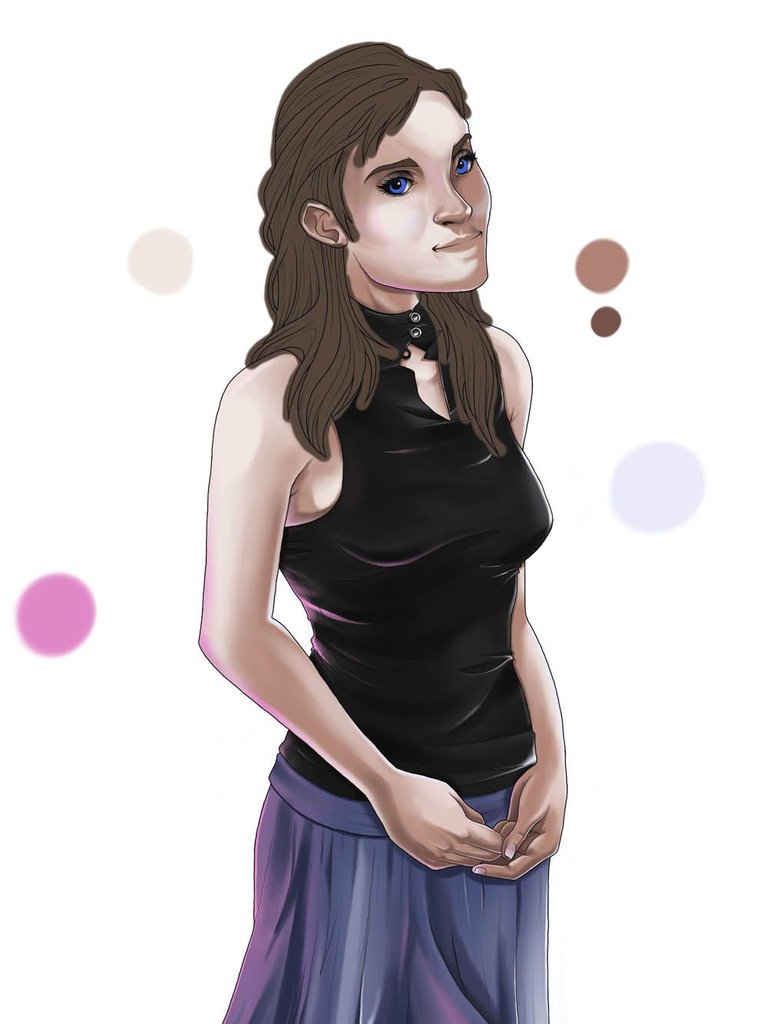
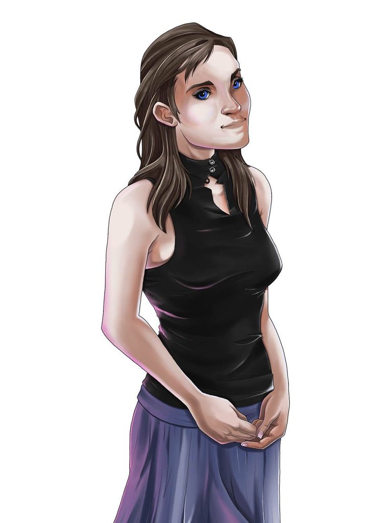
After I have all of my color layers with shadows and highlights, I used the eraser tool and removed the excess color beyond the edges of my line art. Doing so puts everything together nicely and it looks as if I'm just about done.
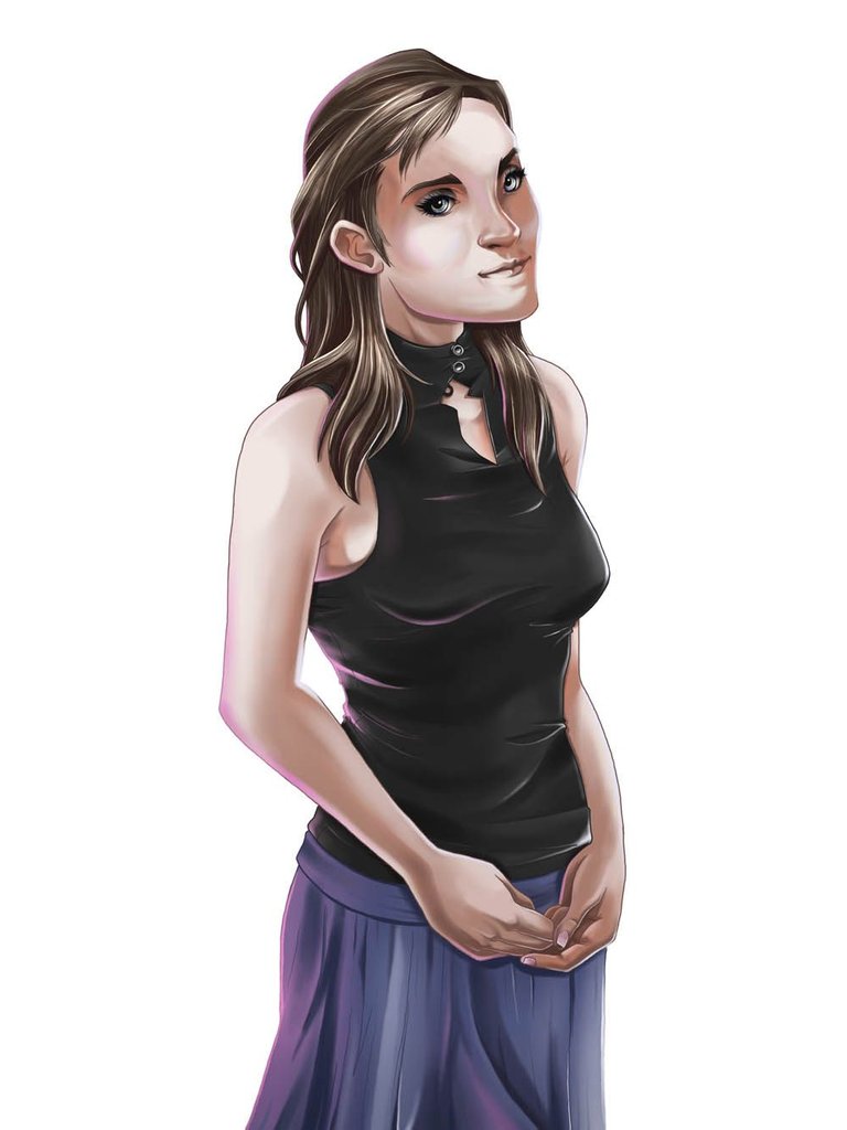
I go through the entire image in detail and add more highlights, lip coloring, and attention to the eyes. Although it's small on these images, the eyes are my favorite part.
The Finished Illustration
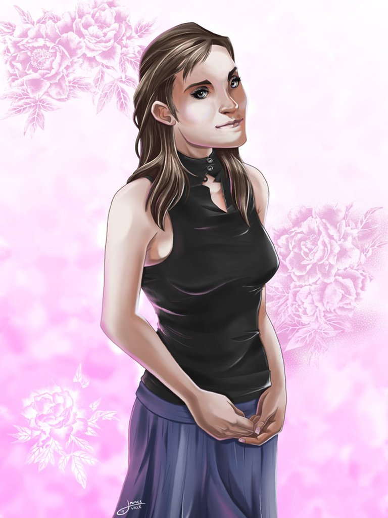
Because I had given her a pink highlight on her edges, it made sense to go with a pink background. With as realistic as I painter her to be, I actually went with something abstract for the backdrop. A combination of clouds and flowery brushes were just the right touch, in my opinion. It was helpful to breakup the harsh white, but subtle enough to keep the focus on my September.
I know how hard it is to draw digitally and you did a great job! The proportations aren't that accurate but the coloring and line art is amazing so keep your work up ! :)
Yeah, this was a piece I made 2011 and I agree there is much room for improvement. Hopefully I will redraw this one down the road.
nice tutorial.. im just no sure about the face proportions..
I'm not sure either. I guess I still have room for improvement!
Your wife has a softer face. The illustration makes her look a bit more stern. As others have pointed out, the proportions are slightly off, especially her right eye socket. But I definitely see your progress as an artist in the intervening years since this was made. It DOES have a unique style and that's more important.
This is a really cool post. I love that you have shared your process on an illustration with older equipment it is really interesting. The final product is beautiful and I would love to see you do another portrait of your wife. I think its really sweet and very romantic! Perhaps you could give her majestic wings and a sword! I really am enjoying your posts and I am learning a lot about the software and techniques you use, I am becoming pretty interested to try them out.
Beautiful illustration !!
The proportions of the face are not quite there yet.
I agree. That's why I said this piece could use improvements. I may redraw someday.
Wow that’s impressive, @jamesartville!