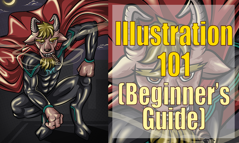
Hello guys, it's me @jeeuuzz today I'm going to share my knowledge about illustrating. I've mentioned creating a detailed tutorial in how I am doing my work in my recent post, and here it is. But first, let me share, a little of my thoughts in creating this blog. Right now I'm on my 4 months of Illustrating, and still learning and discovering new things about Digital Illustration. And one thing that helped me a lot in harnessing my craft, is by joining this amazing community, where I can join art contest(won some of it). It really helps me in a way that i was not only able to submit or pass a entry, but upon the creation of work, in the process I'm actually polishing and improving my talent. And the special part is, I was able to help and take part in raising awareness in social problems we're dealing right now. Another is I was able to have the opportunity to promote this amazing platform Steemit to people that still not familiar with this community (Social Media Site) through my works.
Creating this blog post is a challenge for me, in the sense that it will take time and effort to create tutorials here in steemit. I've gathered 56 screenshots just to provide a guides and information that will help Steemian that is willing to learn illustrating. Another factor that motivate me in making this post is passion, because for almost two month of my stay here is, I've seen a lot of artists that had a great passion for art, though they may have that outstanding work, but their heart and dedication for art is overwhelming. Don't get me wrong, I am not discriminating everybody here, making fun of their works, I just want to share and impart a little bit of my knowledge in illustrating and inspire them to continue making good artwork. Even I, myself, can't say that I'm that very good or something, what I want here is to share my knowledge that will help every steemian that is willing and eager to learn to improve and somehow take their work to another level.
So let's get started, thank you for listening to my sentiments I mean thoughts (haha). I know all of you came here to learn, and to know how I did my work. I'm not gonna prolong your agony in reading, just a advice, just follow and listen carefully in my instruction. Also, even those person who are not using Adobe Illustrator, Adobe Photoshop, etc, can still learn from here. Even if you're doing your artwork in a piece of paper or any medium you can still apply the techniques and principle I'm going to share. So Let's start.
Before anything else let have a quick review about illustrating.
What is Illustration?

Image Source
Contemporary illustration
-uses a wide range of styles and techniques, including drawing, painting, printmaking, collage, montage, digital design, multimedia, 3D modelling. Most illustrators work on a freelance basis.
Contemporary illustration subject matter has broadened and accesses platforms in other artistic forms. Often these illustrations are based on currents events; such as movies, tv shows and video games. Depending on the purpose, illustration may be expressive, stylised, realistic or highly technical
reference
So you already have an idea what is illustration or illustrating is all about. Next, let me give a quick guide where to start in illustrating. I don't require you to follow everything I will say, it's okay for me, we all have our own way anyway, but let me share this guides to those who want to have ideas and learn.
1.- Brainstorming
It is the first thing you need to consider when illustrating. Its the time where you need your creativity and imagination to explode and take over. In order for you to have a presentable outcome you need think of something that is special or out this world idea, as long as possible try to make unique and usual concepts with you work.
2. Have a Plan
Everything starts from a plan, and every good outcome comes from a good plan. You need to think of something that you want your work to be. For example, like in my work, before its done, I started with a plan that I want my character to be on top of the building , I wan't the scene/environment is night time, I want my character to have a red cape, something like that. It's important to have a foresight of what your artwork you want to be.
3. Start to Conceptualize
After brainstorming and having a plan, next thing you need to do is to conceptualize, it is where the stage where you want your character to have his own character, you know what I mean? What I'm trying to say, is when everyone can have an idea or at least have an impression to your character or work at first sight. for instance, with my character (Sorry for always basing on my work, its my easiest way to think of references, hehe) its not usual for every superhero smoking cigar, that is to give an impression of "oh this goat hero is cool! he always got a time to smoke even during a battle or saving someone", something like that guys. Where you give the viewer an idea, about your character's attitude, a vibe that you want them to feel about character/work.
4. Look for Reference
Sometimes there are time that our imagination come up short, or we are not in the groove to visualize something and put them to work. I'm always experiencing that too, to all just starting, you can always use a reference to boost! yes! to boost your imagination! Make use of your internet! If you're having a trouble in visualizing things, you can search for images that will serve as your inspiration. Just take note, as long as possible, do not copy everything, just make it only as reference. Don't make it as if you are just copying everything, make a new better version of it, try to alter, make it unique and different from your reference. Get it guys?
5. Have Your Own Style
This one of the most special thing about being a illustrator or an artist, is when you found your own style, your own signature. It's where everyone can already recognize who is the artist by just looking at the artwork. It's really great to have your own your own style because it resembles you being as an artist. I'm still working on this area right now, and hopefully can find my own style and signature with my works. Because there are lots of amazing and great artist that already had their own name and style to art industry. To those who are just starting, just take your time, because at the right time, we will all have it, hopefully.
6. Invest Your Time in Practicing
Its one of the most important tips I'm giving you. I'm still on this stage also. I'm still practicing and learning things. I believe that all of person's hard work and dedication to something he work for won't all go to waste. The greatest product of your practice is word "IMPROVEMENT". That's what's its all about, you practice because you want your work to step on another level! you exert effort in order for you to improve on what you are doing, that's why it's really important to practice illustrating, drawing, painting, any areas of art. Practice is the great key in shaping and furnishing your God-given talent.
I hope you'll take note those tips I've given you, so let's move on, in this part, I am going to share the process of my work done in Adobe Illustrator CC, (if you still don't have it you can search through the net), you can also apply it on Adobe Photoshop, but the things is, the tools I've used differs from Photoshop Software, but principles and techniques is always applicable to it. Btw, I'm using the two software, (Illustrator for Illustrating, Photoshop for enhancing).
You need to also know, and the most used tool in illustrating (Illustrator). You can check the tools here. Illustrator Tools
The Process
First, I start from sketching on piece of paper, since I don't have a graphical pen tablet, you can also do this as an alternative to. It's making use of available resources in the absence of equipment. Even if you don't have tools guys, important thing is the product of your work.
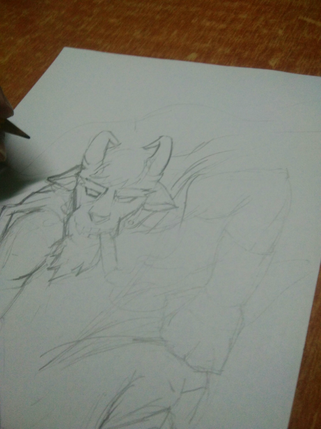
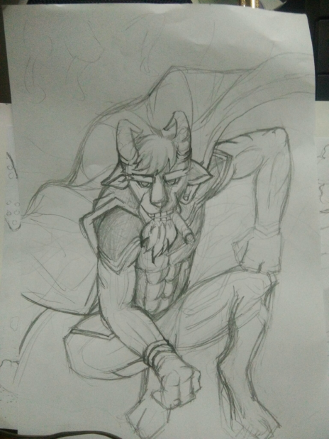
After that I've imported it on Adobe Illustrator CC, you can just directly drag the image to your canvas. And I then start tracing my work using pentool
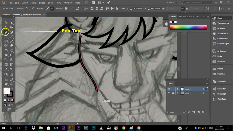
So how I did this? I've taken a detailed screenshot of my tutorial explaining tools in illustrator from my old post. Check it out.
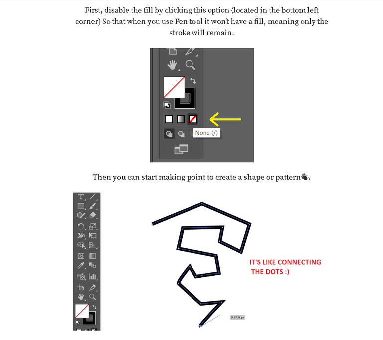
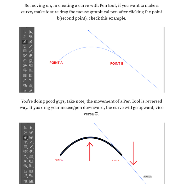
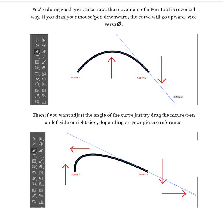
I think, you already get that one, okay let's move on
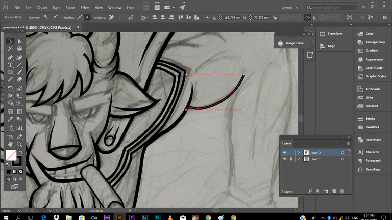
Next is dealing with types of strokes, as you can see below, what I have right there is flat tip, and you don't want to some lines with your work, so how are you going to make the tip edgy and give accent to your strokes.
(press (v) selection tool, to select you strokes, then click the drop down menu of word (Uniform) its where the different types of strokes are located, I've made a marker in the screen shot below to follow).
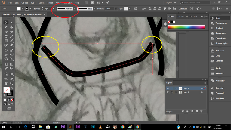
Next, choose the type of stroke that had a pointy edge, kindly check the mark.
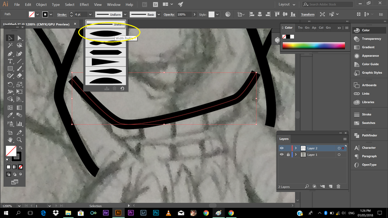
See the changes? cool right? :D
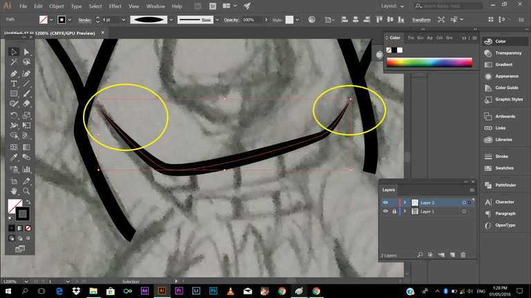
You can always apply that to every detail of your line art (outline) of your work. It's very useful in tracing hairs of your character or what. Just follow the same process for good result.
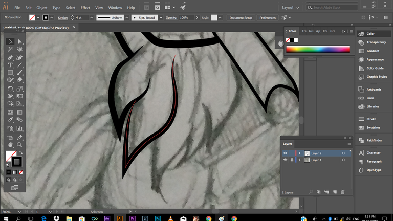
One's you're getting the hang of it, you'll just notice that you're actually enjoys tracing your work.
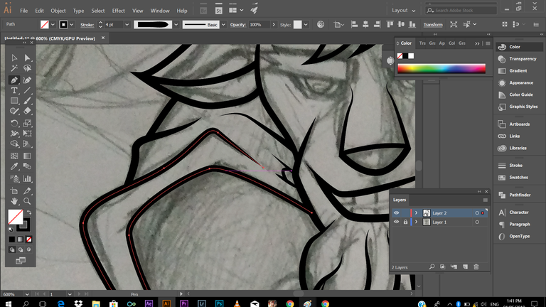
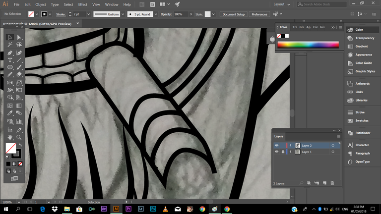
Here's a TIP: you can always, hide the layer of your reference (the one that you're tracing) check the image below, I've put a mark on it, just click the eye icon to hide layer
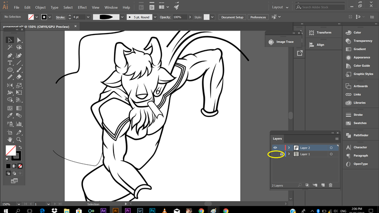
In doing you this, you will be inspired to continue your work because you can actually see the progress of your work. "Oh I'm heading somewhere here" just a feeling like that, haha.
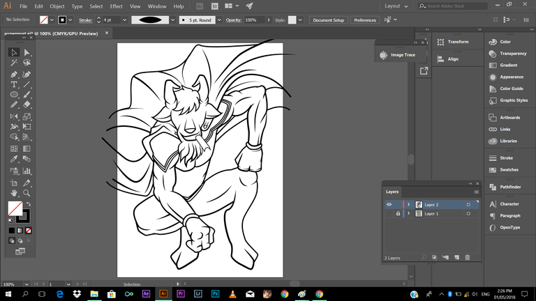
And, we're done tracing!
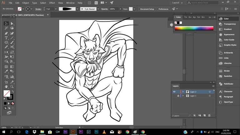
I hope you're still with me guys, just follow every process I'm doing, let's move on! Next is adding color
Let me share a little tips in choosing your colors,
This is some of my learning in my color theory class. If you're having difficulties in choosing color of your work, you can use the color wheel, using the complimentary colors.
So how to use it?
It's very easy, you just need to point the color opposite to its color, wait I'm having hard time a putting this to words. let have this visual explanation.
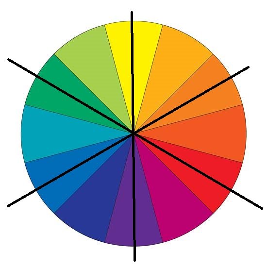
You just need to locate the color intersecting in front of your chosen color. Check this Example!
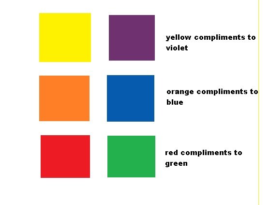
I hope you got that one, I know you're all smart, and catch up quickly 😃😄 later on you can check my work on how I apply complimentary colors, another tip: you can always choose different shade or tone of your color, it doesn't need to be green as green! you can use different shade of your chosen color.
Okay next!
You can create your own guide (color palette) by just making a rectangle and filling it with colors you want. I've picked some color reference I want for my work. I just used the eye dropper tool. Make sure, you're selecting your object(rectangle) using selection tool (v) and press (i) then click it to the area (color) you want to copy.
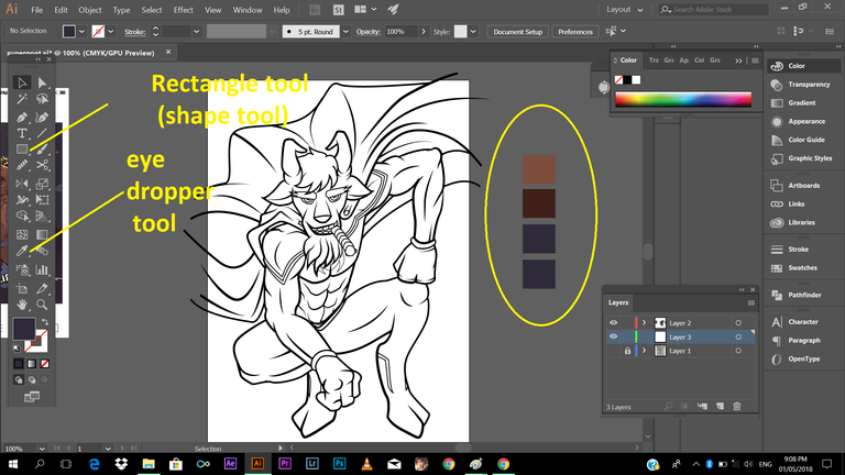
And after that we can start adding color to our line art.
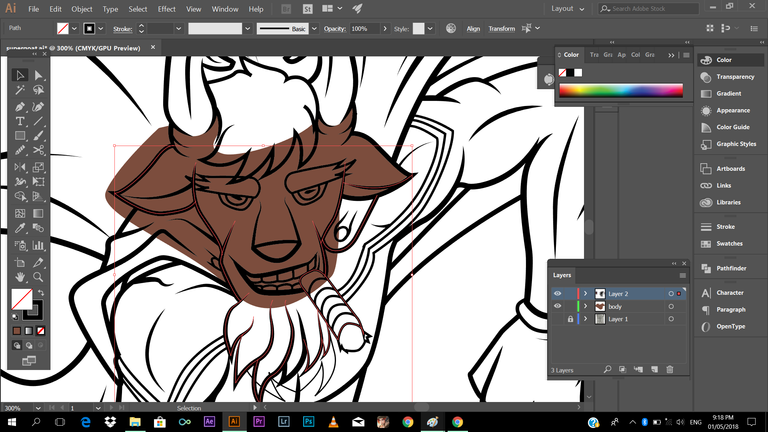
You might say, why he is like messing when adding color to his work, easy guys, there's one great way to make things right. It's one way in coloring your work faster.
What you need to do this is select (v) the color and the outline that color you want to be in. (Note: make sure you didn't miss a single stroke that encloses the color, because the color may bleed, and you wont be able to take the overlapping color) After selecting, press (shist+m) (shapebuilder tool, allows you to delete overlapping objects)
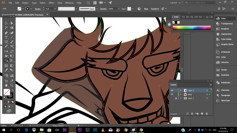
As you can see above, if you place your cursor to the area you want delete, that area will be high lightened. After doing so, click (alt+left click) to the area that you want to be colored. Simple as that guys. Check this
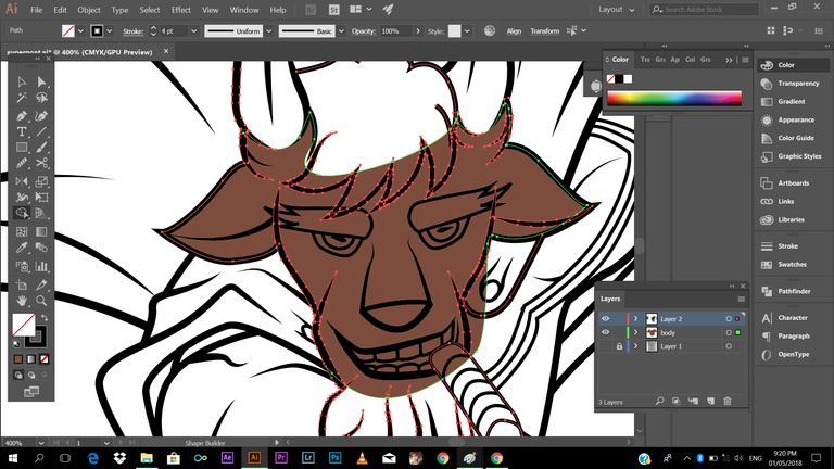
Saw the magic guys? You can always do that process. Just be mindful of the Note I've given you.
I've started coloring in the skin. (Tip: When adding color, focus on one part only, for example, adding colors to part of skin tone, cape, suit, hair. In that way you may not be confused, you won't be able to switch colors from one place to another.)
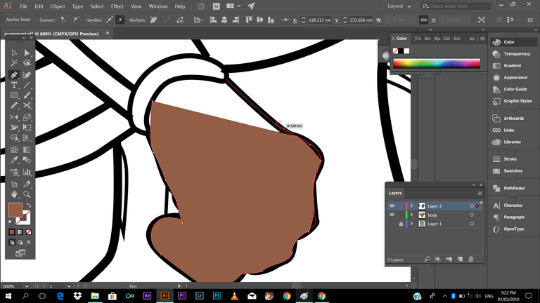
Another thing, remember to put your outline layer on top of every layer, so that in won't covered by your colors
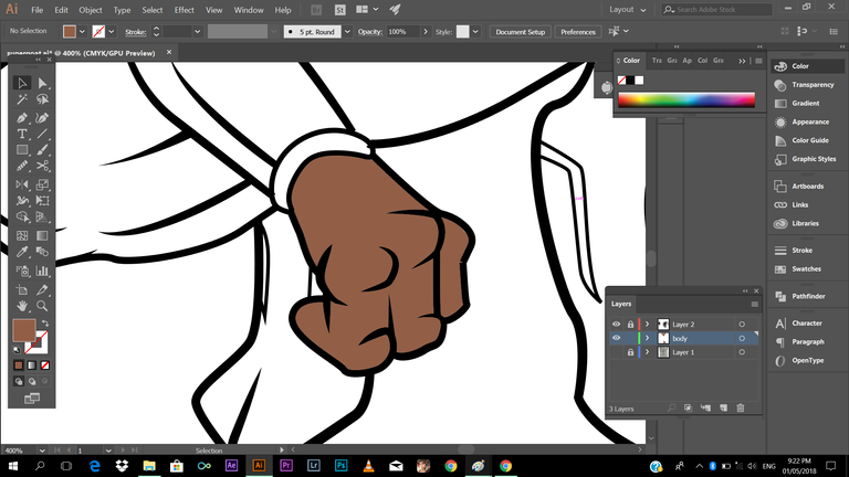
Next adding color to the suit
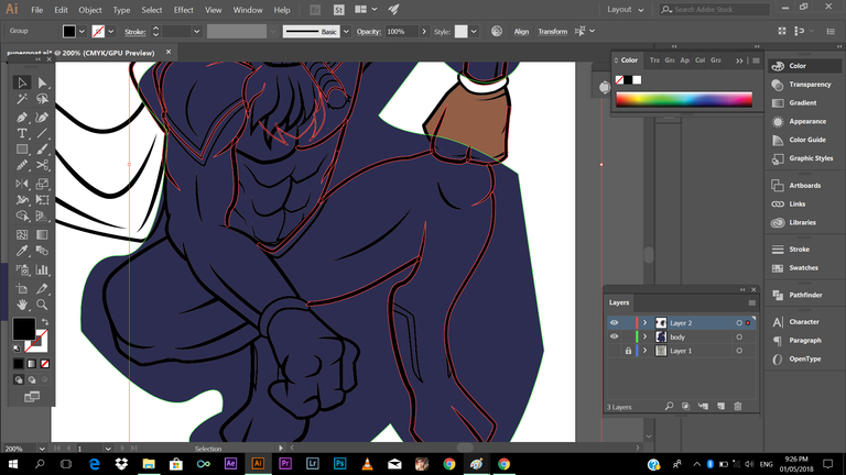
the same process guys! select outline,colors, press (shift+m) then (alt+left click) to the area you don't want to be colored.
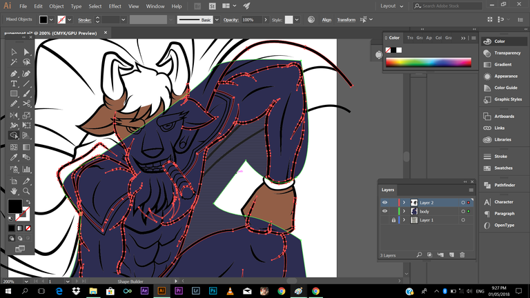
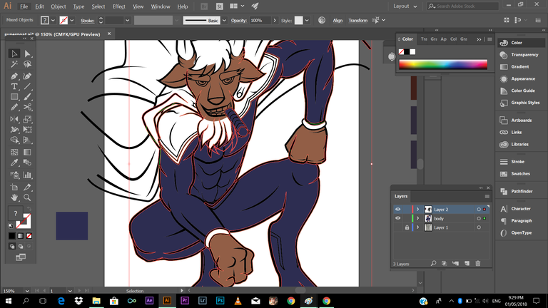
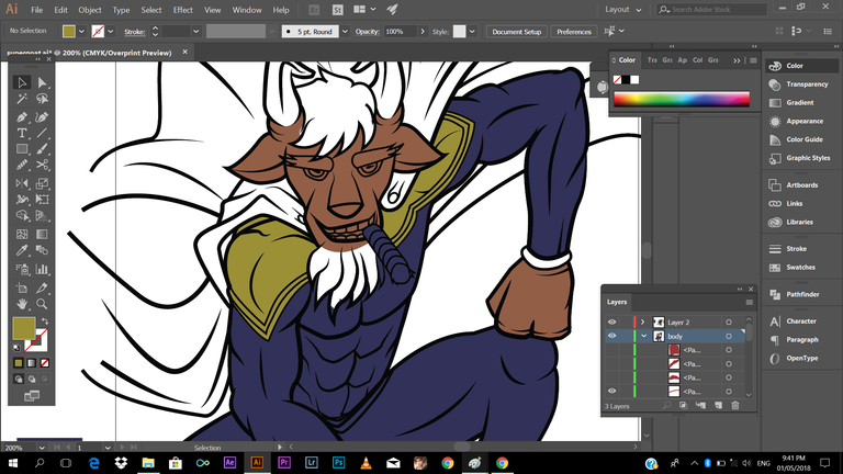
As you can observe, the colors present from the screenshots is different from my final output. The reason behind it, is I always do revision when I feel like the colors are not good enough for me, but still the same process guys, no need to be confused.
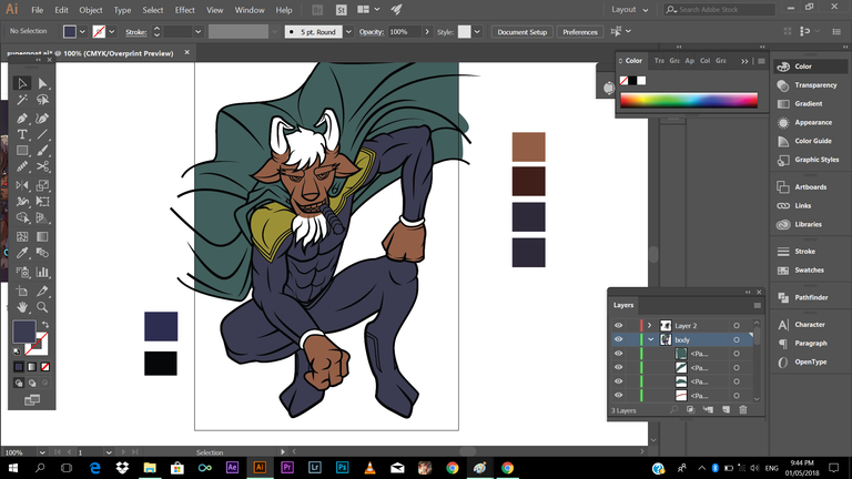
it's like what you're doing with your coloring book, trust me it's fun guys!
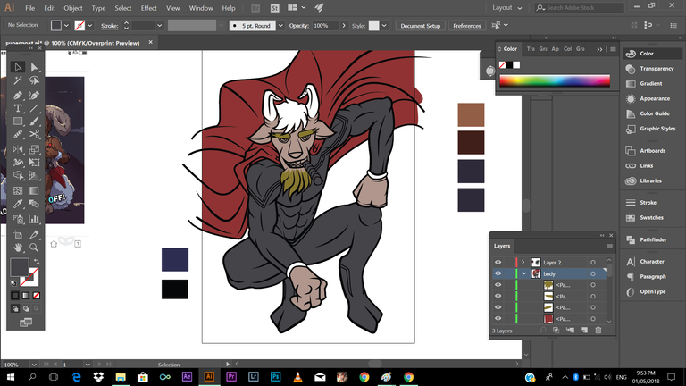
Adding color to hair
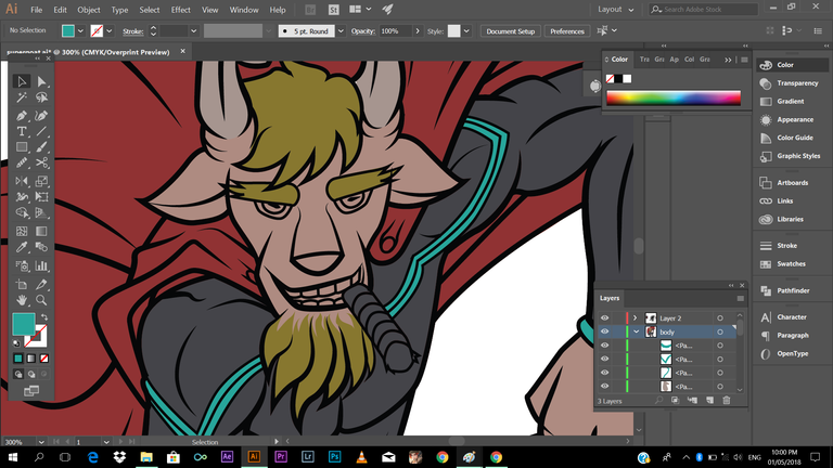
Adding color to the eyes
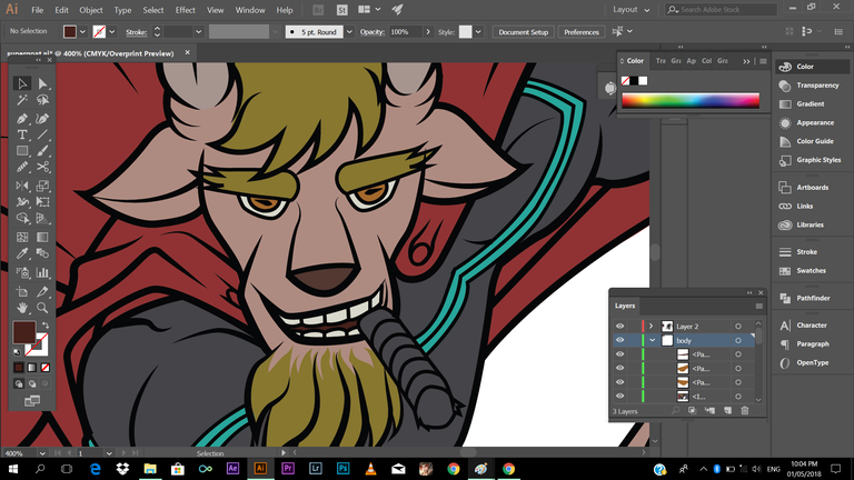
I think we're good to go!
Next is adding shadows, its one the fundamental thing you need to apply in illustrating. You can search references in the internet on how apply or where to apply shadow to your character/work. What I did is, just fill the areas where the light is blocked. You don't need to perfectly add shadows to your work, at least close to being accurate.
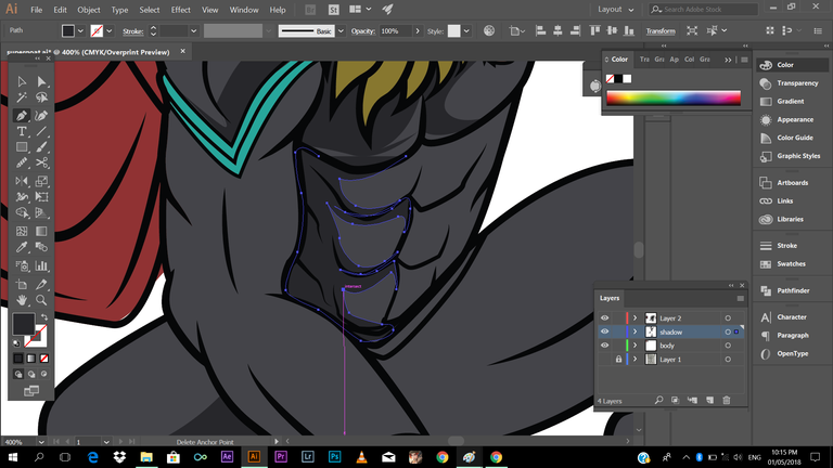
Adding shadows adds more does not only gives some depth but adds drama to your work.
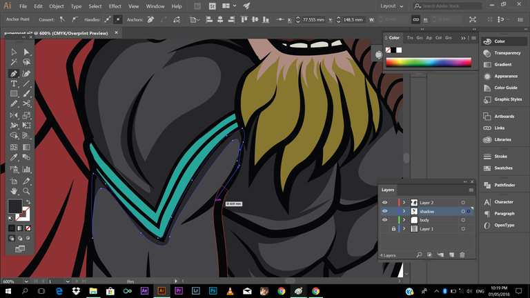
looking good...
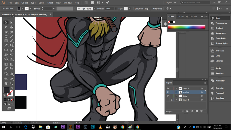
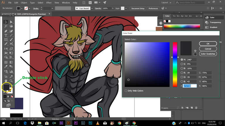
btw in adding choosing the color of you shadow, press the object (color) then click the color on the lower left side and pop op option will appear, then drag down the level of the color (Note: Make sure not to overdo it, or adjusting it too much)
Next is adding another degree or shade of shadow, I've stared from darkest shade, so basically I'll have it lighter.
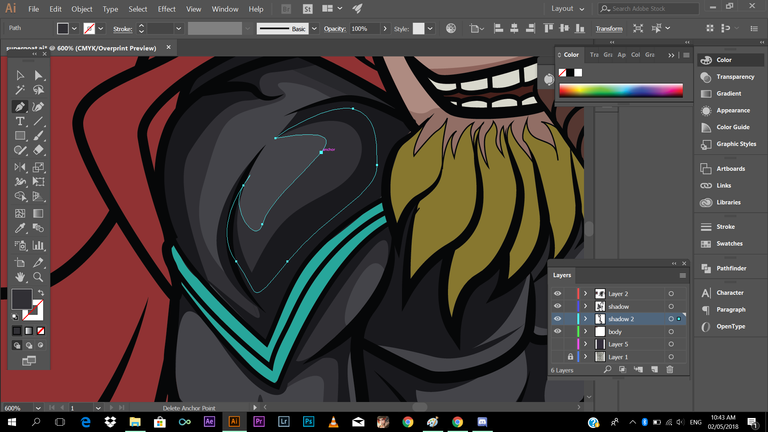
Are still with me guys? Haha, We're almost 50% of the number of screenshots, sorry to have this long, I just want to make a detailed tutorial, so that others may have the chance to learn. So let go!
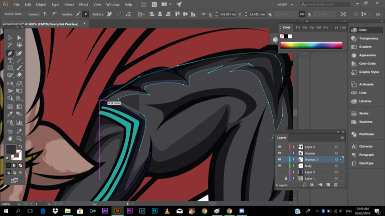
Btw, I've made a another layer and put it below the darker shade of shadow so it wont cover it.
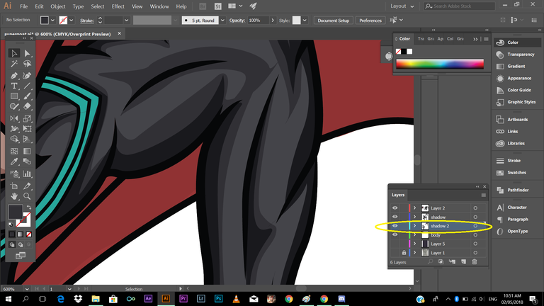
Another Tip: You can always play with the detail or flow of your shadow. Check this out
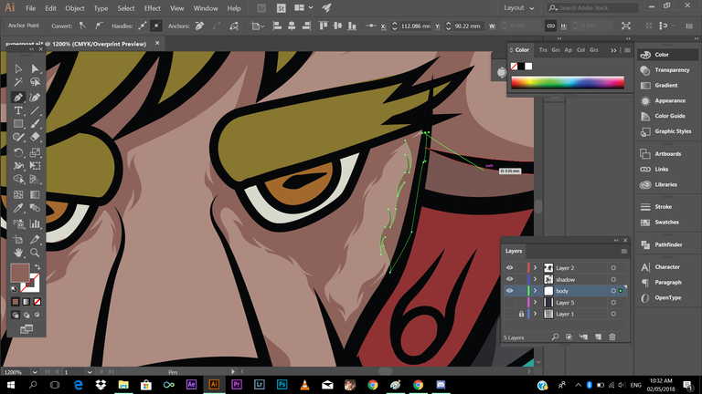
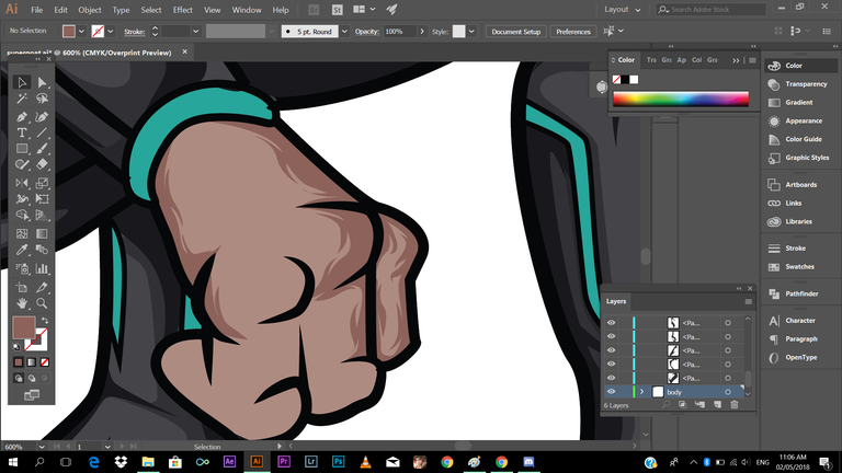
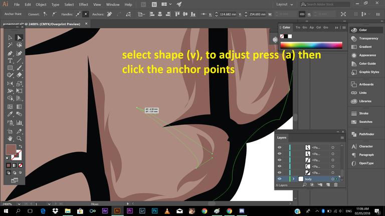
If you want to adjust things you think kinda awkward your can do it by pressing (v) to select object, then press(a) then click the anchorpoints you want to adjust. Check the Image below.
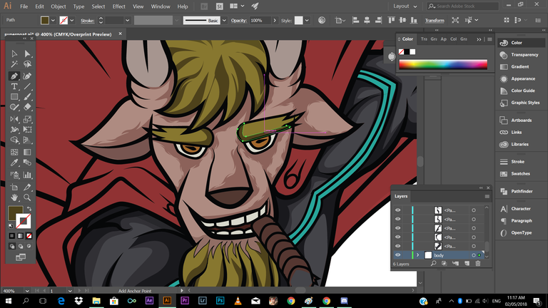
then start adding shadows to the cape
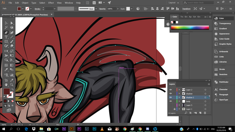
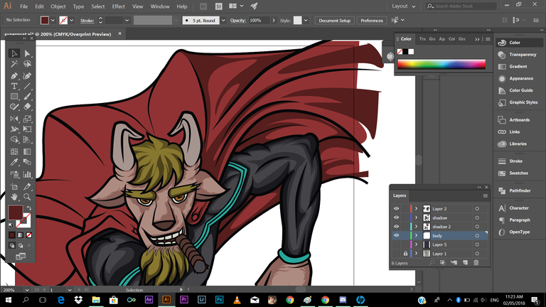
after that, next is adding shadows with the horn, again guys, still the same process, hope you're still hanging with me
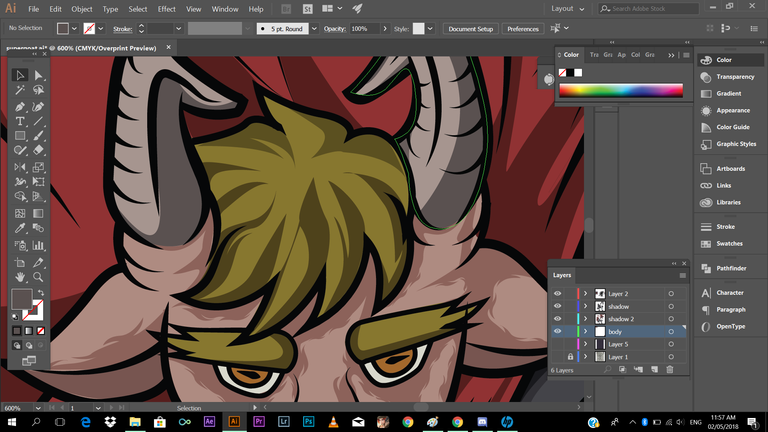
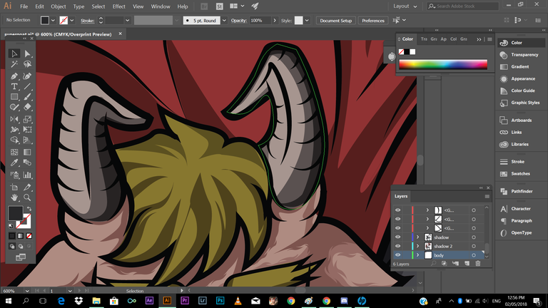
Next adding shadows to the cigar
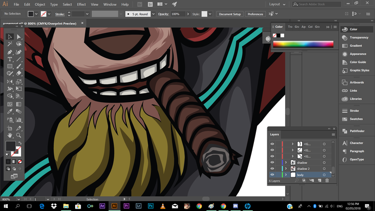
I think everything looking pretty good
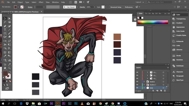
And last part is adding highlights!
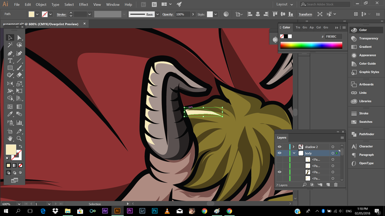
Adding highlights makes your work more complete and alive, it makes more things more like popping out, I mean without it, your work will look flat.
Check this out!
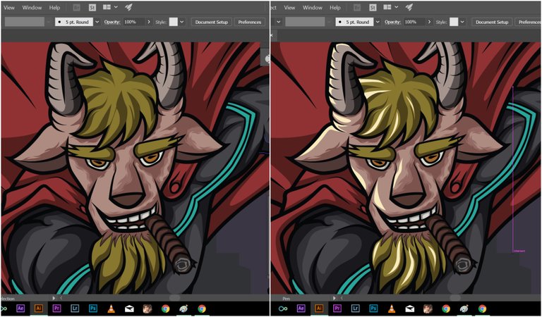
Just hang on guys! we're almost done 😂😂😂
Adding highlights to selected part of our character........
BTW, regarding to the back ground, I've just used pentool filled with colors which in the shade violet. I just used basic shapes like rectangle to make buildings. I've just illustrated it simply, a silhouette buildings are fine. I've also added elements like crescent moon and clouds to the background to add more feels in my illustration.
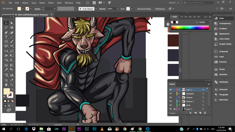
Here's a technique, what I did to the highlights is I've added some blur effect to it. so that it will blend a little bit with the subject. To do this, go to the menu bars, go to effect/blur/Gaussian blur/ then a pop op option will appear, then you can adjust the blurriness of the highlights. I don't strongly force you to do this, it's up to you if it fits with your taste.
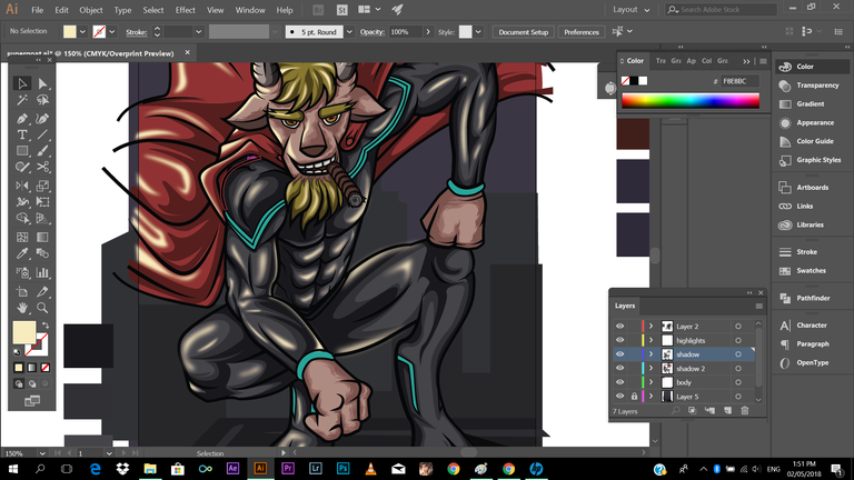
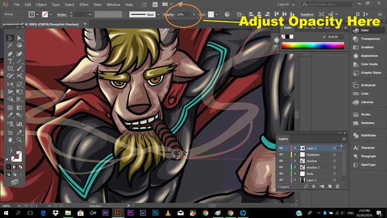
Next is, I've illustrated a smoke coming from his cigar, and then achieve that transparent effect, just adjust the opacity to
30-40 percent. Check the image below:
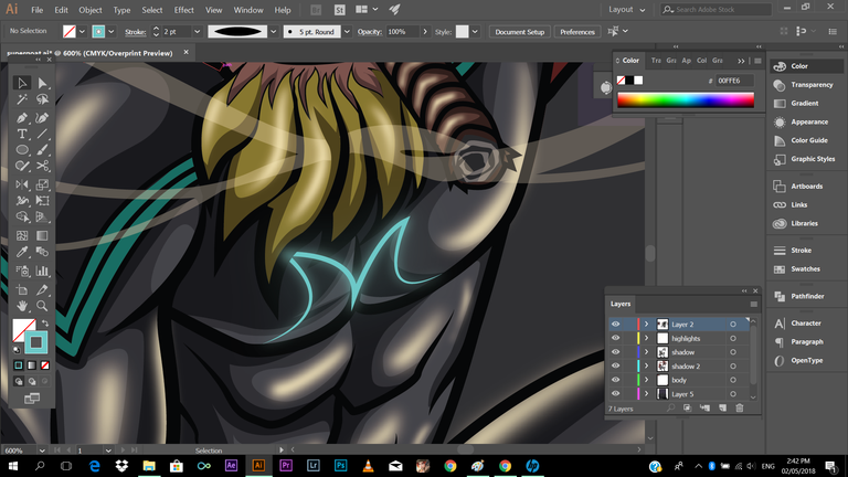
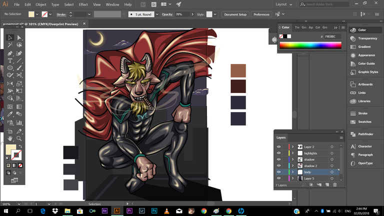
Then I've a glowing added letter symbol to his chest
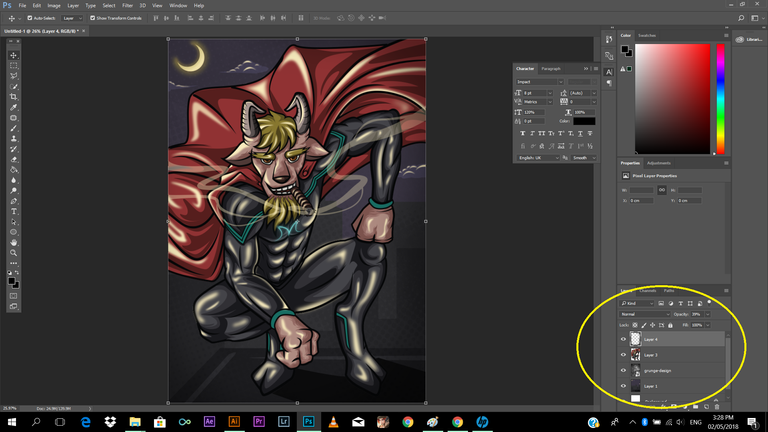
Everything is going as planned I think, so after I'm done (almost 90%), what I'm doing is, I import the image to the Adobe Photoshop, then I'll add some texture and adjust the image's curves,level, saturation, etc. In adding texture you cant just search for stock image texture in the internet/ Right click image's layer, click to blending option, then choose the blending style that fits to your work if its, _overlay, screen, multiply, etc.
And we're ready to save!
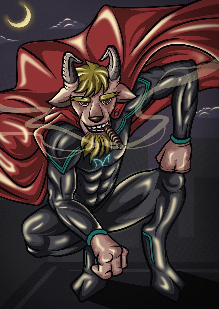
Here's the product of our long tutorial! hehe
"Goatman"
So thank you guys! for listening (though you're reading 😁😁😁) and staying with me till the end. I hope you've learned something from this, because if not, my effort in creating this blog will all go to waste! just kidding, haha. I hope you'll apply all of my guide, tips, techniques, I've shared to you, if not all at least some of it. Just a short message to those are just starting, just continue do art, continue to practice, always have that eagerness to learn, to learn new things, and don't be afraid to explore, you can experiment things out. And I'll leave you a message;
"Hard work will be the engine, and Passion will be the fuel to keep you on going"
Again thank you guys, for visiting and checking my blog! You can share this to your friend too. Have a nice day ahead!
And check this awesome bloggers ✍
@mikaelasinsuat4
@dandalion
@qyugmo
@ishanvirtue
@ediah
@jgonzalez2134
@mermaidvampire
@korinkrafting
@kothy
@looserwin
@kennik
Please do support
@slothicorn
@sndbox
@surpassinggoogle
@steemgigs
@steemph
@stellabelle
@stateofthearts
@steemitachievers
@steemitfamilyph
@artzone

A very informative post! Well done, schoolmate 😁
Thank you schoolmate 😂😁
Mamawism jud kaau ka bah.. Ikaw na jud!👍👍👍
Dli te oy. Hehe.. Slmat te
@carlgnash thank you so much Sir for following me! and for recognizing my work! it really made my day, More powers to you! and to your beloved family! Godbless!
Galing naman.. Congratulations on your curie vote..Keep it up Talented boy
Thank you so much ate. Godbless
another curied post mah bro. congrats and thanks to this very helpful. practice na din ako mag ganyan hehe. salamat
Salamat bro, yeah it's really fun bro, you should try it. Mas gagaling ka pa sa akin. Hehe.
Hahhahahahah nako marami pa ako kakainin na kutsara. Hahaha mamaw mo bro. Idol na talaga Kita sa Digi. Sana makagawa din ako NG tulad ng gawa mo.
Over naman bro, marami dn nmn dn mas magaling pa. Bsta praktis lng tayo always. 😂 thanks anyways
tama tama praktis lang ng praktis hehe salamat ulit jeeuz
You got a 27.55% upvote from @upmewhale courtesy of @jeeuuzz!
Earn 100% earning payout by delegating SP to @upmewhale. Visit http://www.upmewhale.com for details!
Fantastic art. 👍 Also, we need to have a good working mouse otherwise it's going to be hard to move around. 😂
Can't finish my artwork without it.
Yeah, agree with that. I have this durable mouse. Dropped like a hundred times but still working.
excelente. me gusta dibujar pero quiero aprender usar estas herramientas digitales
Ang Bangis pare! Idol Ikaw na master ko! Hindi pa ko gaanong marunong sa AI gamit ko kasi noon PS lang eh ngayon pa lang nag ppractice ng Ai...
Wow, salamat Bro, ayos di nman sa PS. hehe. Salamat bro, hehe
Oo nga ayos din ang PS kaso marami rito sa steemit Logo contest kaya naisipan kong masterin ang Ai kaya pag need ko ng help sana matulungan mo ko ha.... :)
Sure bro, pero more on graphic illustration ako, nagpapraktis pa din ako sa graphic design (logo making)
Nice tutorial bro. Very informative. Sakto inaaral ko palang adobe illustrator.
Nice to help you bro! thanks