Brief outline of the steps I took to design an album cover for a progressive rock power trio and the album “Outlier”.
They wanted an artwork that was loosely inspired by the Amedee Ozenfant painting “Sisteron”: The image has this mysterious desert aesthetic that worked well for the record. The idea was to convey cool colours as if the sun is beginning to set with a sense of mystery shrouding the large structures.
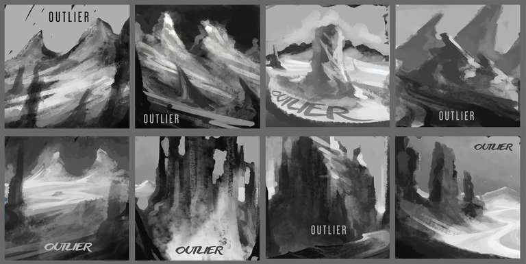
Here are the initial concept sketches I proposed. They are really rough but the idea was to knock out as many as possible in a short time. Towards the end I was beginning to feel more comfortable and we ended up running with the last sketch.
.
.
.
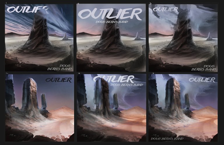
The band still wasn't decided on which version to go for so I took 2 sketches to a near finished result.
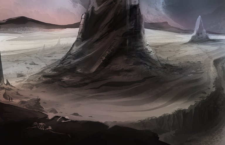
It was difficult to convey a monolithic sense of scale but I left subtle cues and small details.
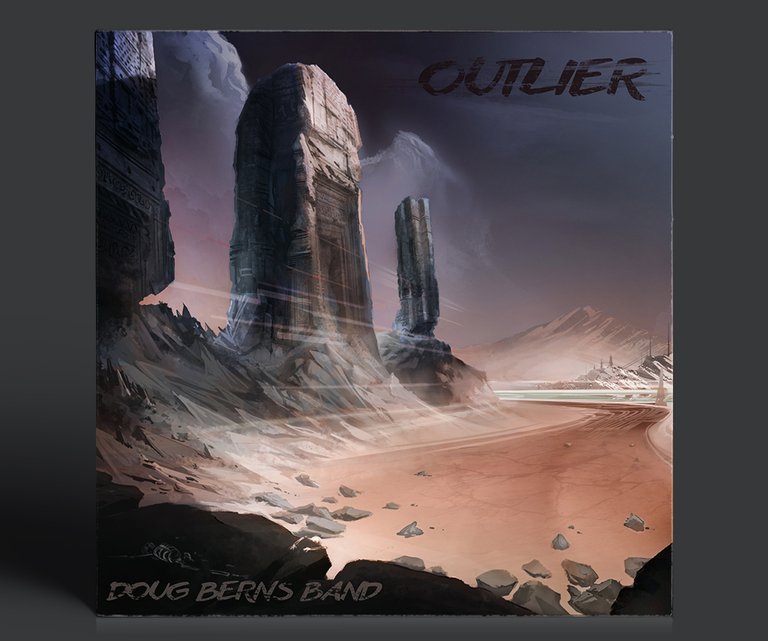
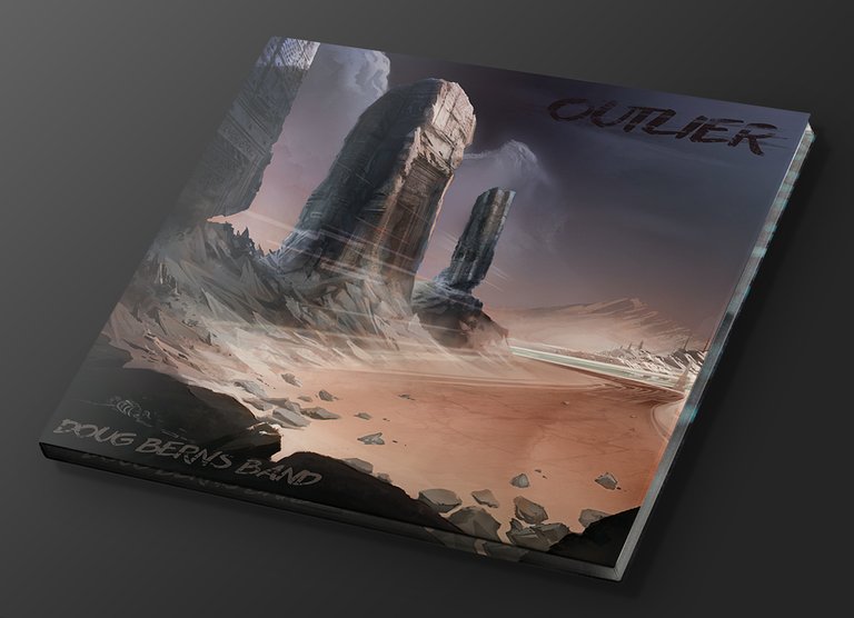
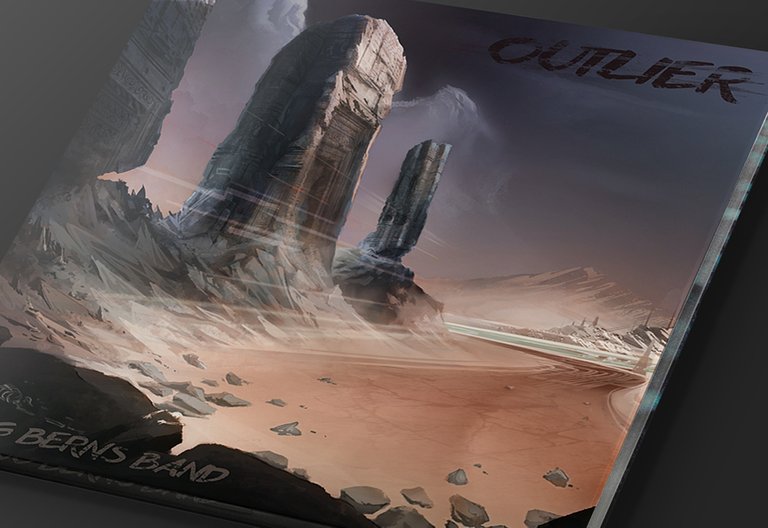
The album is not released yet, but you can check out one of their tracks here!
Thanks for looking!
Awesome cover artwork ^.^
Thanks!
Jeremy this is an awesome band album cover. I always like these kind of art when I look at music album, I used to spend a long time browsing at the music section at the shop, though these days I just use Spotify XD.
I like the step by step that you put in this blog, and I can understand why the band is having difficulties selecting which one they like the most because both of the versions are pretty good looking :).
Thank you! I still occasionally buy physical albums, just to own them!
Wow looks really good the artwork!
Thanks mate!
Great cover. I love the concept, very beautiful!
Thanks man!
Hi jeremyrfk,
Visit curiesteem.com or join the Curie Discord community to learn more.
Wow, Thank you kind stranger!!
Congratulations @jeremyrfk! You have completed the following achievement on the Steem blockchain and have been rewarded with new badge(s) :
Click on the badge to view your Board of Honor.
If you no longer want to receive notifications, reply to this comment with the word
STOPDo not miss the last post from @steemitboard:
Hey jeremy, this is so cute, it's a good experiment, you've made an interesting and attractive choice to make it your art. I'm glad to see this kind of content on the platform, it's great...
The colors despite their rarity give it a unique touch, even the place where the cover has been raised this album is like post apocalyptic, I will have to listen to a little music, but kool.
I hope to see more of you around here bro. Greetings!
Thanks mate!
You did a great job designing the album cover and its nothing short of amazing. I love the design, the "deserty" feel, the cool color tunes, the little details.. Its just amazing.
Many thanks Audrey!
Designing eight album cover for the album outlier really must have taken a whole lot of time isn't it?
The idea that the album cover would be inspired by Amedee Ozenfant painting “Sisteron" is really why I'm still think is it the album name? That makes for the desert aesthetics, seeing that it's definitely a rock song in the album.
However you did a splendid job with this, I love the mundane colours of the cover, the desert looks too cool I love the rock pattern I mean the mountain curves, it's a beautiful album cover. Well done
Thanks for the kind words!
Fantastic drawing!
Thank you :)
Hey man @jeremyrfk, I've seen that painting before, that "Sisteron" and I must say you've done a good job creating this from its reminiscence 👍. Beautiful art.
Thanks man
You had a lot of good options there at the start. I know there were a lot of similarities between them but still left a decision to be made. For any project like this it's obviously going to be a big and somewhat emotional decision. Anything that you put that much effort into like a record is obviously going to be a work of passion and art so you will want everything to match up for the final product.
Since the album is called Outlier i can see how it all matches up together and think that your cover art is a great fit for the project. Nicely done.
Totally agree mate, Thanks for checking it out!
Awesome cover!
thanks mate
Always I've always wanted to do something like this, I really admire people like you who have this opportunity to do great and important works, I understand the pressure that implies but once finished there is nothing left but to feel proud to know that you did your best effort, and the subsequent reward what better!
Very good work and I as an illustrator, I applaud you, many greetings!
Pd: this sounds pretty good actually!
Thanks man, well said, totally agree! Thanks for checking it out
Awesome artwork, I like it a lot. Lovely choice of colours as well. Thank you for sharing.@jeremyrfk All your sketches were nice. I like it very much. I always admire people with such talent. I appreciate art and can draw a simple art but not as great as you guys.
Thank you. We all start somewhere, It doesn't matter at what stage we are, so long as we enjoy the process and journey.
Yes, totally agree with you.
howdy sir jeremyrfk! now that is some cool artwork sir, it really does convey a mysterious look or presence and I don't know how you did it but it looks perfect!
I bet the band liked it too. Do you do this kind of work alot or is this a one time deal? And if you do more will you be posting about them?
Thanks mate! I have done quite a few album covers in the past, I'll be sharing those here too. Thanks!
I picked up those subtle cues for the monoliths :D
More interested in the art and concept creation process than the band, sorry. Anyway, I think they were undecided because all of your proposed images were cool enough to be a real cover for the band.
This is something I noticed when people have me commissioning some art for them with no solid image in mind for the end product. I used to give around 10 images and would get a lot delay time before they arrive at a decision. Now I just create 3-4 concept sketches just to avoid decision fatigue from my clients. (I stopped art commissioning due to med school works but will get back at it asap once the study program is done).
Thanks buddy. I certainly agree with you about decision fatigue, I try to avoid giving too many options because of this too. Sometimes I will also set a limited number of changes to the project also.
Cool, be sure to post your new work when you get back into it!
Wow Wow is an excellent job, your design is very well achieved and you hit the nail with those colors ... all the designs are great but the chosen one transmits a lot, it only causes to look and see every detail .. Great job @jeremyrfk
Thank you for the kind words @naideth!
Dang man, that looks awesome. The band's pretty dang good to. I can see that design working well for them You've got the monolithic/lonely then with the lines and background you get a bit of a fast/futuristic feel... almost like it a road tuning the corner...
Awesome work no doubt about it, they picked the right guy for the job.
Thanks mate, appreciate the positive feedback!
Hey @jeremyrfk, the cover designs are amazing (all your options included). I agree with coinsandchains, the lonely cool desert feel with a fast futuristic background works really well with the band. Even the font looks cool. What do you use for your sketches?
Thanks @marbley! I did the sketches in photoshop with my Wacom intuos 4, very low resolution and some standard basic brush tools.