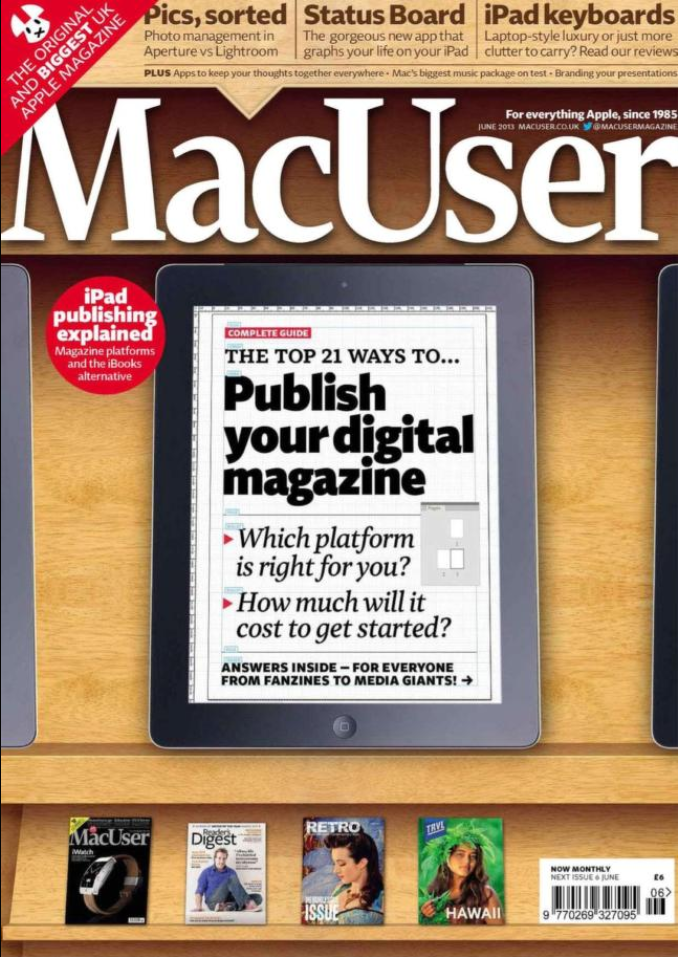
As a child, I was a big Apple fanboy and was praising the names of Steve’s (Jobs, Wozniak) on everything they have created. While the closest I ever got to an Apple computer was in schools, that didn’t stop me from subscribing to a year’s worth of MacUser magazine. Being in the cult of mac, you learn what inspired Steve Jobs to create technology that are not only functional but also beautiful. As they were influenced by typography and design, I became fascinated by how these art forms help made Apple computers to think different.

This is what also got me interested to be into desktop publishing and page design as a way to not only create content, but to arrange as much content into a page area without compromising on readability and visual layers. Naturally, to appreciate these new technologies, I went backwards to learn about the printing press, typography and the painstaking process of color separation.
But in midst of it all, Typography is special to me as I appreciate how every letter is a piece of art that shows intent and purpose while preventing miscommunication if poorly thought out. So with that, here are three fonts that have caught my eyes for being unique.

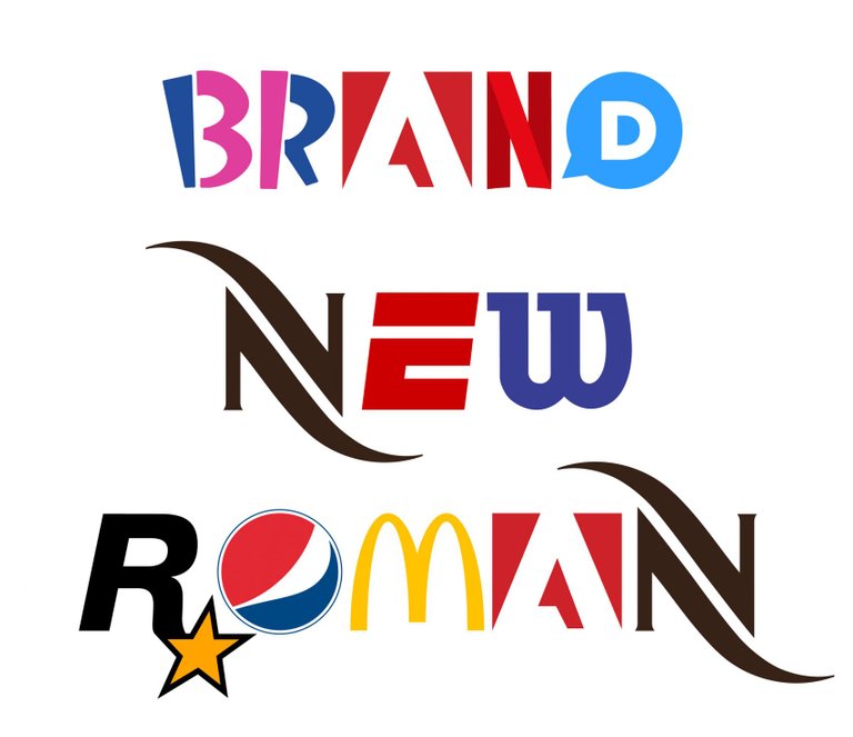
If every letter is a piece of art, and every brand is art, then this font package uses brand logos as a form of typography is art within art. While this is a neat idea, there is a chance of this font being removed due to copyright issues. While it appears to have no real applicable purpose or use, it exists for simply for the joys of brand recognition as a game. Brand New Roman pays homage to the graphic designers who built their client’s brand and awareness through their thoughtful art pieces.

While appearing the most boring of the lot, Noto is incredibly important as a font simply because it gives a consistent look no matter what language you are writing in. Now for those who are bi to multi-lingual, the switch to a different language and typography is incredibly jarring and in some cases, inadvertently shows how “unimportant” the other languages can appear to be. In some cases, the font difference could make reading near impossible due to font size and justification issues and at the very worst, the font don’t have the script and just looks like a series of boxes. Noto was designed to look consistent no matter what language you are writing making each translation equal in readability. Even if you can’t read a foreign language, you’ll appreciate the consistency when jumping around different languages encouraging copy pasta sessions with google translate.

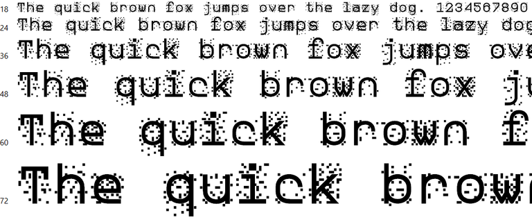
Being the most interesting of the three, zxx was made with the intent on confusing proofreading bots and optical character recognition (OCR) technology. While this makes it ideal in scrambling and protecting said content, the effectiveness depends on the user as these series of fonts can be highlighted and be changed back to something more readable. Clearly, this font isn’t a one stop solution in encrypting your content but as one of many tools working in tandem to deter these activities.
As languages and technology continue to evolve with time, the changes and adaption will also be reflected with the font we use to convey the message. Weather it is in a long and dry report whose font is designed for better readability or the most dynamic font in a bold visual ad, typography and the choice of font is choosing the right messenger. And that is just as important as writing the message.

Congratulations @joeisnotsure! You have received a personal award!
Click on the badge to view your Board of Honor.
Do not miss the last post from @steemitboard:
Congratulations @joeisnotsure! You received a personal award!
You can view your badges on your Steem Board and compare to others on the Steem Ranking
Vote for @Steemitboard as a witness to get one more award and increased upvotes!