Years ago, I had an assignment to design murals for a casino in South Africa called Carnival City, a delightfully "over the top" venue with a colourful "Big Top" theme...
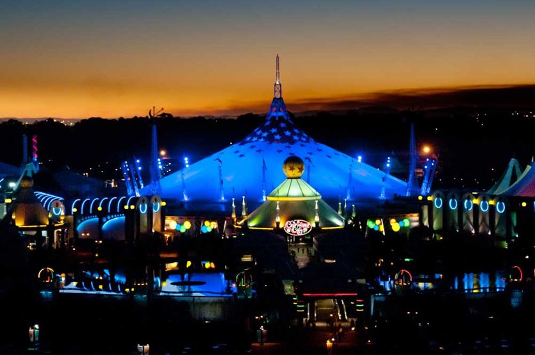
Image Source
The murals would go inside restaurants and shops. They were created with the main theme of harlequins doing all sorts of diverse things...
I kept the images in pencil outlines and concentrated on the anatomy, poses and activities of the harlequins.
Alas, half way through, they decided to use another theme and I was obliged to move on to other ideas. It was a pity they would have looked great inside the casino! Oh well.................
The Marketplace
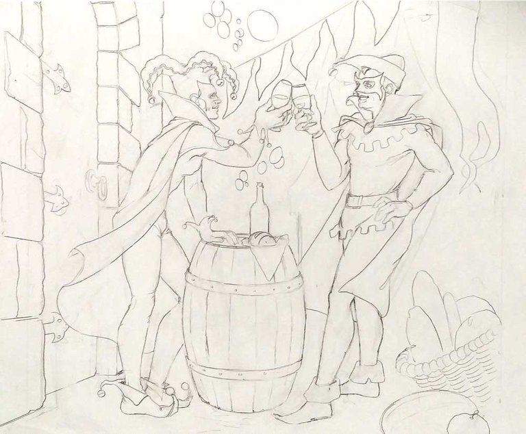
The Restaurant
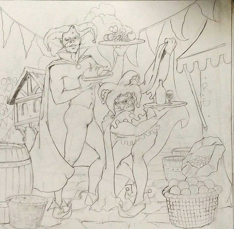
One of the theatres
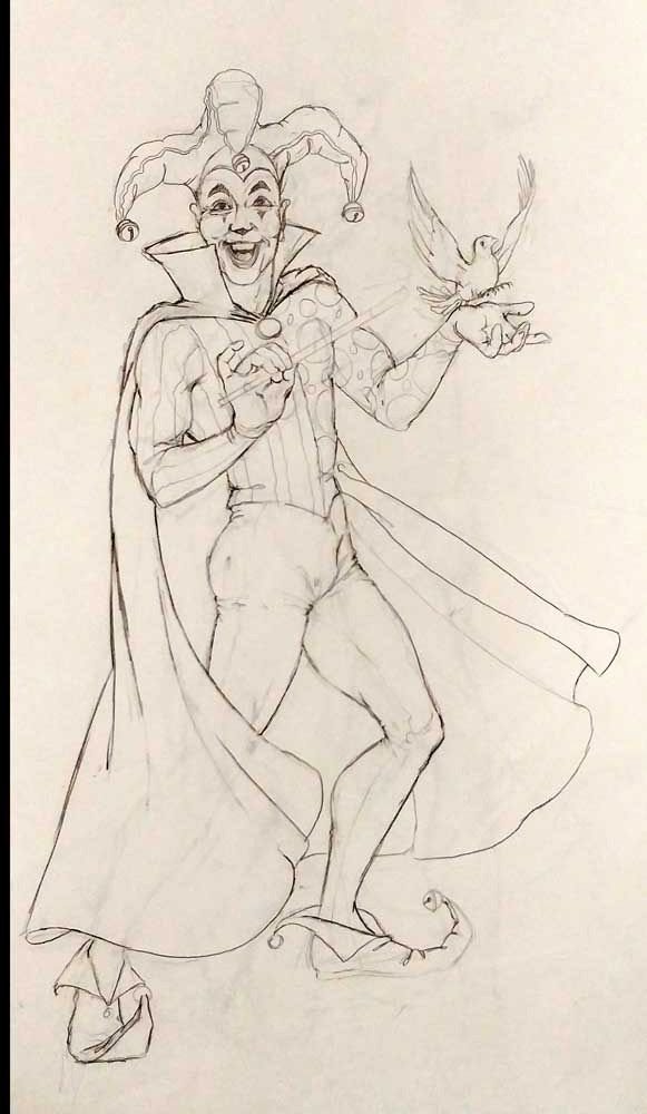
In one of the clubs
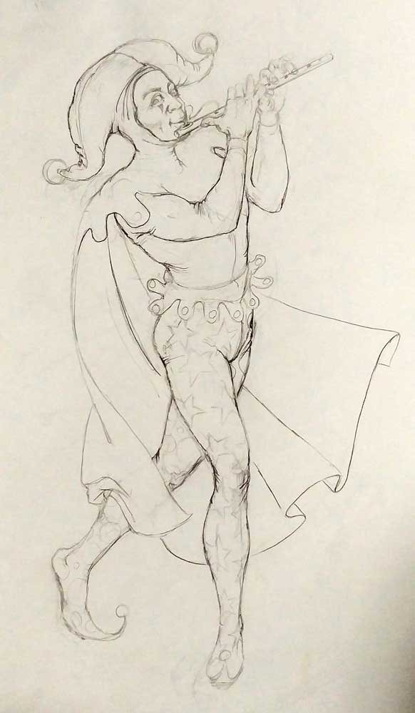
The Circus Arena - 1
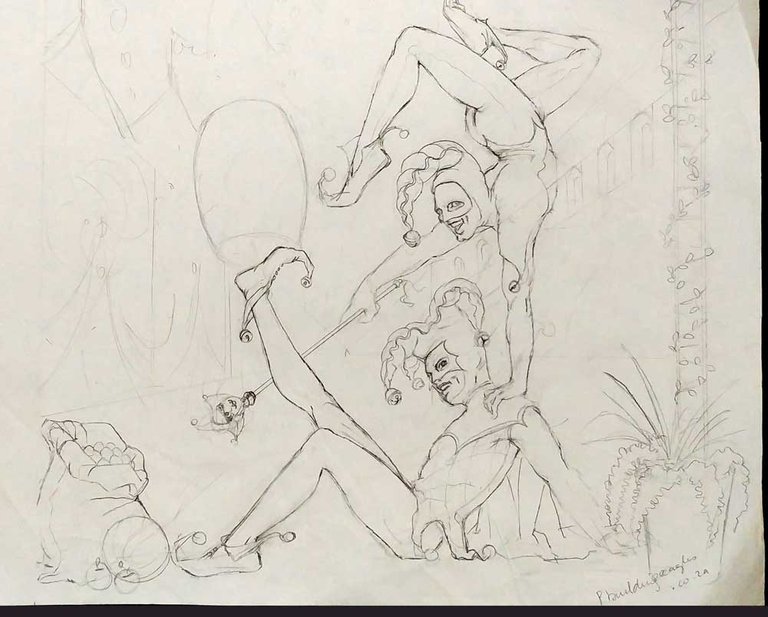
The Circus Arena - 2

The Circus Arena - 3
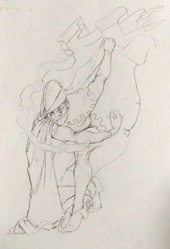
The Circus Arena - 4
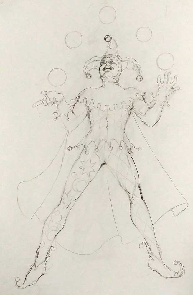
The Circus Arena -5
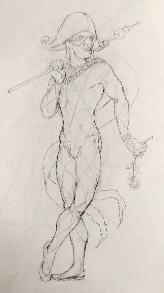
The Circus Arena - 6
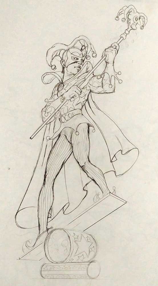
The Circus Arena -7
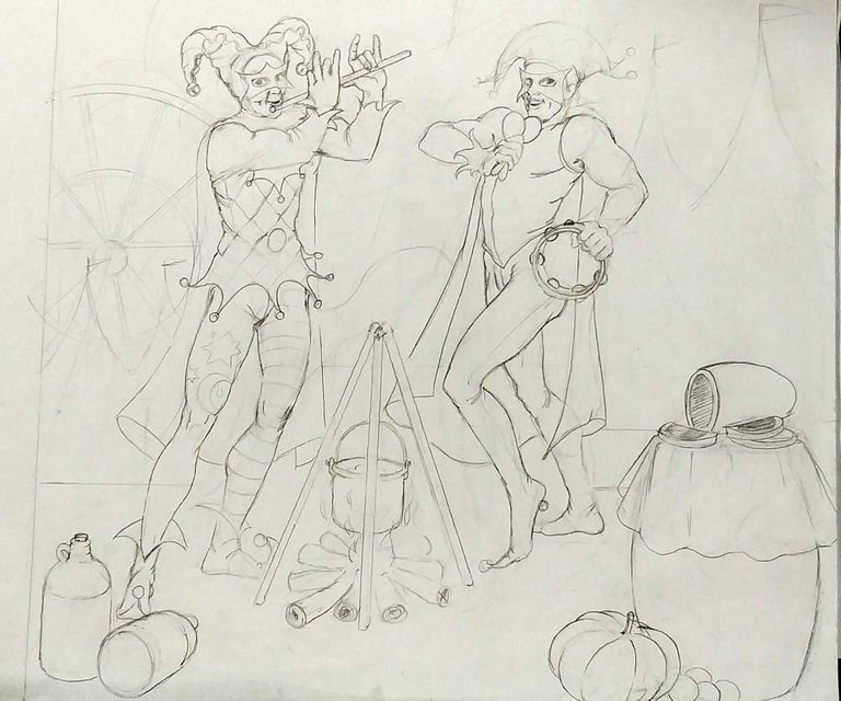
The Circus Arena - 8
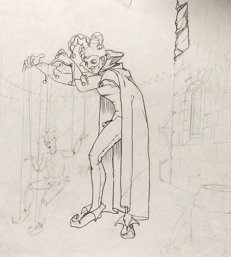
Wow! Looking through this was a bit of nostalgia! This casino has been running since 1990 and has been a mainstay in the town of Brakpan.
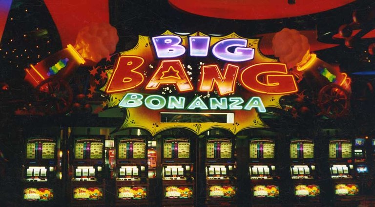
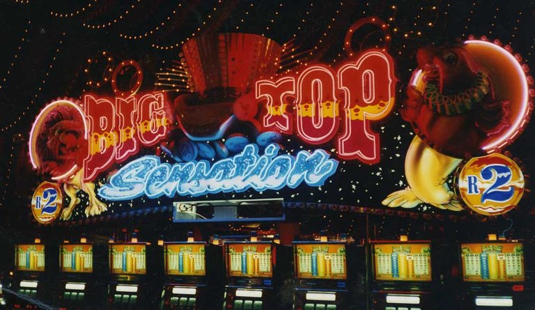
I eventually had some other murals done there and designed some of the slot machine "spectaculars". (The signs over the bank of machines)
Sadly, due to security issues, I was not allowed to photograph the signs inside, but managed to take these two before the casino opened.
Wow hermosas ilustraciones!
Hey I've been there a few times....nicely done!!! These are brilliant btw.
Did you get an after pic of these?
Hi @towjam. Unfortunately, they were not approved and they went for other art. Around the pub area, however, there are a few paintings. If I can remember, it was Rocco the fire eater, Madusa, and inside the pub, two smaller murals.
The signs, "Cash Attack", "Big Bang Bonanza", "Big Top Sensation" and "Strike it Rich" were signs I helped manufacture. Glad its behind me though!
I should enquire from them if they would allow me to photograph the signs, just for my portfolio.
Here are the thumbnail sketches of those paintings I mentioned, The brief was "cheesy bilboard signs in travelling circus adverts of years ago:
Ah man that sux....sorry! I thought they were great.
These are far from cheesy btw, so you should righly and proudly be showing them off. Seriously well done....not blowing smoke wither.
I've tried drawing bodies and its tough! I couldn't get hands and mouths right