Hi, this being my first post after introduction, I figured I wanted to self-reflect on how one can view their own art as downright hideous (gasp) right up until the very end.
One interesting thing I have learned about art through this past month is that there are a lot of visual puzzles to solve when making art. These problems the viewers never really see, because they see the finished work with a lot of these puzzles solved. Even in a lot of speed-painting videos I find that it's hard to tell where the artist struggled the most, where they had to keep undoing over-and-over.
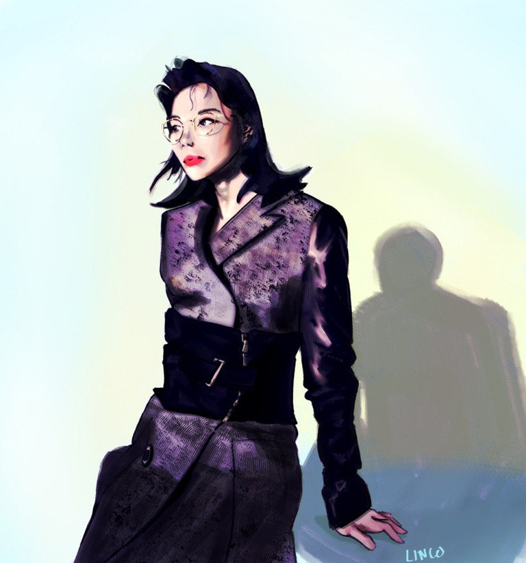
So I'll start backwards, here was my finished digital painting I did yesterday
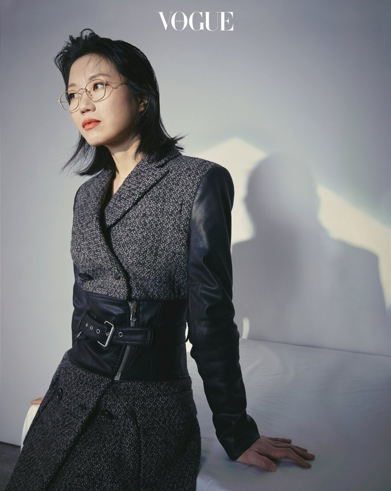
I used a reference of a model from a Korean Vogue magazine. I'm not sure who she is, but I really liked the lighting and the outfit for this shot.
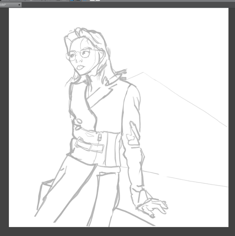
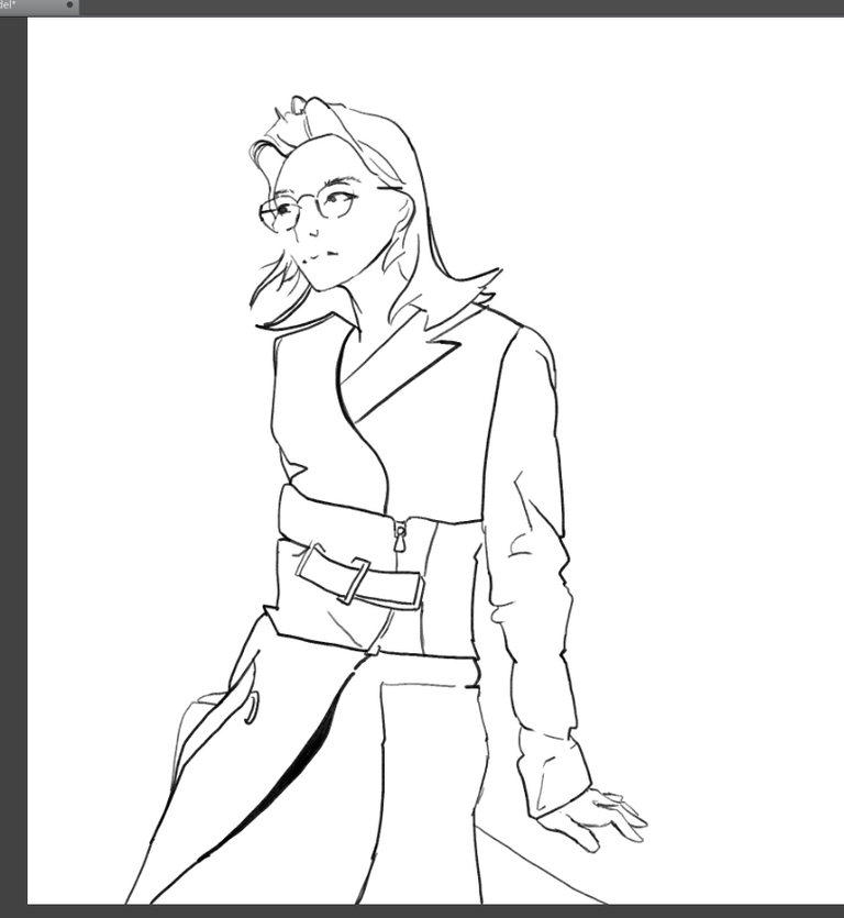
So in typical process fashion, I can show you some progress shots. For this one I did do a sketch and a lineart, but sometimes I don't, I'm still experimenting with what I like. Everything was done in Clip Studio Paint.
The rough lines to block in the shapes
The lineart to get that more "digital" look that's less sketchy (but honestly I love the sketchy look sometimes)
And then adding in some flat colours.
Actually, all of this went very smooth sailing for these first three parts. I didn't notice any glaring mistakes, and it's good to catch them earlier rather than later, so that be squashed before they turn into a bigger problem. Then for me it came to adding in the details, and the devil is in the details.
.
.
.
I've found that It's normal for this part of the process to really slow down the progression, but there was something in the back of my mind bothering me about this painting. And each minute I spent on it I started to hate it more and more. I just wanted to be done with it and not have to look at it ever again.
I think at one point I just took a step back and just wanted to give up and delete the file, that's when I knew I had to take a break and let my eyes rest and come back.
I came back and kept adding more things here and there but was still unhappy with it. I even SIGNED the painting, a signal that I was done with it (but NOPE I LIED), and uploaded it to Google Photos. Then when I looked at it again on my phone, that's when it hit me...
I thought, "WHY IS HER FACE SO MESSED UP??"
My visual problem I had to solve for this painting was just a basic anatomy problem... beginner painters have beginner problems haha and I'm sure every artist goes through this to some degree, whether it be composition, anatomy, the colours, something just feels off.
Specifically for my problem, the eyes being unclear and the shape of the face being wide with very straight lines present. So thank god for the "mesh transform" tool in Clip Studio Paint (I'm sure this exists in other software too, like Photoshop's 'liquify' tool). That's the huge benefit of working digitally and I have to respect traditional artists so much for not having the same amount of flexibility.
Anyways, I played around and got to my finished painting, it's not something I can say I like, but it went from being an image I despised looking at right up until the last moment where I can feel more neutral about it. There are some things that I would do differently next time, but that's what the learning process is all about! So just let this one go and move on.
I heard an anecdote about Norman Rockwell where when asked about his favourite painting of he has made, he said it was the next painting he was about to do.
So anyways, that was my story behind this piece, I quite like looking at magazines even foreign ones that I can't read -- just to draw inspiration from the day-to-day life outside of myself. If anyone has any interesting sources of inspiration let me know! And that's not to say you always have to look outwards for inspiration, I think your own experience and just by looking around yourself can provide some of the most powerful material to tell a unique story.
Thanks for reading today!


This post was shared in the Curation Collective Discord community
community witness. Please consider using one of your witness votes on us here for curators, and upvoted and resteemed by the @c-squared community account after manual review.@c-squared runs a
Very nice, @lincone ! I love how you narrate your process through out, as well, it really is helpful to others when we realise that all of us are struggling with similar concerns :)
She seems very stylish! I like her in your style but it would be helpful to have the actual source to compare it against :D
Thanks Spider! I'm glad that you liked it haha, it's good for me to reflect back on it.
That's very true I'll be sure to include the source in the actual post next time I use a reference around! My mistake.

Source is Vogue KR, photographer Yunhwa Lee, Model Unknown issue 03/01/2019
aaah i love that now we can see the artistic choices and licence that you inputted into your version!
like the original photo seems a bit ... lacking in personality, but yours has something in it that speaks more of a character's narrative. like yours tells a story, the person in your drawing seems to be someone who might be sharp-tongued when angered, for example (to me) :D :D :D
whilst the photomodel is just a photomodel (in the source material) :D
nice drawing, @lincone! \o/
Congratulations @lincone! You have completed the following achievement on the Steem blockchain and have been rewarded with new badge(s) :
You can view your badges on your Steem Board and compare to others on the Steem Ranking
If you no longer want to receive notifications, reply to this comment with the word
STOPVote for @Steemitboard as a witness to get one more award and increased upvotes!
Beautifully made. With her drop down curly hair, she looks like legendary musician Michael Jackson. I love the way you were able to identify the challenges most artists face while working especially that of speed painting.
Posted using Partiko Android