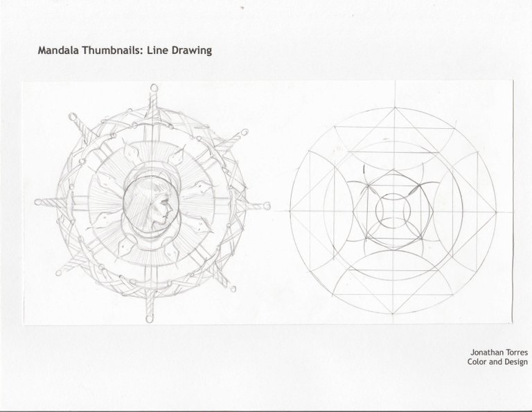
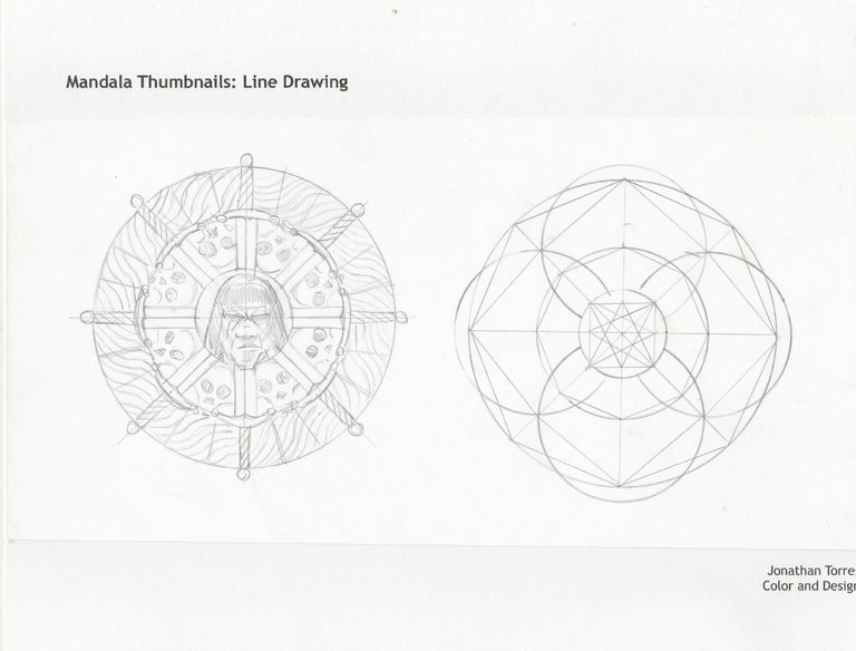
Hey everyone. So for my final project in school in my color and design course, I had to make a mandala. I decided to make mine base on Conan the Barbarian. I started with some thumbnail sketches.


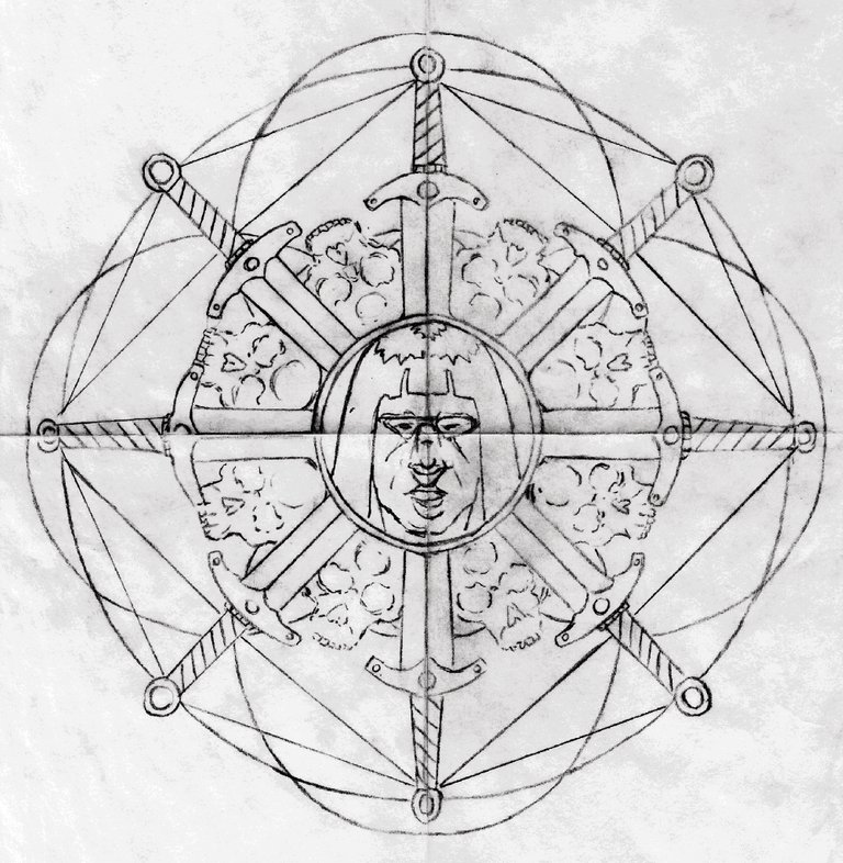
At first, I wasn't sure if I wanted to make a straight up geometric design or go with the Conan theme. I decided to combine the two.

From here, I printed out some copies in order to make some color roughs so I could start to plan out my colors a bit more now. I made two complete color roughs. These and all of the work done beyond this point was painted with gouache paints.

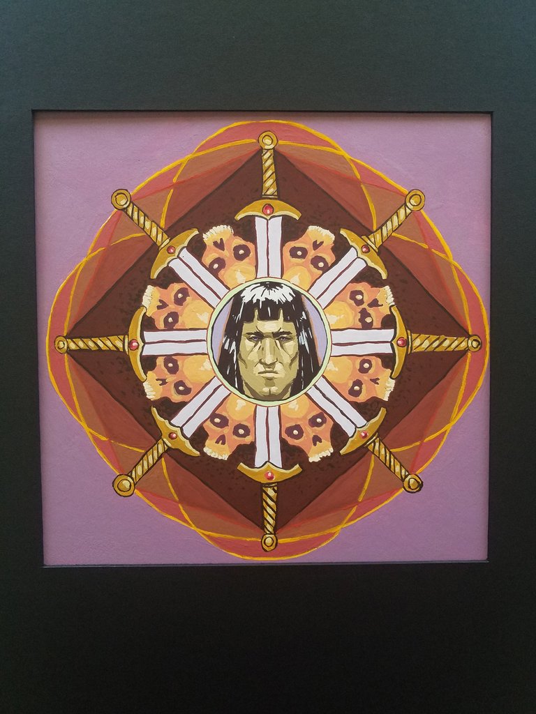
I was going for an analogous split complementary color scheme with these but I didn't quite nail it yet. The color scheme would be blue-violet to orange-yellow and every color in between those two with the complementary colors being a green-yellow and then a mostly yellow color with a hint of green. Finally I felt like I knew what kind of changes I needed to make. I made the following final image.

I learned a lot. My instructor says that what makes the final image weaker was the lack of contrast in the background. I wanted to use a cooler violet color there to counter the warm reds. But my instructor said that keeping the darker, almost black background of my color rough would have maybe been better. I think, the more I look at the image, that this is true. But I really love that soft purple color as well. They also said that I should of had more value and saturation and hue shifts between colors in the outer geometric shapes. In the final, they are too close together. Though, I think this kind of makes them less prominent so we can focus on the swords and Conan's face, which were obviously my focal points that I was shooting for. Perhaps I over reinforced that though.