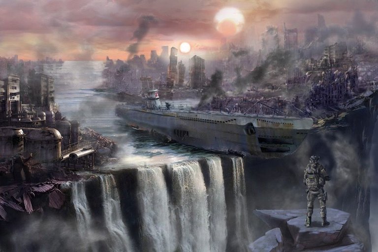
This artwork was done about two years ago. As you can see it’s post apocalyptic theme and its very popular in CG.So a want to show you some right moments and few mistakes which I was done in this artwork
As for good moments :
- Color pallet ( Use a 4 color max. and of course a lot of shades)
- Composition
- Storytelling

The main mistakes is:
- The perspective directions
- Foreground to big I think
- Lack of awesome composition centers
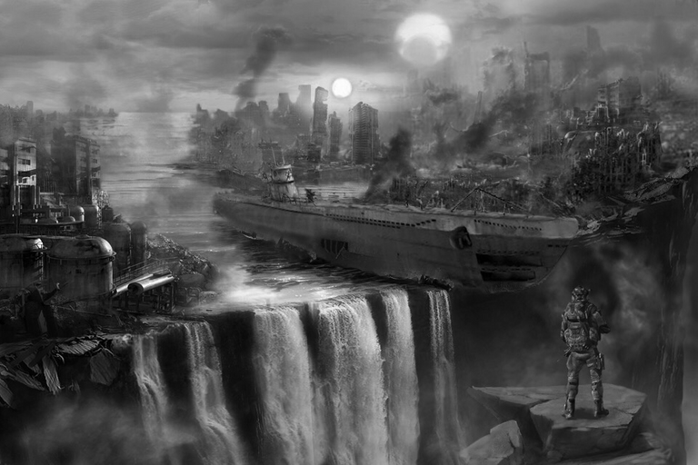
You can also look on your artwork in process in B/W mode it’s very useful I sure you. And it’s necessary to flip it too. You will get a fresh look on your artwork.

So hope this info. will be useful for you... You can also attach your pictures (artworks) in comments and will make some short OVERWIEV in future posts.....
Thanks!
Очень красиво👍
thnks!
extraordinary work!