What a cool contest! Blocktrades is a super awesome service and deserves a great logo. I got a lil' excited about this contest-- and already completed a ton of designs.
Keeping the rules in mind, here's only my first three designs:

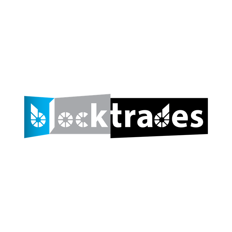
Number One: This appropriates aspects of the forms in the Bitshares logo, compositing it for the b,o,c,d. Included natural 'block' divisions of the Bitshares logo and the words block and trade. It illustrates movement in a playful way.

Number Two: This is abstracting aspects of the Bitshares logo and adding a wave coming up from the right. This shows movement and the power and volume of the service. Used a modern/retro-styled font to show innovation.

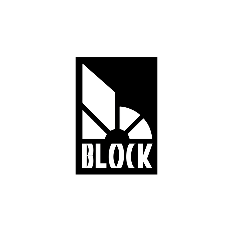
Number Three: This is a simple logo furthering the abstraction of the Bitshares logo as part of the design. It's a partial element as it doesn't need to be fully there for insiders to see the reference. For the new user--they'll see the keystones shapes as a 'blocks' which is integral to the structure. Stability and consistency are important to the cryptocoin domain.
.png)
Working artwork screenshot of these first three logo compositions.
Number 1 my favorite!
i like it too from a stylistic perspective. I am looking a bit more for it to keep a similar idea and represent blocktrades service. good work though! you definitely have skills!