Building new ideas
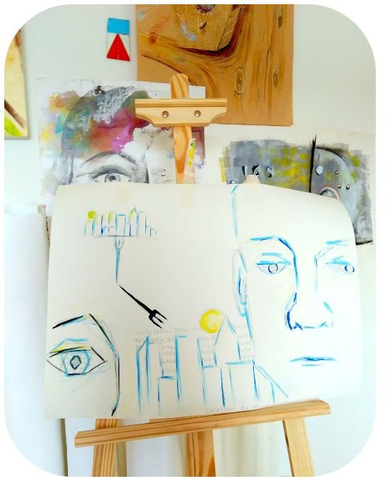
Over the past few days I've been developing some new ideas based on the relationships between individuals, communities and the blockchain. I have a large board that I've been adding sketches too and ideas to possibly develop.
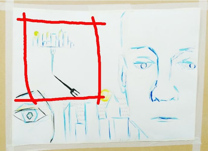
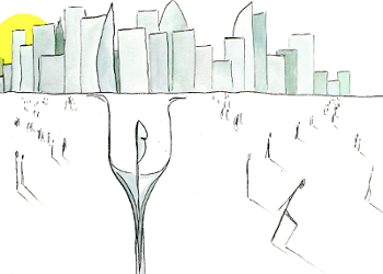
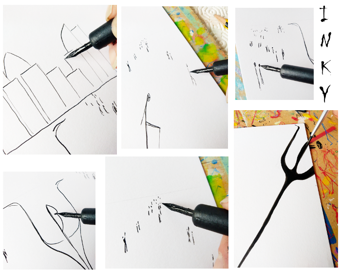
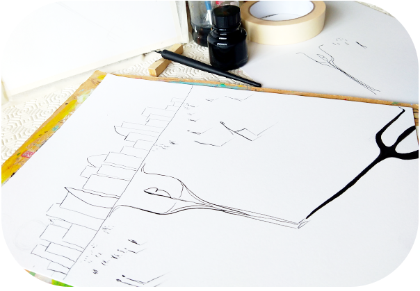
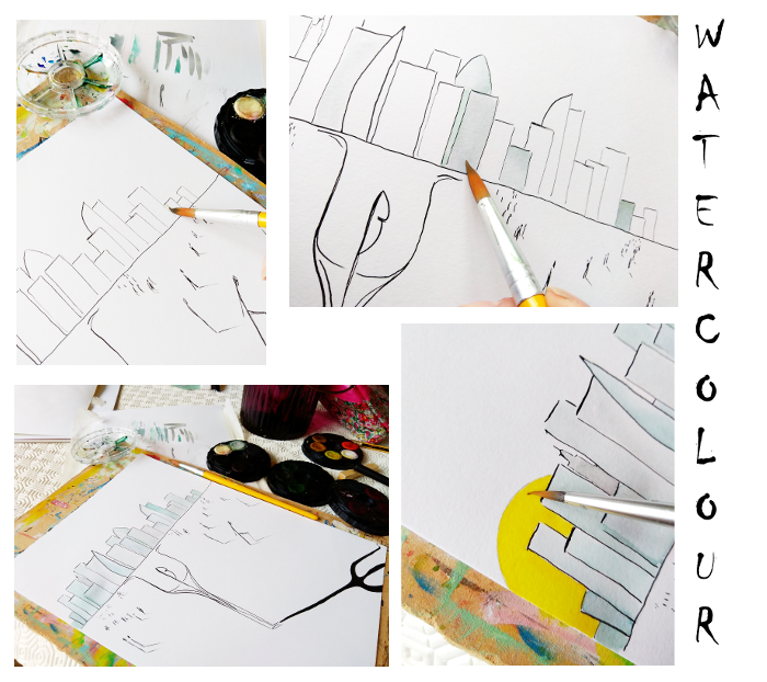
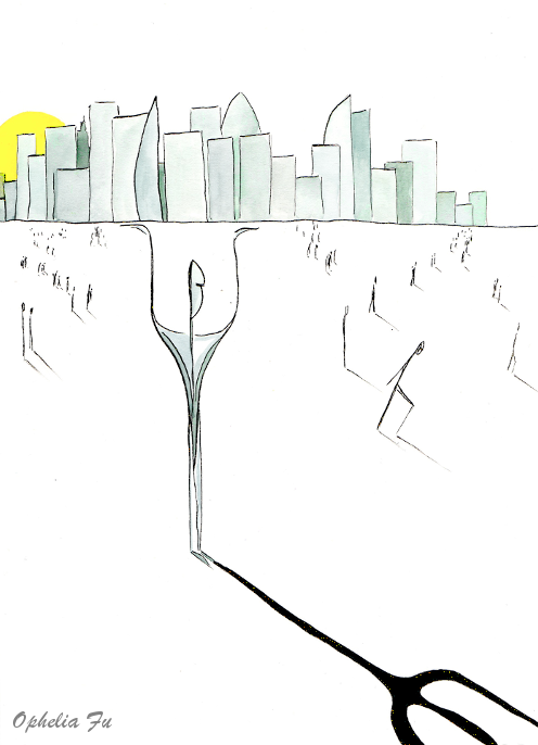
Today I'm focusing on this figure with cityscape drawing. I chose to develop the image using inks and watercolours, adding more figures to the background. The figures are all on route to a new destination, but is the destination the city or away from it?
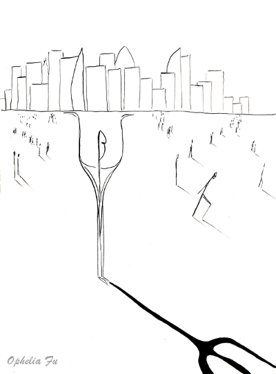
'City Fork'
Have a great day!
You can read what I wrote about your post here.Hi @opheliafu, I just stopped back to let you know your post was one of my favourite reads and I included it in my Steemit Ramble.
The drawings remind me Bitcoin Hard Fork lol. followed n upvoted
There is a hardfork theme going on there- well spotted!
Your style of art is actually very poetic and quite interesting. Upvoted and following!!
Good art, I think you have a fork city in your creative thinking a great imagination for a city fork art @opheliafu 👍👌
Thank you very much, glad you like the art!
Continue to develop your imagination in art will look beautiful
Cool piece! I appreciate the progress pics!
Thank you very much
They definitely look as if they are losing away morosely!
A certain sorrow in their walk
Yes, beaten down by the looks of it
@opheliafu I´m looking forward to meet you in Portugal. ;)
Ah yes, it will be good to see you again. :)
Have a great dayI admire your creative power dear friend @opheliafu, congratulations for these beautiful works.
new ideas bring fork(hard or soft)
I am just so intrigued with your work and the way you do it. Also the presentation, everything is so beautiful and delicate.
I used to work a lot with pen and ink. Always loved the feel of it, the sort of light scratching when you draw. Messed up a few drawings too. Have you ever had a drop of ink dripping onto a drawing accidentally?
Watercolor is a medium I also appreciate very much. Looking at your work reminds me a little of the Japanese masters. Not necessarily the subject, but the level of skill, a harmonious balance between precision and lightness.
To answer your question... This was the third attempt at this piece. The first two attempts the ink was too heavy on the tiny figures.
The abstract story here is very compelling and work so well with your style of drawing - really wonderful work!
I really need a smaller dip pen as you have:) I love how your black lines don't "overweight" the drawing, it stays light and bright, while I usually have too much black and it becomes heavy... Art store, wait for me, I'm coming;)
Ooh i see what you did there ;) Feels like a balancing act- tiny microadjustments to keep things afloat the way our muscles do to keep us upright. I like!
Creatively ingenious ! ;-)
I admire how you draw with ink without sketching (or do you...?)
I would be scared without a first sketch, but it would probably come with the experience...I love how we, artists, all find different tools that are like a prolongation of our hands..LoL
A bit out of topic :
I would challenge you to do your PortraitInPictures, explanations here , as it would be so interesting with all the facets of your art ! ^_^ Feel free to think of it and to come with your own version if you feel the momentum ;-)
I wonder if the fork is actually bearing the weight of the huge city on its shoulders or it's all just an optical illusion... Interesting concept and technique. :)
I just resteemed it at the Steemit Gallery of Art.
Find out more about it here and take a look at the ongoing exhibition here :)
Your work always includes such lovely presentation and progressions of what you're doing... I really like the minimalistic lines on this illustration... reminds me of the cover art for many a "New Yorker" magazine.
Please. Vootte me
I finally included your artwork in the SGoA_Ex#2, the second SGoA Exhibition. Come and have a look :) Good luck!
