Before printers and the endless websites that offer font downloads, there was hand-lettering. There's no denying the charm and beauty of something that is carefully and beautifully written! Even in this age of 3-D printers and crazy technology, I think seeing something crafted by a real, fallible, human hand creates something more that can't really be expressed, but can surely be felt.
So, this leads me to introduce the painting that's currently on the easel. This is going to be a gift for a dear friend of mine who is soon to be married (really hope I can get it finished in time!) The final image will be the well-known passage from I Corinthians 13, wreathed by a bunch of wonderful, useful medicinal plants. As you'll see in the images below, I have yet to get to the plants, but the lettering is done!
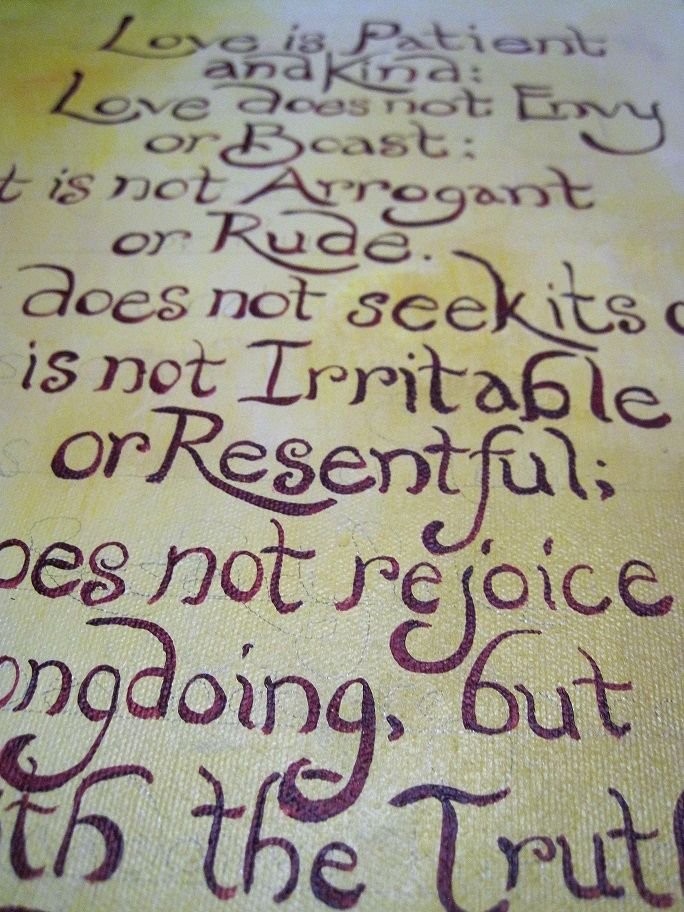
While "writing" this out, I realized that there were lots of things that I can share about the process. Hand-painting letters can be either a calm, nearly meditative process, or an incredibly frustrating experience that leaves you wanting to burn every canvas and brush in sight. I hope that the following tips can help you fall to the nicer end of that spectrum with your next project! As always, these are my personal ideas and methods--pick and choose what works for you.
First, let's talk about getting things set up.
I first painted the background of the canvas in a nice, solid layer of acrylics. The texture of the canvas is still visible through it, but I kind of like the affect it has on letters. If you want an absolutely perfect, smooth surface, try applying several layers of gesso first, then sanding it down before you apply the background colors.
Then, I took my T-square and a pencil and plotted out how far apart each line would be. I sketched this directly onto the canvas, as lightly as possible (so that the graphite will be easy to remove later). It's crucial to plan your moves before you start to paint. There's no way to make it look good when you've obviously run out of room and resort to squishing the letters together to get them to all fit (unless you're going for the 4th grade bake-sale poster look).
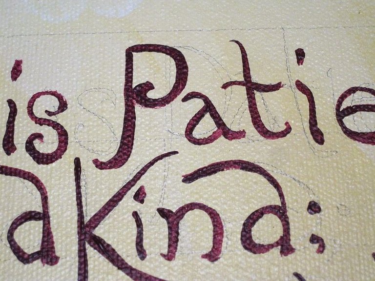
You may notice that I didn't exactly follow my own lines when it comes to the words itself--but that's alright. I knew that the whole text could fit, and I wasn't going for "perfect" letters.
Next, let's talk about tools.
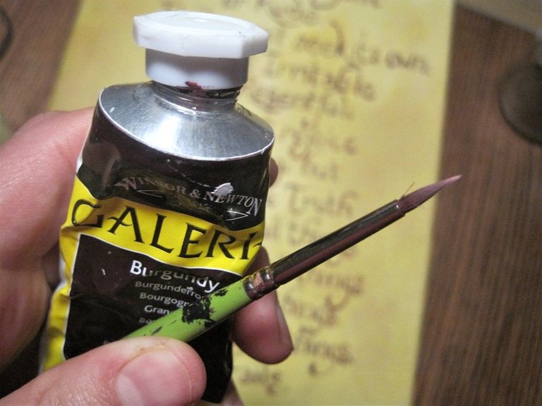
For a canvas this size (roughly 1x3'), I like using a brush with a really fine point. This brush is a #0 round brush--a lower priced synthetic one which works perfectly for my needs. Also, though I rarely buy paints that are a "set" color (I far prefer to get some solid red/blue/yellow/white/black and then blend my own colors), I make an exception when it comes to lettering. Since the lettering on this canvas took a few sessions, I knew there would be no chance that I would be able to blend this burgundy color perfectly every time. Instead, I used the color straight from the tube, knowing that there would be a color match no matter how much time I had! Time and paint saved.
When it comes to writing the letters themselves, there's no room for being hesitant! Make each brushstroke with confidence. If you need to, keep a piece of scrap paper nearby to make some "warm up" strokes before applying the real ones--I find that it really helps me out when I don't feel quite ready to work. Additionally, this can help you get the right amount of paint on the brush--not so much that it bloops everywhere (a very technical term), and not so little that you end up drybrushing.
So you're painting, you're confident, the words are flowing, and THEN IT HAPPENS. You make a mistake, right all over your perfectly toned background. A horrified, "oh...CRAP." slides from your lips.
Take heart! This happens to everyone, and it can be fixed. First, stay calm. If you're working with acrylics, you know very well that it's too late to take the paint off. Don't try to paint over it or fix it just yet. Take a deep breath, walk away and let it dry.
If you're working with a light background, like I was, get your white paint (if you're working with a dark background/light letters, get the darkest version of the dominant background color ready). Paint out the mistake, and feather the outline of the corrective paint as much as possible. If you leave a clear border, it will always be visible, and that's what you don't want. Now, let that layer dry completely before you move on.
If the mistake letters are still visible through the first layer, add another layer of fix-it paint. Again, let it dry.
Now, feather the colors of your background back over the mistake area to blend it seamlessly with the background. If you take your time and let the layers dry between applications, you can make it seem as if it never happened.
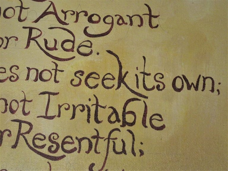
I did this process with the area below. I took this photo at an angle and edited the colors so that the area of "editing" is now visible. If you look at "seek its own," you can see where I corrected a mistake.
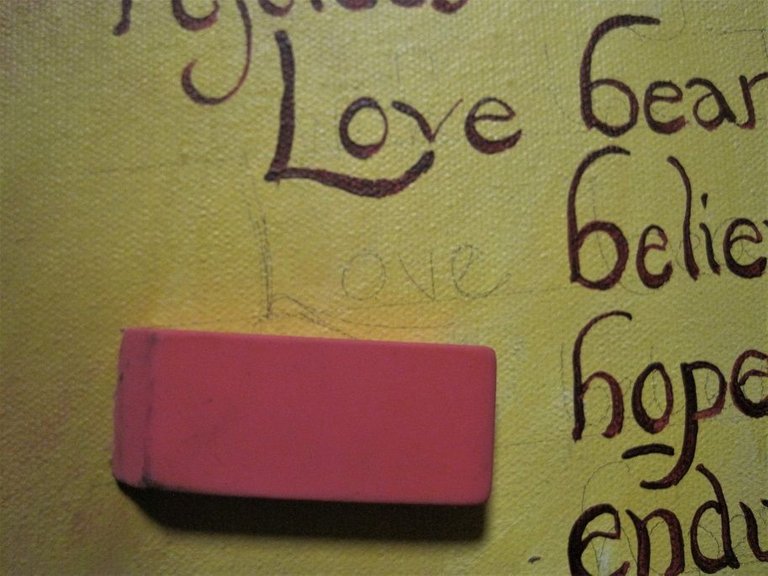
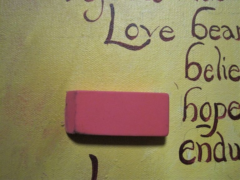
Once you get all the rest of the lettering done, the final step is to get rid of your pencil lines! The easiest way I know is to use a good-old rubber eraser. BE SURE THE PAINT IS TOTALLY DRY BEFORE YOU DO THIS. It may seem like an obvious thing to say, but we've all smeared paint on accident, and after correcting lettering mistakes once on this project, I really didn't want to have to do it again.
So there you have it! I hope those are some helpful tips for the next time you are hand-lettering a sign, painting that awesome quote to hang above your mantle, or making a 4th-grade bake sale sign to make the other kids jealous.
I'll be posting the finished image of the painting, by the way, within a few weeks (once I finish it, haha!)
Are there any helpful tips that I've missed? I'd love to hear your thoughts in the comments below! As always, thanks for reading. :)

Looks great! I have had those “oh crap!” Mistakes before! Messed up letters, misspelled names, etc. That technique you recommended works every time when patience is practiced. Which unfortunately doesn’t always happen 🤦🏻♀️
Great tips. - David Berkowitz Chicago