The two elements of a good logo are the pleasure of recognition and the promise of meaning.
Paul Rand
better/verse
better/verse is a pet project. It aims to build a platform to share original art and literature and build an active community of readers and contributors.
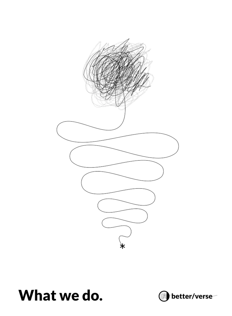
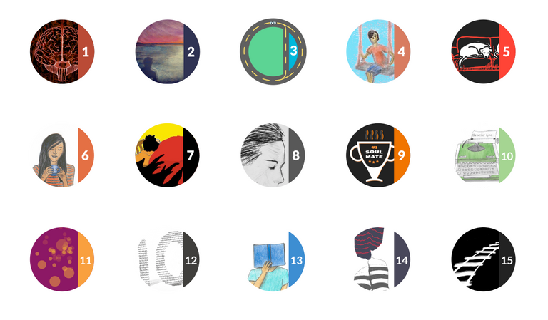
The year is 2016 and there no reason for an identity to be a static visual. Ours is like an organism changing its face all of the time yet being familiar.
The logo has three elements
- The ink,
- The Blank Canvas and
- The Full Circle.
They together represent all the elements of a b/v style publication
Libereco
Libereco is a team of highly motivated individuals from various disciplines including Design, Front End Development, DevOps and Copy Writing.
They build modern, functional web solutions for clients.

The logo highlights the 5 members coming together to form the team.
PHI : Programming Hours Initiative
PHI is an initiative I started in college to teach and learn programming and problem-solving skills. The logo is a play on the glyph of Phi cleverly revealing P.
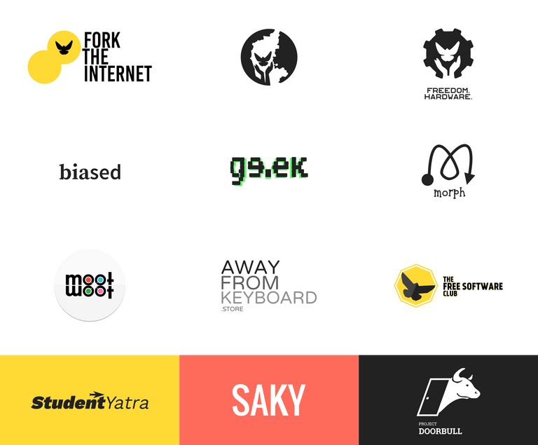
A few more
Follow, Upvote & Resteem. It helps me write. :)
Holy fuck, my man, I love this, oh my god, I envy all you talented fucks
Envy is pretty much what drove me. So, take that envy and go make some art!
My type of art is very different!!!