So, last Tuesday I found an interesting competition in a group I was part of. The rules were fairly simple - take a picture, draw or do anything you want, recreating a scene from a game you like, and post it on either Facebook or Discord. The price was a bundle with 3 games - Hollow Knight, Hitman (the complete first season) and 7 Days to Die.
I'm really glad I participated. Even though I didn't win, I learned a lot from building this scene. Plus, I still got the bundle since it was only $12 (and you can as well, here: https://www.humblebundle.com/monthly/subscriber ).
I decided to participate and make something in Blender, and since just a few weeks ago I finished Dark Souls 1, I thought it would be a nice thing to make a scene from that game.
It was pretty hard to find a scene that I could make, something not incredibly hard (since I only had a few days at my disposal), and after some thinking, I decided to make the first part of Undead Burg, a place where a lot of people who are playing the game for the first time spend hours farming.
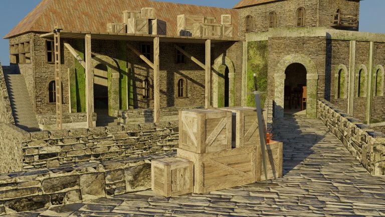
Here is what I managed to make:

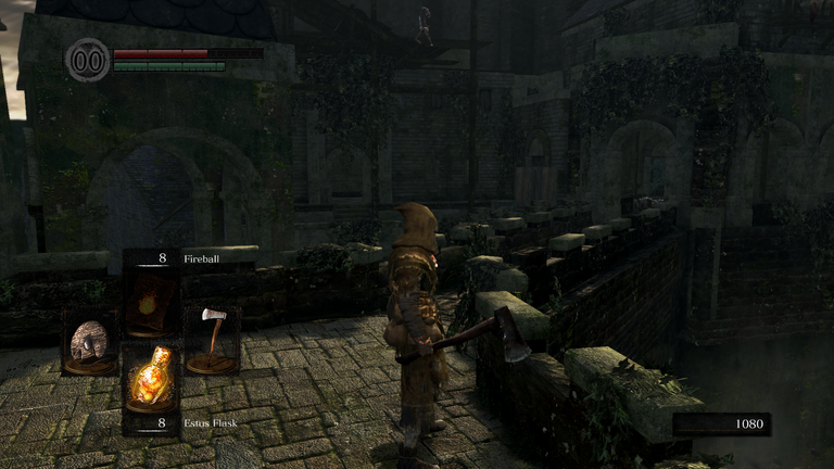
And this is how the scene looks in the game:

I'm fairly pleased with the result, since I only had around 4 days to work on it (though I thought I only had 3, so I rushed it a lot). Also, my aim was to make the scene look alive, because in the game it's the exact opposite of that. I'll still have to add a lot of elements to make it look like people are living there, but that's gonna take some extra work.
The building process was actually fairly simple. I finished creating most of the scene in less than 5 hours. Texturing however, well, that took easily over 20 hours.
Everything is pretty much made out of cubes that were scaled and edited to look in a certain way. Actually, I don't think I used any spheres in this scene. Since the scene was part of some sort of castle, there was no need for me to use anything but cubes, and that's why the scene was easy to build.
Also, the perspective was pretty bothersome too, especially the building right after the bridge. It was hard to work on it since nothing rotated and moved the way I wanted it to move. Besides that, everything is a combination of the Array modifier and the creation of cubes.
Texturing was fairly hard. The UV Maps weren't hard to make, since everything is made out of cubes, but finding good textures and applying them the right way was a pain in the ass. Luckily, there are websites like Poliigon with some free texture on them, and websites like Texture Ninja where you can find a bunch of images with textures you may need. Then all you need is Photoshop to get the Normal Map, Displacement Map and maybe Reflection Map, in case you want that as well.
Sadly, I didn't think about recording the process or saving several images to show you multiple stages of the project, but maybe I will do something like that the next time I'll write about this scene. Since everything was made in around 3 days, I had to rush a lot of things, and not everything is the way I want it to be.
So, I'll be working a little more on the scene, improving a few things, reapplying some textures and trying to improve everything, even if by a little bit. Then I'll create another post showing you what the scene looks like after the improvement.
For a 4 day work, it looks pretty good. I’ll follow you and looking for the improved version.
Thank you :)
Nice work, what software did you use please?
I used Blender :)