Today we will look at two disparate paintings by one of my favorite naïvist artists. Like other representatives of the proletarian perspective in art, he has long been unjustly overlooked and is rarely mentioned together with his more renowned contemporaries. Some have even called him a simple amateur. Although, he belonged to one of the select group of official war artists, and he rejected the British Knighthood title in 1968. An uncompromising artist, well worth a closer look at.

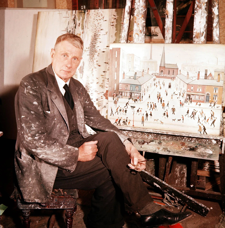
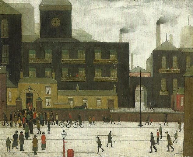
British artist L. S. Lowry (1887 – 1976) is mostly known for his dystopian industrial landscapes: the street life, urban environments and modern social life of the working class. Lowry is a rather gloomy artist who chose gray colors and bleak motifs. He looked with concern and distaste at the industrialization of Northern England. Politically though, he was basically conservative. The "progress" he saw in his hometown left a bad taste in his mouth. The buildings are not merely a character among others in the picture, but usually more complex and diverse than the people. The depicted people always look the same. They wear the same clothes and have the same body shapes. They occupy the lower parts of the paintings and usually never extend past the bottom third of the painting. You rarely see any facial features, and when you do it's made up by a simple line and three dots, representing mouth, eyes and nose. They could have been cut out of a template and are often called "matchstick men". The monotony and the lack of variation in appearance, highlights the absent individuality of the toiling man in the industrial era. The industry buildings are bigger and more and dominate the room. The urban space belongs not to the people, but the industry.
The buildings, on the other hand, overlap. We see them in several layers, they extend far into the picture and become paler the closer they come to the periphery. Sometimes they dominate the cityscape dramatically, stretches out and make up the nature of the urban landscape, as woods or hills in a pre-industrial painting. Despite their prominent role, the buildings are rarely in the foreground. They reign in the center or background of the image. They don't inspire a distinctly threatening mood. Instead, they put the finger on something else, something much worse: monotony.
The ground is always white, as if snow, although activities in the scene clearly show that this is not the case. Therefore, you usually have no idea what season is being depicted: it's always the same time. The smoke pillars testify that the wind nearly always blows from left to right. Nature is also stuck in a rut.

In the few cases you see clocks on buildings, it's unclear what time it shows. Time is non existent. Every day the same. Except, and deliberately so, in the painting A Northern Hospital (1926), where you can clearly see the hour and minute hand on the hospital clock. Here every second is counted. In this building, absent of any chimneys, they may end. In the background to the right, the chimneys of the factories belch out smoke. The factory work will continue even if your own hours, minutes and seconds run out. Here, man's transience and how little consideration the industry shows for it is assured. The industrial everyday life has its way regardless of what personal disasters may happen in the insignificant worker's life. He can easily be replaced by one of the other cut-out figures.
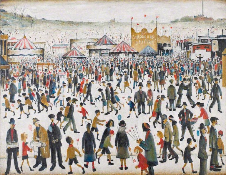
The second painting we will have a look at, Lancashire fair: Good Friday, Daisy Nook (1946), differs a lot from Lowry's other paintings. It's still a city view: a market in Lancashire, where Lowry lived and worked for the majority of his life. The colors are a little brighter than in the more bleak urban industrial landscapes, and we actually get to see some faces (albeit very simplistically made). Open gazebo stands aren't locking man inside, as opposed to the dark factory buildings. The outdoor spirit of the weekend is palpable. The people in the picture glance at us, the viewer, and their movement patterns are far more realistic and free. The figures here have a relatively individual body language. Quite far back to the right you can for example see a man standing on a small stage, agitating with his arms outstretched. The market and its visitors extend far to the periphery and make up the better part of the canvas. Only in the upper right corner we can see a little factory with its chimney.

Although the majority of Lowry's paintings depict the industrial city and its workers, it is equally important to point out what they do not portray: work itself. We see the workers on their way to and from work. To the factory, from the factory, outside the factory. We see children on the school playground with the factory in the background: a reminder of what lies ahead. We see worn out workers sick and we see them buried. The monotony and weight of the industry rests like a heavy shadow over every aspect of the city, and becomes so much the more palpable than if work itself would be depicted.
 @SteemSwede
Sources:
Leber, Michael and Sandling, Judith. L. S. Lowry (Oxford: Phaidon, 1987)
Levy, Mervyn. Selected Paintings of L.S. Lowry (Jupiter Books, 1988)
https://thelowry.com/about-us/ls-lowry/
Interesting painter. Instantly recognizable, which always is a sort of quality stamp. They have a modern, low-key expressionist feel to them I really like. Remember seeing him years back but had kind of forgotten
The Creative Crypto is all about art on the blockchain and learning from creatives like you. Looking forward to crossing paths again soon. Steem on!Hello @steemswede, thank you for sharing this creative work! We just stopped by to say that you've been upvoted by the @creativecrypto magazine.