Hello yesterday i made a piece in Arnhem ,... 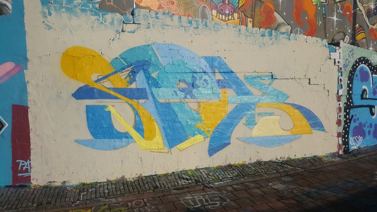
It was a windy place and i it didn't worked out the way i wanted... but sometimes when i make a piece that isn't so good as the last one , i sit back and study my foto's and learn even more then when everything goes right....
I want to take you trough the foto's and try to explain what went wrong... and why i made sertian decissions.
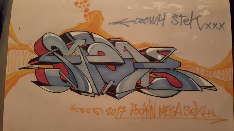
This was my sketch. I liked it . This was where i was going for....
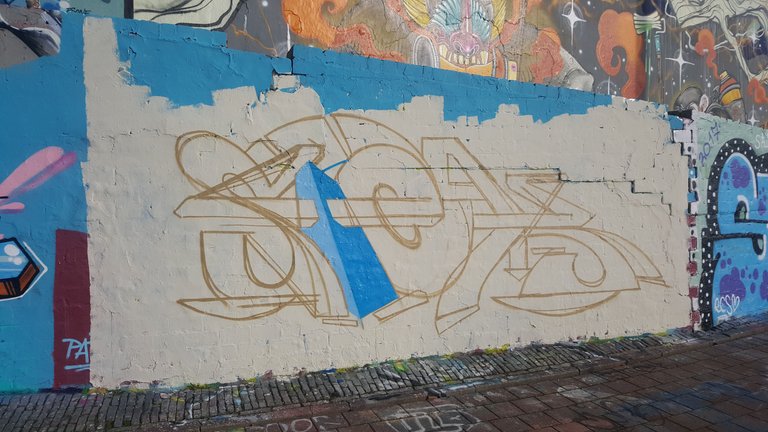
I've used a broken white latex paint... rather use a dark colour the the piece will automaticly stand out. The upset got a vew mistakes like in the 's' and the shape of the 'e' isn't right.
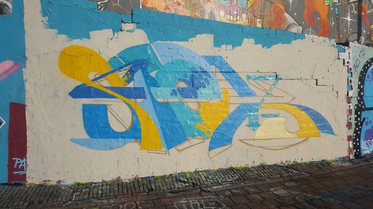
I like this fill-in I likex the colours yellow with the blue....In this design i have to devide the same colour in the piece.
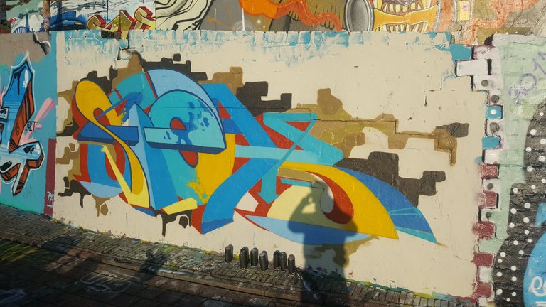
I started the background with some left-over brown shades ... that was a mistake ... The piece is now getting sloppy and too busy.... and for some contrast i made the 3d of the letters red ... it was better to make it black and orange... but unfortunally i didn't have enoug black...
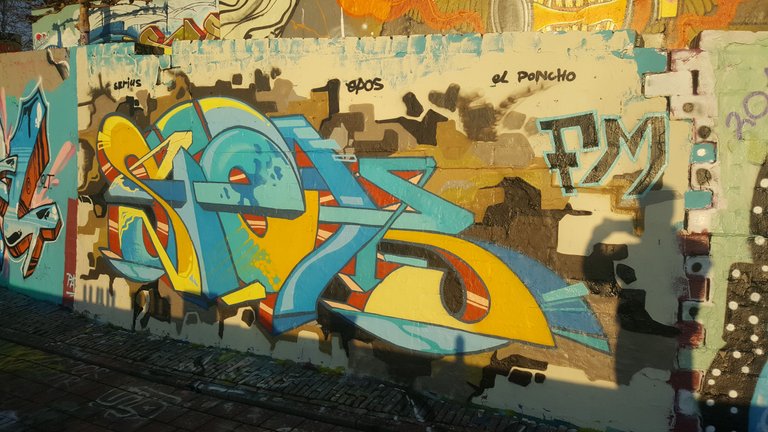
If you zoom in you can see that the outlines are not staight and a bit off...I try to pimp it up with some details in the fill -in but i wasn't into it anymore and i just wanted to go home....
I hope you enjoy this graffiti explaination.. ..
Congratulations @stekone! You have completed some achievement on Steemit and have been rewarded with new badge(s) :
Click on any badge to view your own Board of Honor on SteemitBoard.
For more information about SteemitBoard, click here
If you no longer want to receive notifications, reply to this comment with the word
STOPdamm that's really special beautiful it looks
Thats cool. I have never seen it broken down like that. Such a tricky art.
yes yes yo ,where you based in holland ? i have been visit your country like 5 times :) dope graffiti scene allover . respect
YOU JUST GOT PAINT BOMBED!
https://steemit.com/@blackbook