I like drawing this kind of stuff, I've done it since I was 10 years old. For my Steemit introduceyourself I drew a Steemit logo of my own and I wanted to share with you how I did it.
Disclaimer
Okay first off, it takes countless of hours and hours of practice to get to a certain acceptable level. Not only do you need the talent and creativity to be able to build legible, but creative letters. Also it takes a lot of practice to being able to draw straight or round lines without failing. This is hard, don't think it's not for one second. Many people think of graffiti as a form of vandalism, and it could be just that. But it heavily depends on what you do with it. Random scribbled words on the streets or trains are vandalism, but there are also countless people who see and treat it like an artform. As do I. I'd much rather take my time to come up with something nice at a place where it's allowed, then to go out and destroy or deface property.
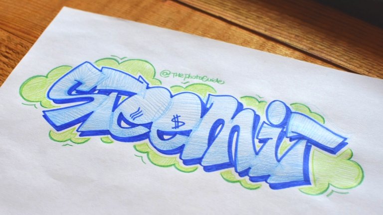
First, the final result
Now that we've got that little disclaimer out of the way, let's see the end result before I will show you how to construct it.

How to begin
Like I said before, it is hard to build a unique letter that fits your style. The truth is, every letter can be bent, stretched or maybe even altered a little bit. Still it has to be legibile and the basic construction of the letter has to remain intact. There are many different styles and everyone has their own preference. To be able to form your own style, takes years of practice and lots of skill.
So obviously you start off with the first letter. This will be the foundation of the total design and every other letter has to fit in with the rest. The first one was the S...(yeah thanks captain obvious)

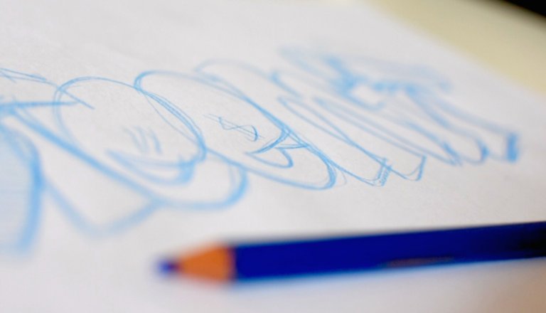
I colored this one in already to get a basic idea of how the rest should be. After this, the rest will all be just sketch lines until the entire design is finished. That way I can easily see how it's going to turn out and easily change wherever I want to.
Used materials
I almost always use colored pencils to sketch and fill it in. This way I have full control over my lines as they are soft. I much rather use these over ink because with these pencils I can easily determine how thick or thin the lines have to be. For the outlines I usually use thin felt tip markers.
Now for the rest


Here comes the hardest part...it's make or break time
This is by far the hardest part. Whether it's on paper or on a wall with a spraycan, the outlines are supposed to make, but can easily break the entire design. Now I know I always want it to be absolutely perfect and I'm hardly ever satisfied, but this is truly the point of no return. With paint, you can paint over, although not always easy. With felt markers or ink, it's final and can't be undone.
I start off with the basic outlines and after that's done, I start adding the drop shadow. It's also possible to do a 3d effect, or nothing at all...but I prefer doing drop shadow. Knowing where to place these exact lines is very important and if done correctly, will give an instant boost to the overall design.

Now to wrap things up
After that's all done, I can add a lot more stuff like backgrounds, highlights, second outlines...you name it. For sketching, I usually keep it very basic.
Thanks for reading! Give me some feedback or ask me anything about this in the comments. Be sure to follow if you want more :)

What do you write then?
Not a lot anymore these days ;)
Same here, so you're from Netherlands have you heard of Duna?
Lady Duna you mean?
Yes, so you do know her
We met about 10 years ago
She is amazing with her talent i saw some of her body art and was blown away
Not in person, I have seen her work yes
I went to Amsterdam about 10 years ago with a friend and got stranded she let us stay at her place for a week until we returned to London, she was seeing a guy that graffed Bern at the time.
Appreciate the effort you put into all your post. A perfect example of quality content. Those pictures are awesome.
Thank you
Nice work! May we use it?

What for and how exactly?
Nice! Youth style 👦
Thank you :)
This post has received a 2.08 % upvote from @booster thanks to: @thephotoguide.
Not bad, looks pretty cool :)
Thanks! This is just an easy sketch I did for fun obviously ;)
What's the process of getting your drawing on paper into an image that you can post on your blog?
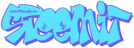
Do you mean like the logo I placed at the end of the post? Well there are a few things but here is my (workaround) method. Obviously it's best to place under a scanner and trace in inDesign but I don't have the patience for that. So what I do is make sure you have as much natural light as possible, take a photo and load it into Photoshop (or any similar software). Then adjust the levels so the background is as white as possible and boost the lines by cranking up the contrast. Of course there is no preset value so you are going to have to find the best balance. After that your drawing should come up very white and only the outlines should be visible. Now you can color in the empty spaces with any color or gradient you'd like. Like I said, it's a bit of a nitty gritty lazy workaround but it works for this kind of usage.
Yes, the logo at the end. Thanks for the reply. Unfortunately, I don't have Photoshop but I do work with digital images of my drawings and paintings to get the truest possible reproduction in iPhoto and Preview on my iMac. So, if I ever want to take one of my artworks and turn it into a logo-type image, maybe I can do that. BTW, good luck on Steemit...I'll follow you and look forward to your posts. @thephotoguide
I much prefer photoshop in terms of usability, but you could also download Paint.net for free. It basically features the same options but is not as good as Photoshop. Still you could do the same as I described. Good luck with it in the future ;) Thanks for following, I already did the same before :)
Thanks for the follow @thephotoguide ! I use an iMac so I'm afraid paint.net is out of the question. I'll do fine with what I already have.
Love it!
Thanks so much! :)
great art
Thanks!