
I've written a little about how artwork will sometimes end up going places you weren't expecting or arriving at a point where you might feel like you need to go further with the piece than you originally planned.
I'm going to take you through an example with this piece I started many months ago, maybe in April, but decided to revisit and redo in the past couple months.
First the sketch
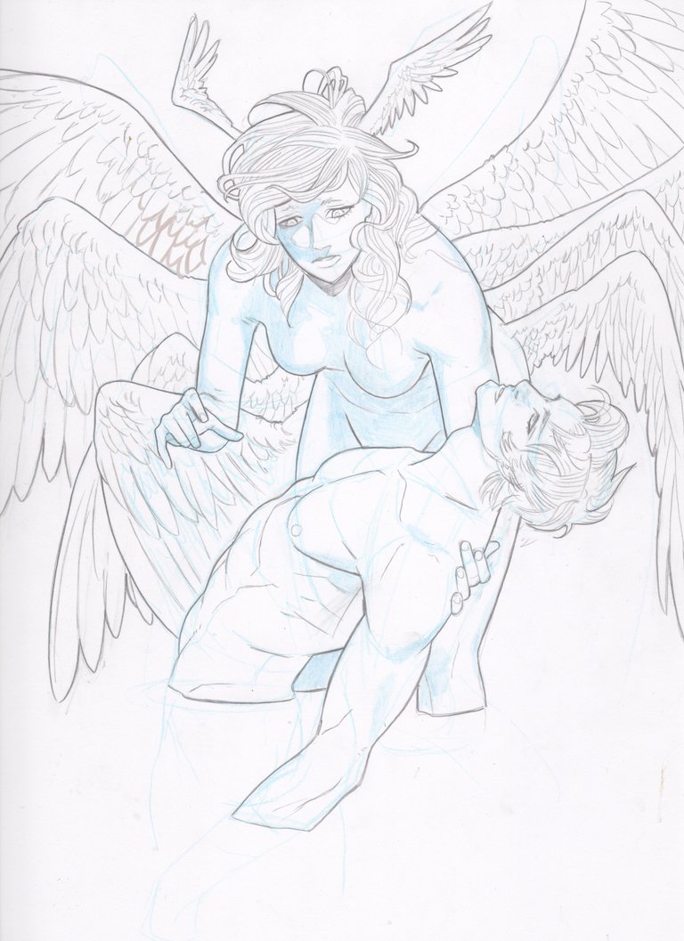
As you can clearly see, this was a pencil sketch with some blue color pencil for some light shading to get an idea of where the light is coming from
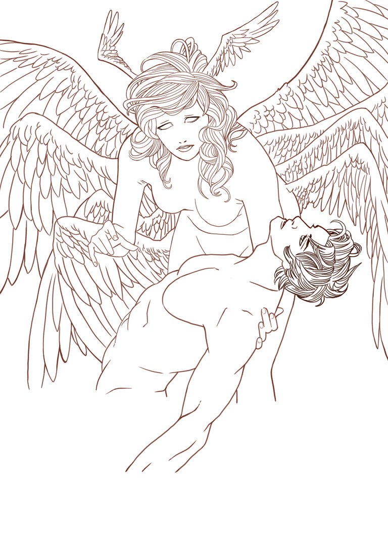
This is the ink layer. As you can see, the lines arent a pure black but a dark brown
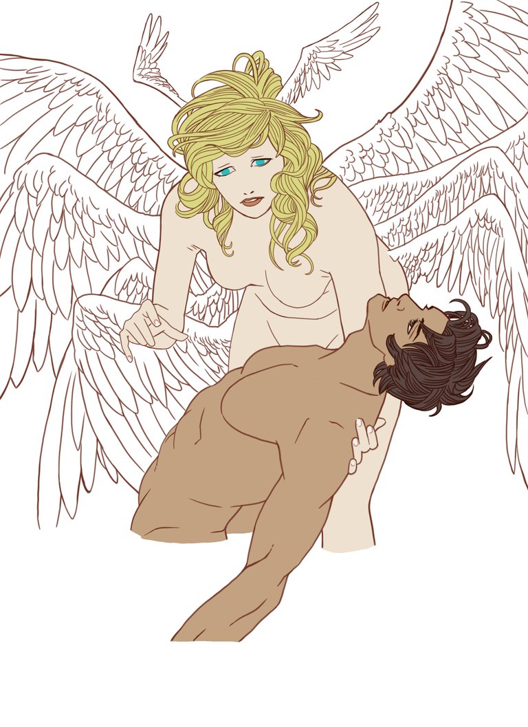
Here are the flats
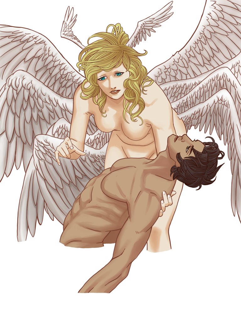
The rendered shadows
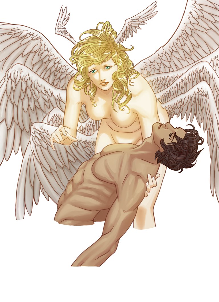
These are followed by lighting including harder highlights and very soft lighting on Ryo (the one with the wings)
This was my first go at the background. I wasnt satisfied with it and imported the piece into photoshop as I had been working on it in Clip Studio
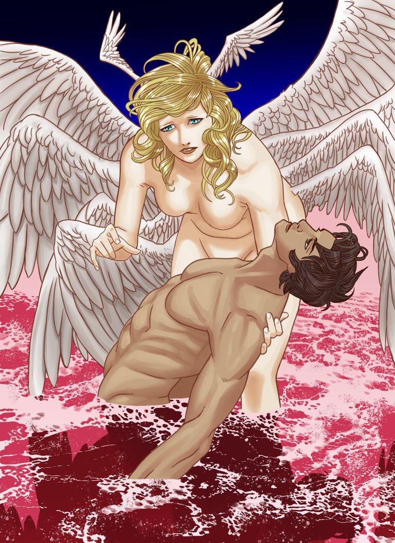
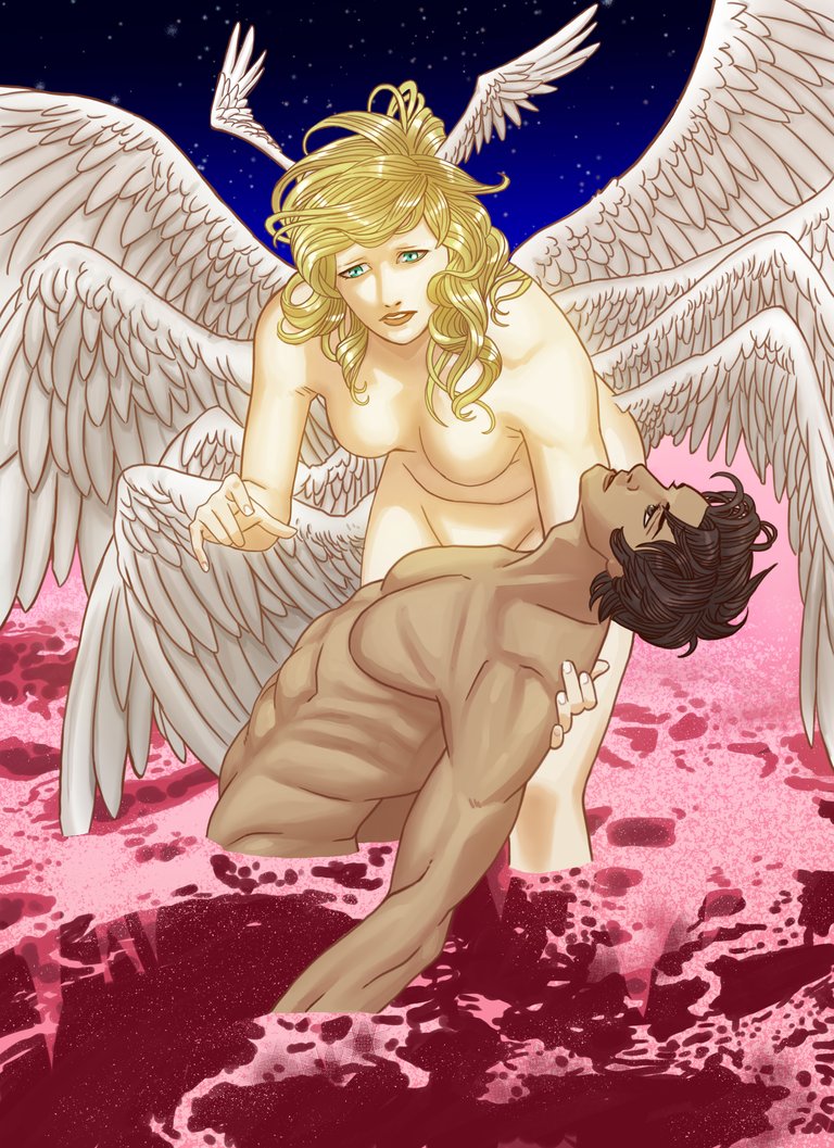
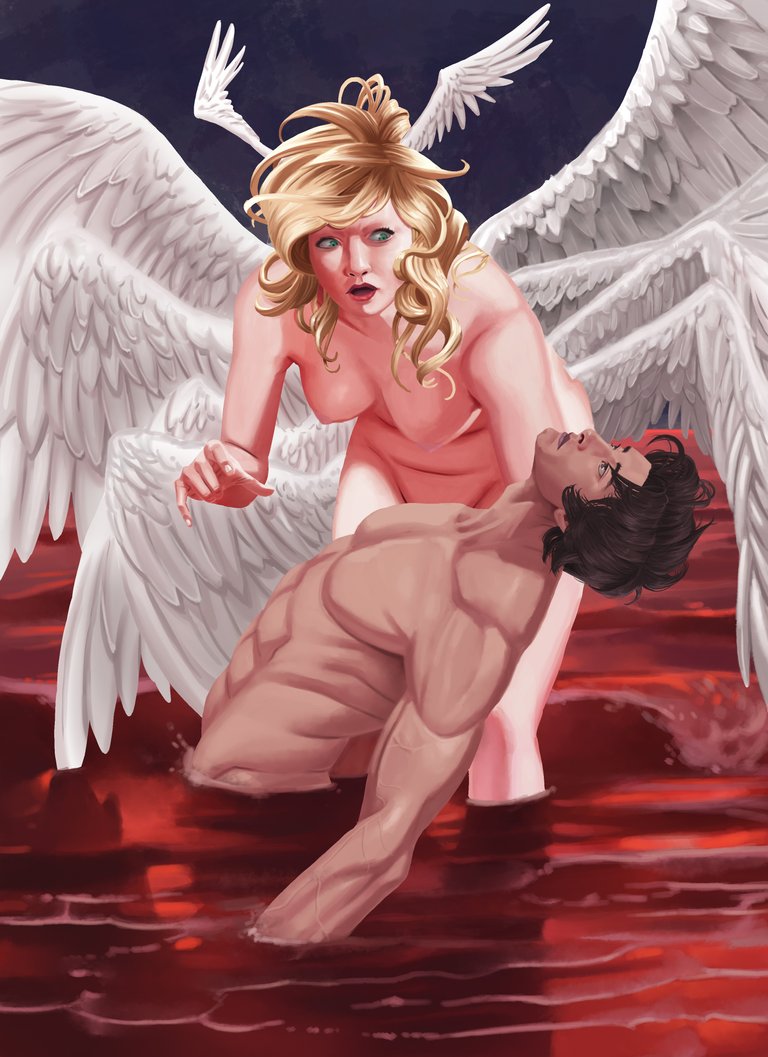
Honestly, this would have been a fine place to end, but I was struck about how it might look with a different approach. So I decided painting the whole thing might be worthwhile.
Some of the graphic elements had to be reworked quite a bit. The sky is a lot less saturated and muted. The sea had to be redone completely and I adjusted the look in Ryo's face a bit. It feels like a pretty different piece even if they are structurally similar. I'm not sure if this this is where I wanna stop yet but at least I'm pretty satisfied knowing I took the initiative to find out what might happen if I took the piece further. I strongly believe conciously making an effort to grow past what you are comfortable and into places where you more easily make mistakes is how you develop your instincts as an artist
Let me know if you have any questions or if you have thoughts on the quality of one version over the other!
Hello, dear user, we welcome you to @artisteem, could you explain us a little about your process? I invite you to read the guidelines on how to publish and the new @artisteem competitions. Remember that @artisteem grows every day thanks to artists like you.
Dear Artzonian, thanks for using the #ArtzOne hashtag. Your work is valuable to the @ArtzOne community. Quote of the week: Art, freedom and creativity will change society faster than politics. -Victor Pinchuk
Hi edgaruvm,
Visit curiesteem.com or join the Curie Discord community to learn more.
Epic picture of Devilman <3. I love that you keep going to the last version, though the one before is already pretty good.
Congratulations for your curie vote =).
This post was shared in the Curation Collective Discord community
community witness. Please consider using one of your witness votes on us here for curators, and upvoted and resteemed by the @c-squared community account after manual review.@c-squared runs a
aaaaaaaaaaah Ryo and Akira * ___ *
Amazing, Ed <3 The colours are really great <3 THAT OCEAN OF BLOOD IS EPIC * ___ *
Love the step by step so much, also
talented persons everywhere on steemit.
I think you did a nice job on the art but I would I prefer the normal Ryos face but it's your art and you the one that have the idea so I still think it's amazing .
Amazing drawing! Loving the step by step process. Both version look amazing, but I prefer Ryo's face in the previous version :)
Congratz on your curie vote!
I am a curator for AkibaSteem and this is just to let you know that...:Hi @edgaruvm
We're an anime-focused community full of fans and good people!
We aim to find good anime & manga content, share a happy moment, & give some visibility. You got our vote and your post may get featured in our compilation post, if you don't want to be featured please let us know. Keep up the great work!
Also, feel welcome to join our community on Discord! -:
 https://discord.gg/7JQruwm
Woah! This is an incredible work <3 I love that you took it further, the result is stunning :)
Congratulations @edgaruvm! You have completed the following achievement on the Steem blockchain and have been rewarded with new badge(s) :
Click here to view your Board of Honor
If you no longer want to receive notifications, reply to this comment with the word
STOPDo not miss the last post from @steemitboard:
OMG I love the detailed anatomy of those bodies. Human body is just sooo beautiful if it's taken care of! Btw the change of women/angel expression in the last picture totally puzzled me :D Why did you change it? I kinda liked the first one more TBH. But the whole thing is STUNNING!
Thanks for sharing this :) Best of luck!
Really nice to see the whole process and thank you taking time and putting your steps with comments. I like everything but till the last picture, I would probably leave the man with a bit darker, I mean like light brown toned colored skin and the angel probably also less pink.But I can understand if you say that this is because of reflection from the red colors water surface. The rest everything is perfect, beautifully drawn sketch and great final result, I like that vein map of his arm :)
Thank you for your kind words! I had adjusted the color of both their skin to compensate for the different color of the sea and due to the change in style. The individual colors of the characters are governed more by the "global light" than the individual local color. Ryo is probably a little too pink though haha
Oh man, this is as powerful as the actual ending of Devilman Crybaby,the sea of blood, the expression on Ryo's and Akira's faces and the work on the shadows are all perfect, great piece!
Thanks! Crybaby's ending stayed with me for a while and I'm glad I was able to express that in your eyes
I like the blending and detailing on the man's face and hair. Good job. :)
this looks really cool! Its always great so see other artists work process
Whoah!! Oh my... that's amazingly stunning work of art! It is very colorful and beautiful.but on top of that, what an action of love! I am trying to imagine how would a girl like Ryo would feel holding her dying love one like that.
I like the bloody red sea on the last photo but I like Ryo better on the previous version. She looks more of an innocent victim on the former photo while she looks the wicked broken angel with vengeance in her eyes on the last photo.
The Photoshop version looks finer while the Clip Studio version is crispier.
Angel with five pairs of wings? What kind of which is Ryo? Is her love one a human being? I wonder what's the story behind the painting.
Thank you for your compliments :)
So this piece is kind of an alternate depiction of the last scene of Devilman Crybaby, an intensely violent and sexual show on Netflix. I'd hate to spoil it for you by answering some of your questions in case you get around to it. Ryo's expression at the end is very complicated one and I wasnt sure which of the two expressions would come across as more faithfully
Oh, so this is from a show. Last scene? That makes me miss it then if I get to grab a friend who has Netflix subscription. 😊
I am not into violent vengeance so I would settle on the second to the last photo with Ryo's innocent eyes. I usually just let karma take its place when someone does wrong to me. 😊
damn it. how amazing work dude... I was hypnotised reading the step by step and boom. the final result ... it was a perfectly evolution. great work..
how much time took you finish?
congrats for share it in that way. I mean you show us a piece of the final result on the cover. and at the end the entire artwork.
Thank you! Honestly, this one took a while. The first version took me maybe 6 hours to do and the second attempts took me a similar length of time. I think a good bit of the time was taken up by being unsure of where to take the piece, ultimately.