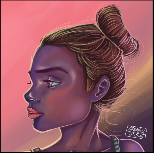
Hi Everybody. I hope all of you be fine with excellent health.
In this opportunity I would like to show another portrait experiment. I should admind that this illustration became more difficult to made considering my previous digitalworks, but at the end turnet out something really interesting.
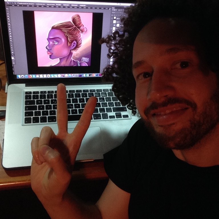
For whose dont know about my work, I am really intereted to know more and more about color armony, and I am doing a series of some digital portraits as an experiment to improve digital colors into compositions. This artwork has been done with Adobe Photoshop and a drawing Tablet (Wacom Bamboo). It tooks to me almost 2 days to finish it (almost 7 hours of work).
Well I am going to show you how was the art process and how was step by step I reach and complete this artpiece.
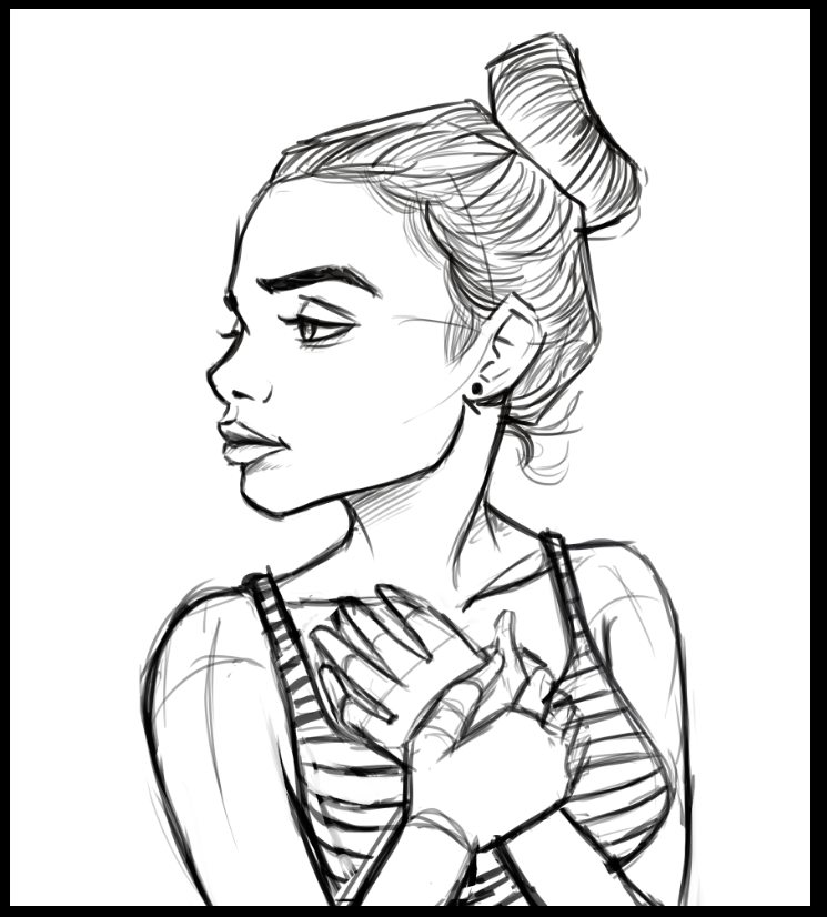
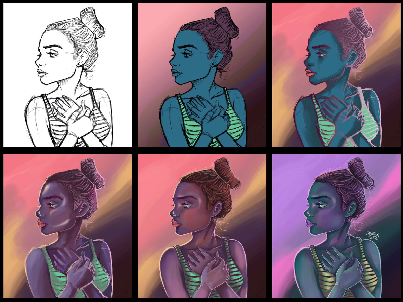
1-First I made a sketch as a reference for the shape of character. It is just a simple reference to bellow steps. this sketch is made as a layer that will be on top of next layers.
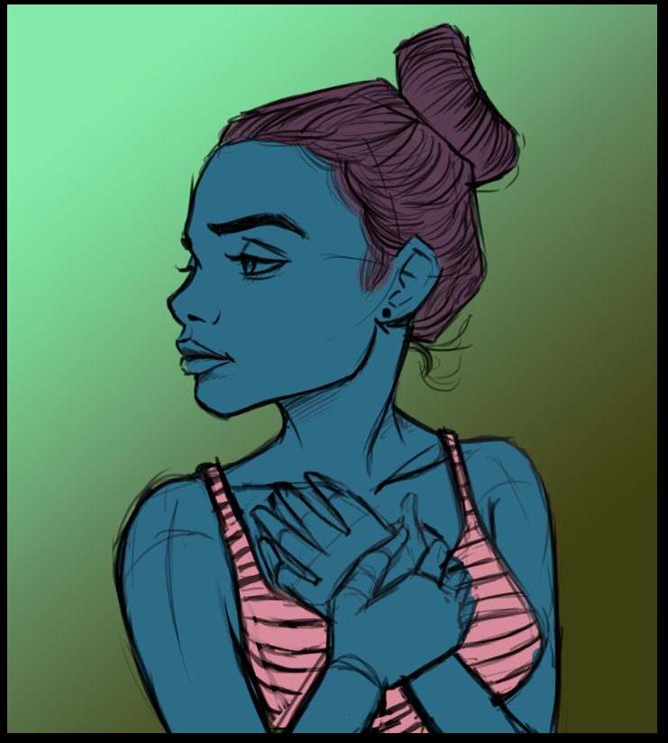
2- I added some plane colors. Here the background is separate from sketch and characters colors. I thought to use a blue for the skin as a first reference.
3- Here I changed of opinion about background. I wished to create a contrast of warm colors vs cold colors. In this way I thought that backgraund could be more bright with gradient of pink to yellow and purple.
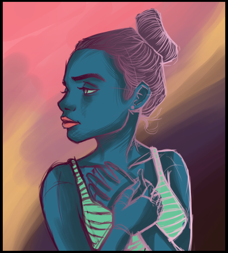
4- In this step I added a color gradient into sketch layer. It helped me to have an idea about colors and combinations characters tones.
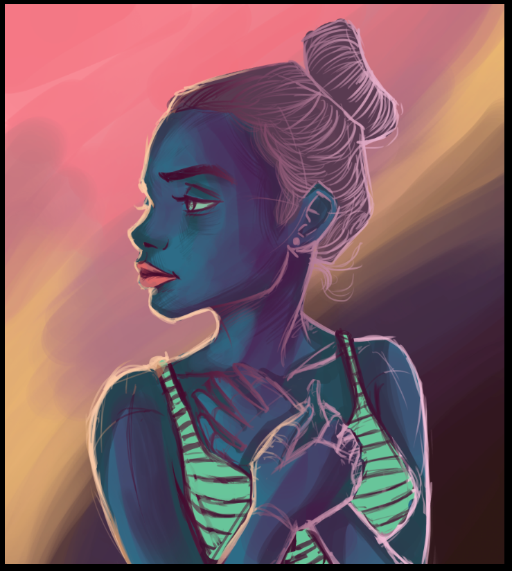
5- Here I used a shadow tones for the skin and hair. I decided to use dark purple for the female character. I was not worry about how its looked. I only added some tones that I am going to blend later.
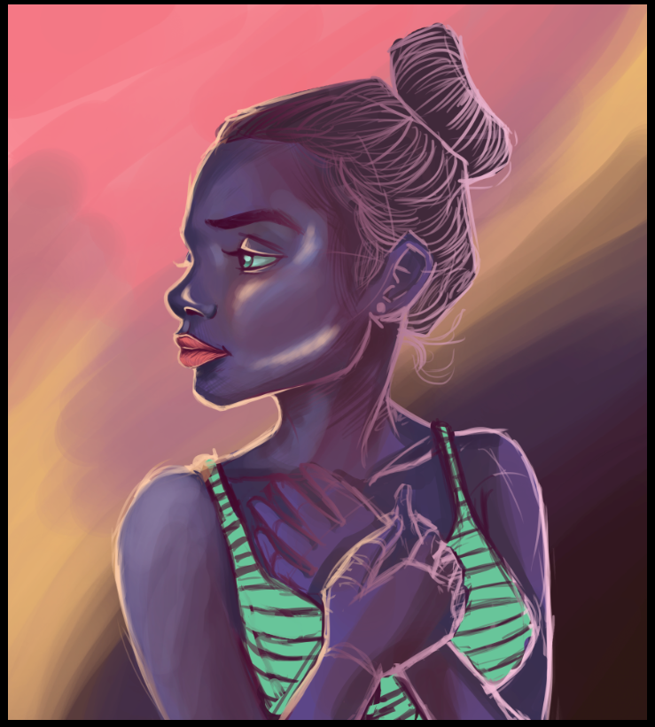
6- Here we are, the blending step. This step was not easy, it was necessary again not be afraid and with a lot of patience I initiated blending the colors. I added face details, shadows and lights.

7- Blending colors again. I started adding some brown colors in skin because face looked too purple and I needed to create an interesting composition with many different color tones.
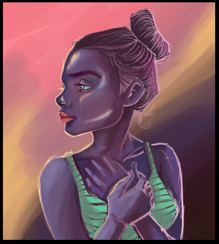
8- I decided to change the color hair for brown tones. I needed diferenciate the skin to hair. This process has been experimental and hardest, maybe at another moment I am going to pick some differents tones for skin and hair at the beggining. These little colors mistakes let me learn and improve as an artist. At this step the face comes out really nice.
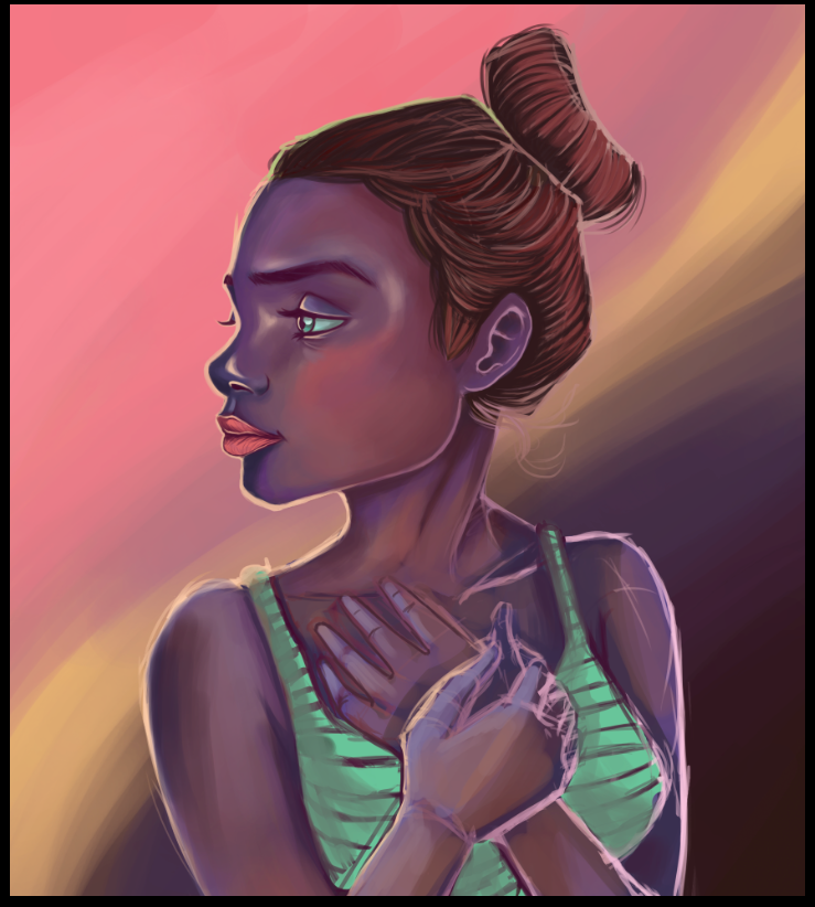
9- Here I added more details at the hands and blend the clothes and body. Also I drawed some lines and light at the hair.
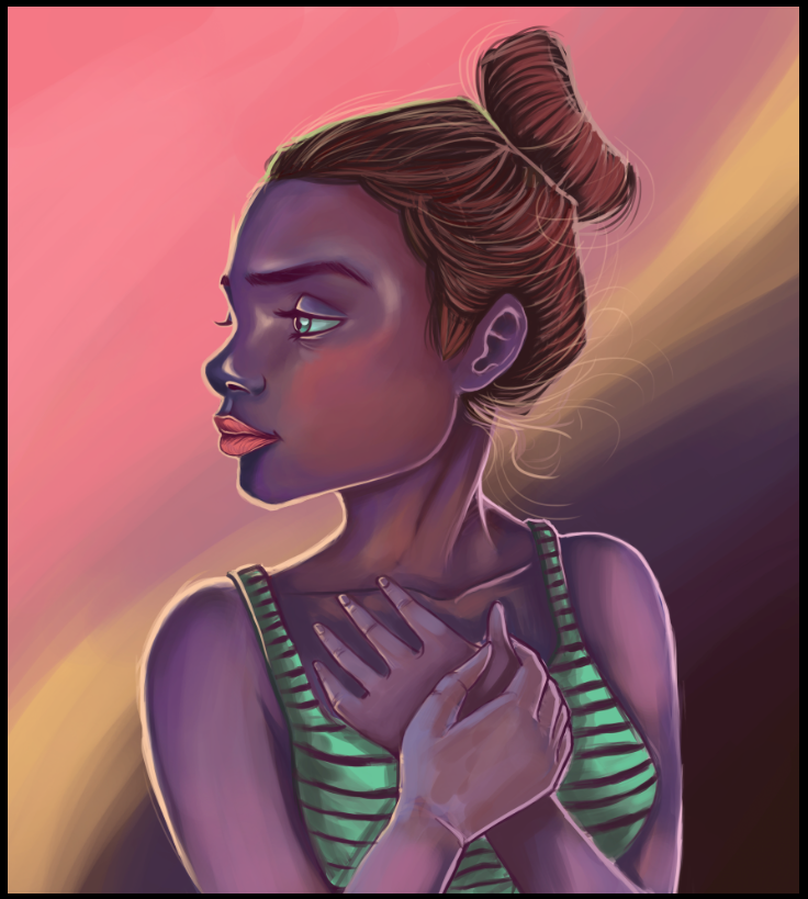
10- Finally. I reached the quality I had been looking. Sometimes when I am blending colors I can lose the sketch reference, for example, I changed the little finger of hand because in the previous step the finger shape was not well done (this detail can be more evident at animation process that I show bellow)
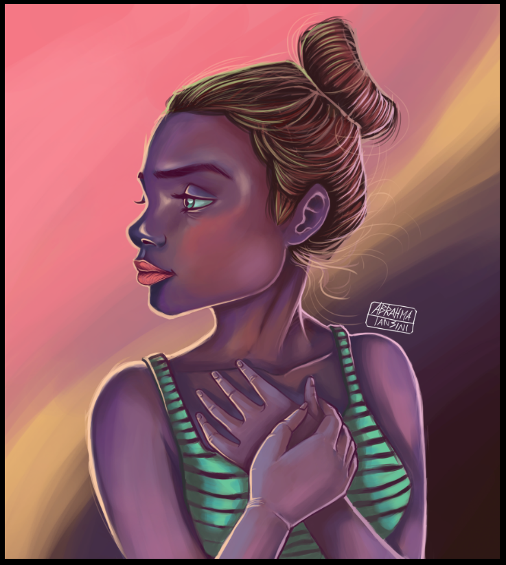
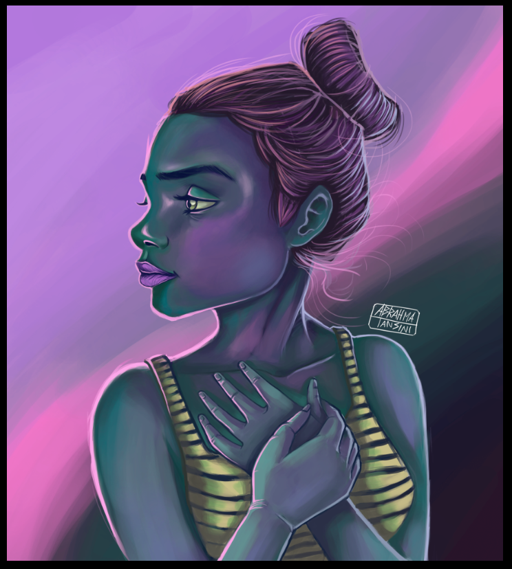
11- Also I have been doing color experiment with values and saturation in Photoshop and this is another version of artwork. Which would you like more? The first artwork or this second one?
I hope everyone had enjoyed this digital art process. It have been really heavy to completed it, but it is the best way to improve. I am posting also the GIF files where you can see the process of artwork as an animation. Is really interesting How the illustration is looks step by step.
If you like my post and you want to support my art, upvote me. I really apreciate all your feedbacks and opinions. Thank you so much to check my post and enjoy it. Also if you like to see more of my work, follow me at instagram: https://www.instagram.com/abrahmatan/
Media: Adobe PhotoshopCopyright @abrahmatan - All Rights Reserved
Love your layering process, don't do any digital but I'm really considering doing it. If you want to check out my art work on my blog that would be awesome. Keep it up!
You are right, as a traditional or digital artist we use layers in our artwork and illustrations :). Thanks for your feedback. Yes I have seen your profile. Nice tradicional portrait :). I really like the Robert de Niro illustration. Keep working my friend.
What a beautiful drawing. Excellent work. I love it! 😊
Thank you my friend. It was hard to completed it, but finally was a good experience. :)
Amazing! I like great bright colors!
Thank you! I appreciate your comment. I hope the next illustrations turned out more bright because I think these are still a little bit dark. It is just an color experiment!
Click Here to Read our New Curation Policy And Updated Rules
You've received an upvote from @slothicorn! (@karmachela)
Thank you so much! It means a lot to me! :) I keep posting great artwork! Have a wonderfull day!
My first thought was how much I liked the colors, so it was neat to read that that was exactly what you were experimenting with. For what it's worth, I prefer the first version with warmer tones.