Hello everyone, I recently read about @artzone's logo contest and decided to put my hands to work and create my own designs.
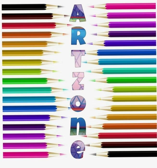
LOGO ONE
LOGO TWO
Logos one and two are simple, yet sleek designs that represent the artistic side that Artzone brings out in Amateur artists like me.😊
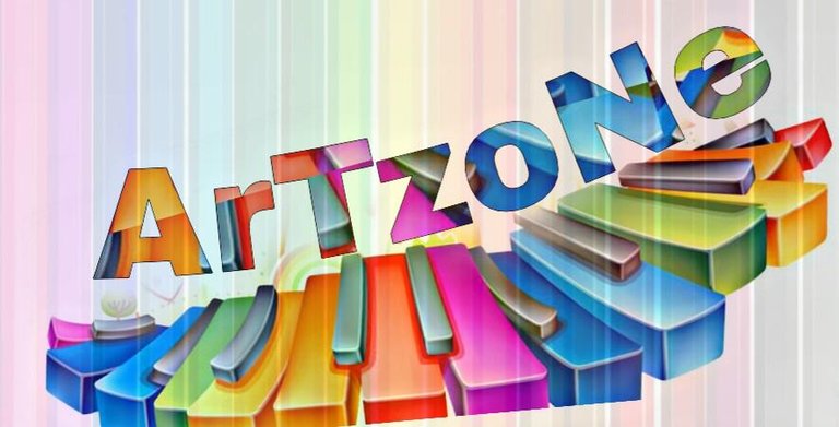
LOGO THREE
Since Artzone represents Art, Culture, Music..., this Logo represents the music side of Artzone and the hidden talents it brings out in it's members.
I'm working on some more logo designs and I know I'd get better with every logo I create.😊
Anticipate!😉
Which Logo do you like best?.
What do you think I need to work on with the Logos?.
Thank You Surfyogi for creating @artzone and for giving us all an opportunity to be creative and expressive.😊
Thanks for stopping by.
With Love from Adedoyinwealth
💖


Menurut saya logo nomor tiga yang lebih bagus, pi kalau bisa latar belakangnya agak diblurkan sedikit biar lbh cas logo dan latar belakang tersebut..
In English Please.
Sorry. I am forget
I think the logo number three is better, but if the background is somewhat blur in a bit let me better logo and the background ..
Okay. I would work on that.
Thank You.
I like the 3rd one the best as it has a keyboard for the musical part of artzone!
Okay.
Thank You Daddy William.
I'm glad you like it.
😊
You are welcome!