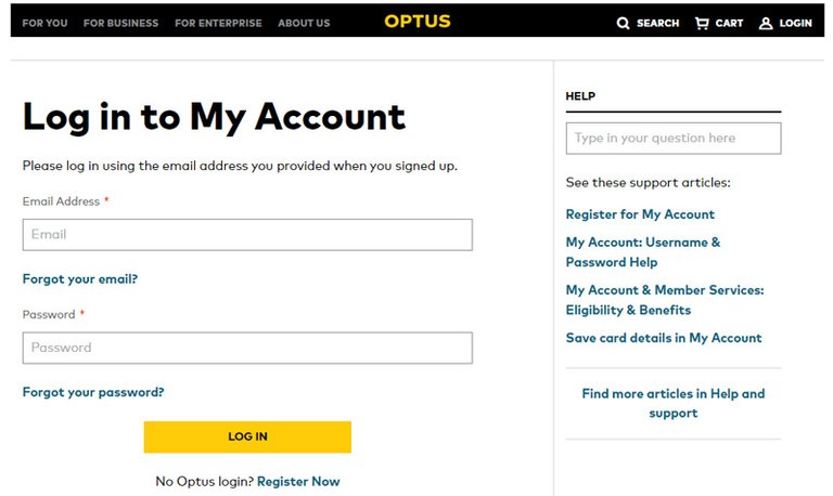
Being logged-in to your telco account may not give you any added “discounts” when searching for new products (even though we hope it does), but at least your experience is somewhat personalised…right?
I mean, the whole point of signing into any account is to get “inside” the system, in behind the protected walls, to have access to that which only members have access to. But what is the point in signing in..if the left hand doesn’t talk to the right hand?

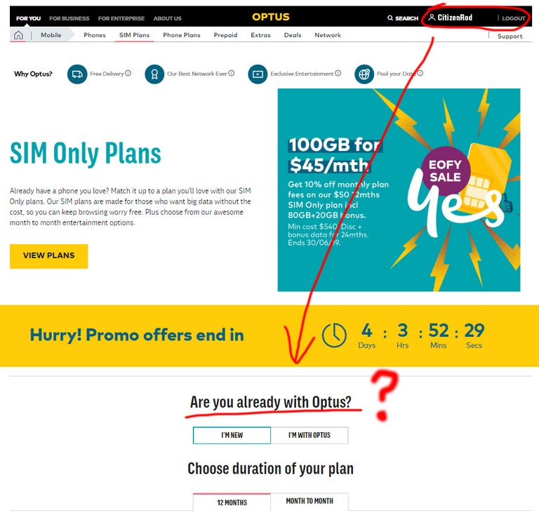
What do you mean “are you already with Optus?”
I’M LOGGED IN!!
We are all very familiar with the drama of trying to resolve problems with our telecommunication companies. They bounce us around from department to department because this department cannot help with that problem, even though they are the one company.
Well as you can see from the image above, it seems the website is just as disunited as the “support” centre. But perhaps this is on purpose… Perhaps this is intentional…hmm. From our experience, different departments feel like they are totally different companies, unable to talk to each and work as a cohesive unit. The website seems to simply be following on with this same user experience. Ahhh ha, of course! User…..Experience…..Continuity…..that’s it!
Of course I’m joking. If that was the intention, then they have bigger problems.
Bad design? Yes of course. From the company’s perspective, the entire goal of bringing the user into the system has failed, and from the user’s perspective, the entire goal of becoming a member has failed. Sure, in this case it may only be one component out of a hundred, but not having all the components working together feels like a leaky ship. Can it be fixed? Of course it can…it’s software baby!CitizenRod is a designer, artist, entrepreneur, and thinker. Follow him on Medium, Steemit, Twitter, Instagram, LinkedIn, his artwork here, and his startup at Maate.it
Note: This article was originally posted on Medium by CitizenRod.