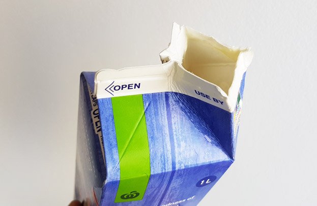
Instructions are great, if people read them, otherwise they are useless. When it comes to everyday items, people believe they know what they are doing, people believe they know how to use them and therefore don’t read the instructions.
I mean, if you’ve opened up one milk carton, you’ve opened them all…right?
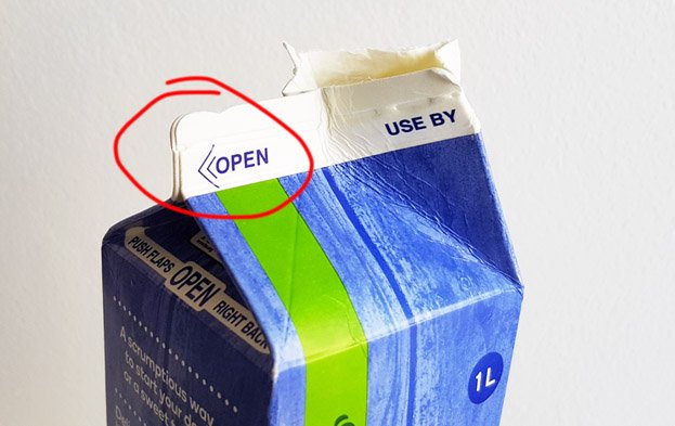
Maybe not. I found this milk carton at a friend’s house. You can see that regardless of how many instructions or warnings you stamp all over your product, users will still find a way to get it wrong.
This milk carton design is over 30 years old. You’d think we’d know how to open milk cartons by now (and no, it’s not just my friend who doesn’t know how to open milk cartons, I see plenty of cartons with rough looking spouts thanks someone not reading the instructions).But why is this? How is it possible we get such simple tasks wrong?
There are a couple reasons we humans continue to fail, here are two:
The first reason is obvious, nobody RTFM anymore. Nobody has time to read the manual or any other instruction material that comes with products anymore. People just want to dive straight-in, bam bam, no time to waste, we’re all so busy busy busy…GIVE ME MY MILK…NOW!!!
As a consequence many companies stopped supplying manuals a long time ago. Instead they have tried to make their products more intuitive, such that a manual would not be required. This is great, this is good design… if you do it right.
Interestingly, milk cartons continue to have instructions printed on them, I wonder why?… are they aware their cartons are badly designed, and hence need explanation on how to use them? hmm? hmmmmm?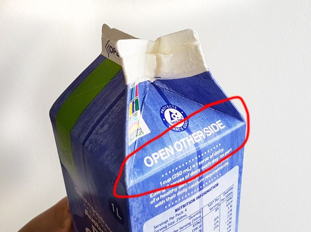
The second reason? You guessed it!
Bad Design!
Amazingly bad design can withstand the test of time. 30 years on, and this design continues to allow users to make mistakes.
In design we speak of affordances, that which allows a user to perceive how a product is used.
Unfortunately the milk carton communicates the wrong information to users (let’s ignore the instructions for now, as everybody does).
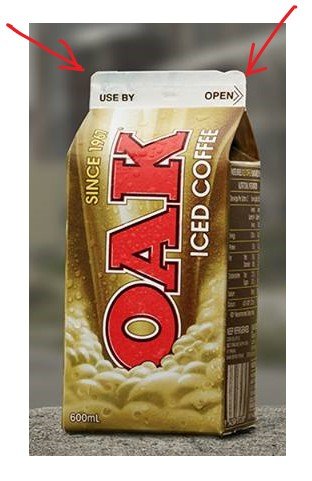
The “use by” side and the “open” side are basically the same. The overall visible shape is almost identical. Now unless you look closely and notice the small notch on the “open” side, then you could be forgiven for not knowing which side was the correct side to open, barring reading the instructions.
Hence this carton sends the wrong affordances information. This carton visually says, “hey, both sides are the same, so you can open whichever one you like”. Those of us who remember that only one side should be opened, usually then look for the instructions, ie. “open”, because although both sides look the same, we have made the mistake in the past and learnt our lesson. Experience counts, you had to learn how to open the carton at one point. And some people, like my friend, insist on re-learning later in life, hehehe. Yes, there are new milk cartons in the market which address this issue, such as those with screw caps. Plastics screw caps, an issue we won’t go into here.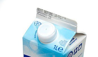
But our badly designed carton is still out there, being sold everyday, why?
Price of course
It is definitely cheaper to produce our non-cap carton than the one with a screw cap. Therefore companies will continue to make them, and people will continue to open them incorrectly.
But surely there is a simple design change that can resolve the mis-communication of false affordances. Surely there is a simple packaging design solution.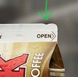
You can see in the above image that they did try to give users a hint, a cue, but it is too subtle, and therefore is missed at times.
PROBLEM = OPPORTUNITY
This can definitely be improved. Make the notch bigger, change the shape of one side, completely remove one side, make it possible to open any side…
What else ?? Over to you package designers!!
CitizenRod is a designer, artist, entrepreneur, and thinker. Follow him on Medium, Steemit, Twitter, Instagram, LinkedIn, his artwork here, and his startup at Maate.itNote: This article was originally posted on Medium by CitizenRod.