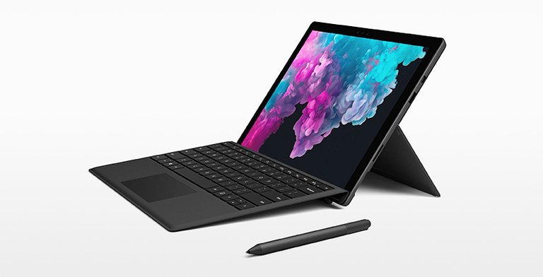
Microsoft’s Surface Pro 6, oh so cool, oh so sexy. With its slick design, cool kickstand, and Alcantara keyboard, who needs a Lambo right?
But don’t let the slickness fool you,
even a TRILLION dollar company like Microsoft can get it wrong.

But how? How can they get simple things wrong? Their design department must be huge, taking up floor after floor, filled with the “greatest” designers, filled with whiteboards and colourful post-it notes, filled with 3D printed prototypes, filled with staged scenarios where they put their designs through persona UX testing… yet a simple human factor fact, can slip them up.
What do you notice about these images?

That’s right, ALL of the Surface Pro’s connections (except the headphone jack) are on the right-hand side of the device.
The right-hand side!
Now compare those last images with these.

70–90% of the world’s population is ‘right-handed’
So why would you put all your device connections on the side that 90% of the world will need to be clear of clutter? Why?
If you and I make design mistakes, ok, we missed it. We are forgiven because we don’t have the resources to test, evaluate, tweak, test evaluate, tweak… But a trillion dollar company?
Bad design? What do you think?
Big companies, bad design, it happens. Read about one of Nike’s badly designed products in an older article of mine, click here.
CitizenRod is a designer, artist, entrepreneur, and thinker. Follow him on Medium, Steemit, Twitter, Instagram, LinkedIn, his artwork here, and his startup at Maate.it
Note: This article was originally posted on Medium by CitizenRod.
Congratulations @citizenrod! You have completed the following achievement on the Steem blockchain and have been rewarded with new badge(s) :
You can view your badges on your Steem Board and compare to others on the Steem Ranking
If you no longer want to receive notifications, reply to this comment with the word
STOPTo support your work, I also upvoted your post!
Vote for @Steemitboard as a witness to get one more award and increased upvotes!