I have always noticed the red fire hydrant valves outside buildings but never thought too much about their design. Not being an architect myself, I always just assumed that is the way they had to be…
Red, bold, and “ugly”.
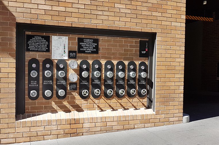
So for this reason I never thought to tag them as bad designs, as I didn’t think there was a choice. That is until I saw this:

Now this changes everything!
How is it that this one architect has been allowed to influence the look and style of the fire hydrants? Or does this mean that architects are actually allowed to redesign them?
There are rules and standards that fire equipment needs to abide by. So this architect has gone the extra mile, done his homework, studied the regulations, and determined what he could or could not do with the design, while remaining compliant.
Good on you architect!!
It’s people like you that push the boundaries and open minds.
So…does this mean that all other architects have explicitly made the decision to not include the fire hydrants as part of their master plan?? Tsk tsk tsk.
Come guys, remember what wise old Yoda said…
Do, or do not, there is no try.
CitizenRod is a designer, artist, entrepreneur, and thinker. Follow him on Medium, Steemit, Twitter, Instagram, LinkedIn, his artwork here, and his apps Maate.it and CryptoFlip.me.
Note: This article was originally posted on Medium by me, CitizenRod.
The Creative Crypto is all about art on the blockchain and learning from creatives like you. Looking forward to crossing paths again soon. Steem on!Hello @citizenrod, thank you for sharing this creative work! We just stopped by to say that you've been upvoted by the @creativecrypto magazine.