BITCOIN CRASHED! BITCOIN DROPPED 10,000 USD! BITCOIN IS DEAD !
That's what we were all hearing last week. The panic was huge and people actually believed something extraordinary was happening.... well, let's have a look at few charts and see the facts:
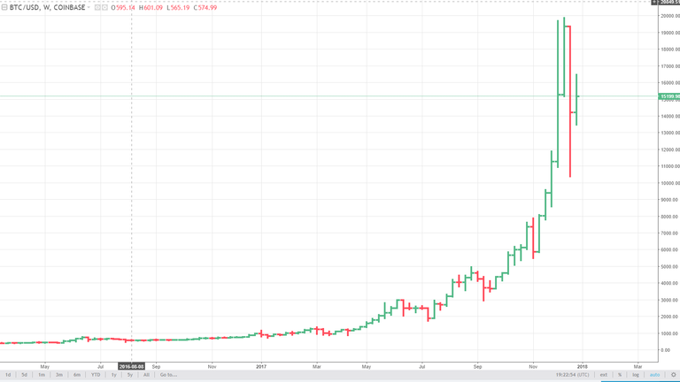
If we look at the chart above, things indeed look a bit scary.... looks like a big drop isn't it?
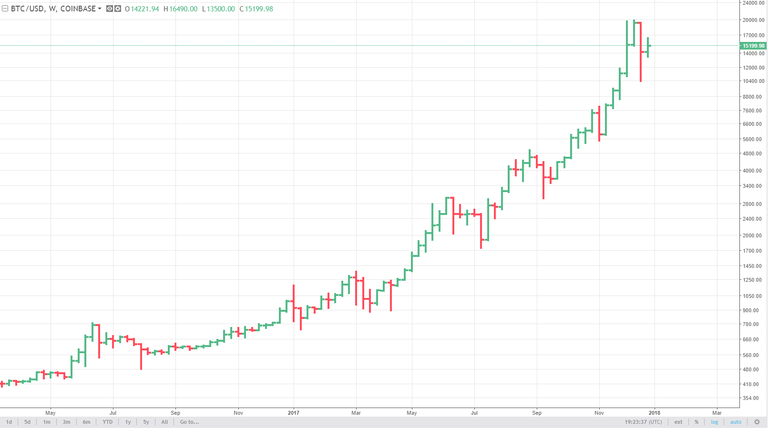
Now let's check the chart below :
It looks perfectly normal! The "huge" 10k drop is barely noticeable and is somehow not "dramatic" at all! We can see several similar dips (corrections) .
That is exactly the same weekly BTC chart, for the exact same period... with one small, but VERY important difference - that's a logarithmic chart.
Basically the difference between logarithmic and standard chart is in the Y axis - the standard chart has equal spacing on the Y axis (the price) , and the logarithmic represent the price movement in % ! You can find more info about the differences on internet.
Crypto markets are very volatile and if you want to do any sort of analysis, using logarithmic charts is essential! The standard charts just does not give you clear enough picture. Whether or not you want to draw trendlines, put channels or use moving averages and so on, IMHO log charts are much, much better (for crypto - FX, stocks and futures is different story)
PS> I am not saying the price will go up, nor I make any predictions - just my 2 cents on how crypto price charts should be looked at.

