Those of us who are involved with the Bitcoin and cryptocurrencies world must have heard latley about the DEATH CROSS (short video inide link) which spread FUD all over the Crypto Market.
However It effect wasn't substantial:
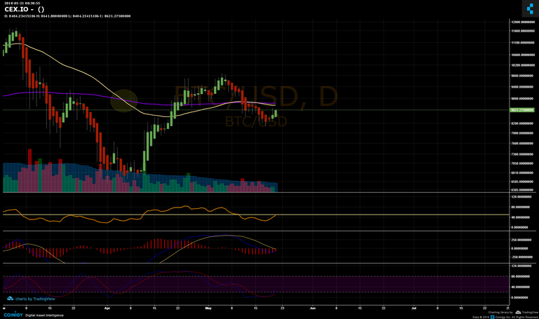
Now the opposite of the DEATH CROSS is The:
And I've noticed that there is a correlation between PRICE ACTION and those AVERAGES
Just look at those time frames and read explanation below:
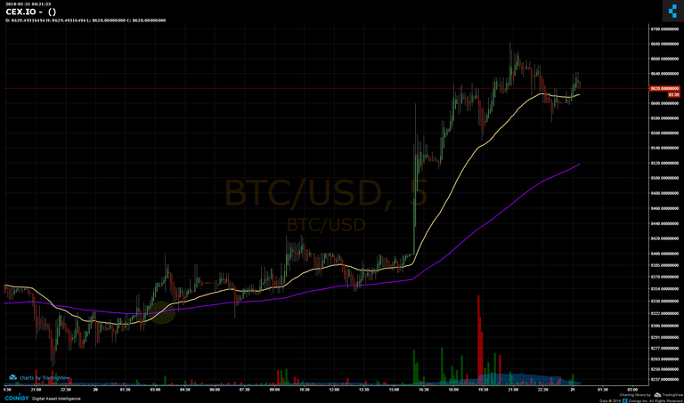 5 min Chart
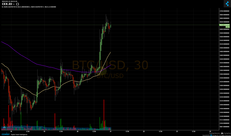 30min Chart
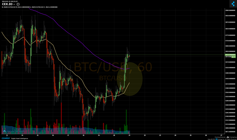 1Hour Chart
OK OK OK SO????
Take a good look on when exactly price action pumps up. It happening before the golden cross actually (5 min chart)
And we have same Situation on 1HOUR chart.
Check out this custom Time Frames:
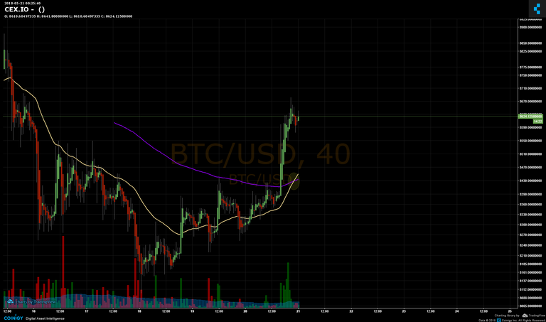 40MIN Chart
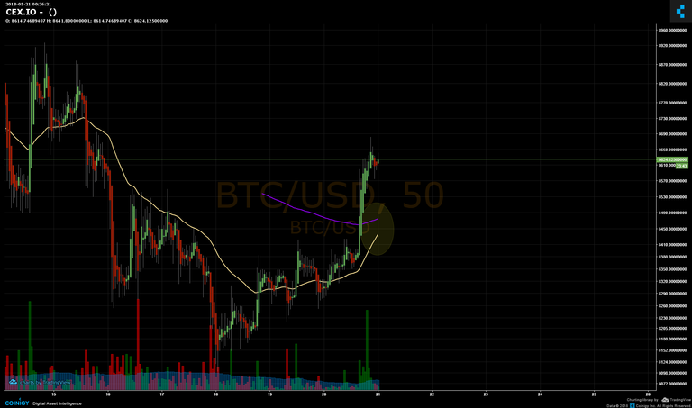 50 MIN Chart
If VOLUME KEEPS BACKING PRICE UP THEN WE ARE ABOUT TO KEEP MOVING UP.
Try to follow this basic indicator and update what you discover.
If you want to use pro charts check out this amazing Pro chart Platform
for more info and updates check out my free BitcoinMF bot.
Please if you find this useful share upvote and resteem.
Thanks for reading.
Congratulations @lazymf! You received a personal award!
Click here to view your Board