Dear Good folk of Steemit,
I've recently started dabbling in the ways of the Ichimoku Cloud and it's got me quite excited. I think, strangely, it's effected me on a philosophical level. The ichimoku cloud gives us an insight into the mind/ psyche of the crowds/ groups, i.e., the market, and having such an oversight is very empowering and provides great insight and clarity. This is a system that requires a lot of practice and experience (of which I have not much), but none the less, I want to share what I've found so far, and what I've understood.
For those of you who want to know more about this indicator, go here : https://steemit.com/investing/@jholmes91/trading-steem-bitcoin-crypto-s-with-ichimoku-kinko-hyo.
The way I look at it (and this is not official) at it's very core, Ichimoku tells us what the crowd (the market) is thinking. It's a system for understanding group dynamics. Looking at the Ichimoku, one should get an idea of the mind of the crowd at a glance. It has three components - the past, the present and the future.
The system looks fairly complicated, but its actually very simple, and hopefully, as I learn what the Ichimoku is telling us, you will too. I will try to be extremely basic, and look at the Ichimoku without any complex terms or technicalities. The idea is to be able to understand the cloud intuitively, like a living breathing organism, that follows certain natural rules. I'll try and set out what those rules are as we go along. If this interests you, please look into this deeper, it will surely enrich your understanding of any market you apply this to.
I'll keep adding in more details as we go along, and in case I'm wrong about anything or have missed certain cues, please feel free to correct me.
I will analyze BTC/USD over different time scales to get a clear picture. So, be kind, here I go :
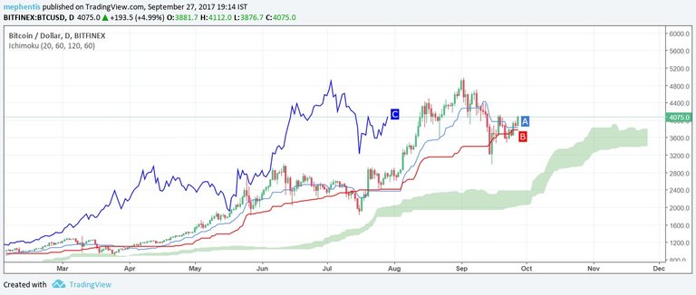
This is BTC against the Dollar on a 1 Day scale (meaning every candle represents an entire day). This gives us a macro view of whats happening with BTC. When 'A', the light blue line is on top of 'B', the red line, its a positive trend. 'C' , the dark blue line, is a lagging line, meaning it's the current price line moved back a few period. This tells us where we are, and where we used to be, for sake of contrast.
The above chart tells us that the bull trend is still intact as A,B, C, and the price are all above the cloud. As the price is near 'A' and 'B' both, it indicates that the price is at equilibrium during a positive trend, and thus is a good entry point for those buying for the very long term only.
If we look at the cloud (kumo), it too is all green - this means the crowd sentiment is positive. The cloud is projected into the future and this is important as the price ,as well as 'A', 'B' and 'C' lines will always interact with the cloud when they meet. The cloud is an area of equilibrium for the crowd's mind, and once the prices and the lines come close to it or get inside it, it stays there till it finds the strength to break out or loses momentum and drops down. This we will see as we go a little deeper.
Now lets zoom in a bit, and look at the 12 Hour chart. This will tell us whats happening at a more zoomed in scale.
 https://in.tradingview.com/x/kRQ53aDM/
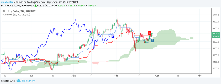
Over where the story is a little different. So what do we see ?
'B' is above 'A' , both are above the cloud (just about), and the price is above 'B'. Further, 'C' is in between all kinds of lines and prices. What this tells us that the crowd is confused right now, and it's not a wise time to place any bets, one way or other. Price being out of a cloud is a good sign, but 'B' on top of 'A' is not. Also, 'B' is absolutely flat, and as a flat 'B' often acts as a magnet and pull the price back towards it, and it's advisable to wait till 'B' heads upwards and the 'A' comes on top and 'C' is clear and above all lines and prices.
Also see how the cloud is thinning at the end, that also indicates uncertainly. If it turns red, that'll mean a negative sentiment. So far, the sentiment is still positive, just about. A thick green cloud in the horizon (like the one below us at the moment or the one in the 1 day chart) is ideal.
Moving on to the 6 hour chart, zooming in even further in. We see this :
https://in.tradingview.com/x/iopmEbok/
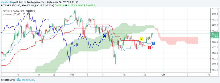
More confusion. The deeper we go, the more negative the sentiment gets. This time 'A' is above 'B' -which is a good sign on it's own , but as the A/B cross over has happened in bear territory (below the cloud)- at 'D', we should not rely too much on this signal. Its weak. A medium signal would be a cross over in the cloud and a good bull signal would be a cross over above the cloud.
'C' is in the cloud, below all the lines and the price. So that's no good for prospective buyers either. For one to buy, 'C' should be above all the obstacles, otherwise, there's always a chance it'll react to the price or any of the lines ( as I said earlier, think of the ichimoku system as an organic system, everything reacts to everything else -just like in nature, and there are gravitational forces at work. For anything to moon, the price and the lines need to break free of the systems gravity).
Lastly, the horizon is red, and the red cloud has a flat top. A flat red top acts as a magnet as well, just like a flat 'B' red line. So, in sums, the 6 Hour reading tell us to do nothing.
Now for the last perspective, lets go ever deeper into the crowds mind, and jump into the 3 hour chart. (The Ichimoku system works best with larger time frames).
 https://in.tradingview.com/x/iI3kHQlK/
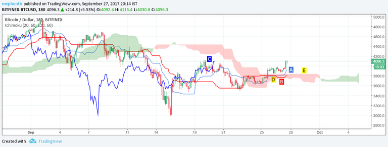
Now, 'A' is on top of 'B'. The crossover happens within the cloud, at 'D'. 'C' is under the cloud, within the price and the lines. The price is above 'A', 'B' and the cloud. This is promising, yet, not actionable. We should wait till 'C' comes out above the cloud before we press the buy trigger. Another thing that worries me with this picture is the flat top of the red cloud -'E'. As is said earlier, this acts as a magnet. But, the horizon is green, though the cloud is thin.
So where does all of this leave us. It's very important to wait for all the components of the ichimoku system to give us a clear signal, align. A buyers market looks like the first, 1 day chart I showed (in there, also see how the ichimoku behaved during July -August period when the fork was ongoing. It'll give you a wider understanding of how major events look when viewed through the ichimoku system. Though the the price of BTC took a solid beating, the trend did not break).
So for a long term investor / buyer, this may be a good time to enter, but be prepared to expect some volatility, as all the shorter term trends seem confused and mixed. Once we see 'C' break out of the cloud in the 3 hour chart, I will be more confident entering the market.
Price always keeps returning to a point of equilibrium, being the 'A' or 'B' line or the cloud. As a post script, have a look at the 3 day chart to see how the BTC bull trend looks on an even larger scale :
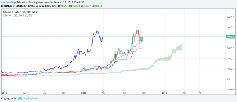 https://in.tradingview.com/x/Y9l4nqfj/
I feel it's very important to know/ learn the art of doing nothing, and the ichimoku teaches us that. Hope this helped.
I'm happy to hear your thoughts on this.
Cheers.
Thanks for your summary of Ichimoku, it is well worth exploring.
You're very welcome! It's been my pleasure. In case you want me to look at anything in particular, do let me know.
Cheers.
Congratulations @mephentis! You have completed some achievement on Steemit and have been rewarded with new badge(s) :
Click on any badge to view your own Board of Honor on SteemitBoard.
For more information about SteemitBoard, click here
If you no longer want to receive notifications, reply to this comment with the word
STOP