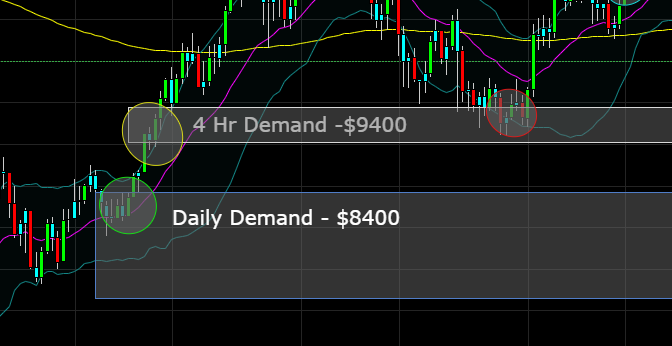
Daily demand represent a level on the daily chart where there are buy orders. For example, on 4 hr chart, I was able to identify buyers at $9400 as indicated by the yellow circle. The buyers weren't able to get all their orders filled at this level. Thus, when price came back to the level, the remaining buyer orders were filled. This is why price reacted to that level (red circle) and price then went back to $12000. The higher the time frame, the stronger the level. That's why I like the $8400 level more, it represents a stronger buying level. Let me know if this explanation helped at all and appreciate you asking.
