And the stock market will likely crash soon, too!
I really like the point your making. But, while the visual is stunning, it's a different graph looking at a different type of asset.
The graph looks like this because the US dollar has lost so much value over the past 50 years. A lot of the price increase comes from inflation (i.e., the loss of the dollar's value). Look at the graph on this page: https://www.investopedia.com/articles/investing/052913/inflations-impact-stock-returns.asp
As the value of the dollar goes down, the cost of everything you buy with dollars goes up. Like stocks. They're more expensive, but not necessarily over-valued. It's just that the dollar has lost so much value, you need a LOT more than you used to.
The stock market is not technically a bubble because the value is aligned with the dollar. This chart really just shows how worthless the dollar has become.
I totally agree with your criticism of "mainstream" financial analysts. But Bitcoin has an extremely tiny rate of inflation so it's not a great comparison...sorry bro! But your larger point is well-made!
Your chart is from 1947... how is that relevant to my chart from 1982? You can't just compare two different time frames. On your chart from 1982 onwards the chart is actually really flat... the chart in my picture is anything but flat... so this massive upwards move in the stock market isn't a result of the devaluing dollar then.
Not comparing. Sorry to upset you.
My chart simply shows how inflation devalues the dollar, as part of an article explaining in simplistic terms how inflation makes everything cost more. You can't compare the two charts -- they map different variables. Tilt my chart 90 degrees counter-clockwise and you'll see the parabolic curve. But still not a comparison. My chart illustrates how inflation works, yours illustrates how DJIA stock prices have risen over time.
A graph of my savings account (pure dollars with minimal interest) would show the same type of curve as your chart. But that doesn't mean my savings account is a bubble. It means I've benefited from compound interest. Even though it looks the same, you can't compare it to your graph or the one I linked to.
Any chart that measures an asset in dollars will show a parabolic growth in aggregate -- because of inflation. Yours covers 1970 - today, the one I linked to covers 1947 - today, and they both explain different things.
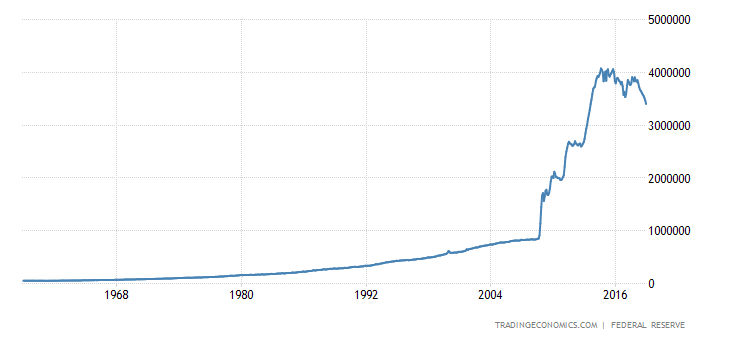
Again, I didn't mean to offend you. I agree with your conclusion and your chart is dead on -- "mainstream" investors have their heads up their ass if they think cryptos are any more risky than stocks or bonds. That doesn't mean stocks are in a bubble. Stock prices have shot up because the Fed has pumped a crap-load of dollars into the market.
I'm not upset man, it must just be my typing style or whatever I like to get straight to the point. You might very well be right that it is the printing of dollars which has set this off and I actually just looked at the historical chart for Money Supply of the US and it is fairly similar to the DJIA.
I'm not bothered if you are right or I am right here, I just want the facts. I do still believe it is a bubble because you can't just keep pumping dollars into the economy forever. It is going to end badly at some point. Do you expect the DJIA to go up vertically forever? Just asking not trying to offend you or anything.