New header and settings layout, use of new external crypto and api libraries as well as tons of bug fixes and improvements.
This is probably the biggest Bitshares GUI release since launch, and it is also the first release that incorporates some of the work done by the designer hired by Ronny Boesing of Openledger to help improve the GUI. His touch can be seen in the header and the Deposit/Witdhraw page, but most importantly in the new Settings page.
Summary of main new features:
- Api code moved to new graphenejs-ws library
- Crypto and blockchain state code moved to graphenejs-lib library
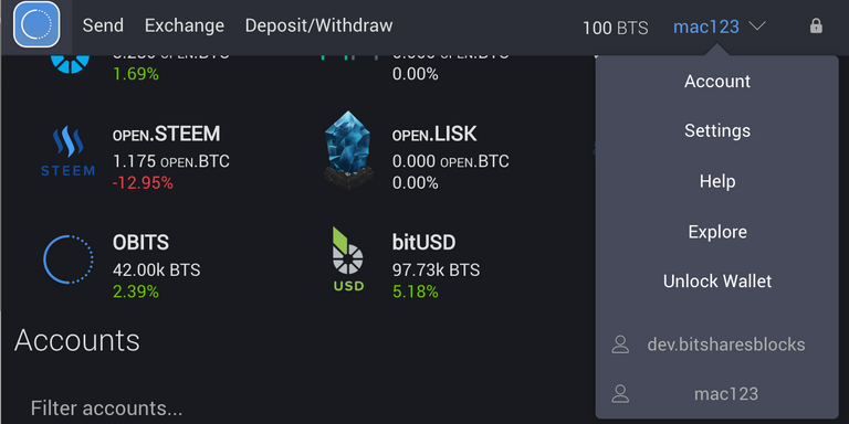
- Updated header layout with dropdown menu
- Big refactor of the Settings page to more friendly layout
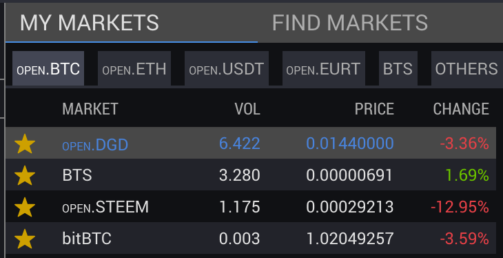
- Refactor MyMarkets selection to tabbed layout
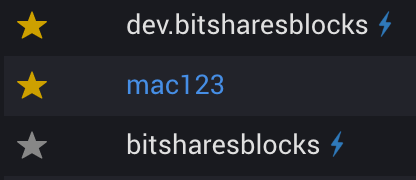
- Add lightning bolt to indicate lifetime members
Api and crypto libraries
I've recently taken the time to extract two of the basic building blocks of graphene-ui into separate libraries. These are available as npm modules and can be used to either connect to a graphene websocket api server in the case of graphenejs-ws, or in the case of graphenejs-lib: to perform all the cryptography functions required to create, sign and broadcast transactions to a graphene based blockchain.
This library now has several improvements in terms of data-fetching and resolution compared to the code previously used by the GUI, which should result in a performance increase when making transactions.
For one application of graphenejs-lib, see this post about a simple wallet template I created: https://steemit.com/bitshares/@svk/new-simple-wallet-template.
New header layout
The new header layout hides several of the less used links behind a dropdown menu that can be triggered by clicking on the account name. It also replaces the Home link with a logo.
Settings page refactor
This change was proposed by the new designer working for Openledger. The new settings layout introduces different categories and a more coherent layout.
Refactor MyMarkets selection to tabbed layout
Inspired by the recent update to Poloniex that added ETH as a quote asset, I've refactor the MyMarkets page to use a similar layout. You'll also find a lot more assets in the lists by default.
Lightning bolt for lifetime members
By popular demand I've added the lightning bolt used by cryptofresh.com to indicate lifetime members.
Release notes
The full release notes can be found below, and the you can find the binaries here
2.0.160703 binaries are bug fix releases that fix an issue with backup restoration.

New features
--------
- Api code moved to new graphenejs-ws library
- Crypto and blockchain state code moved to graphenejs-lib library
- Add OPEN.MKR deposit/withdrawal
- Limit chat messages to 140 characters
- Refactor MyMarkets selection to tabbed layout
- Remove MetaEx deposits, add warning and link
- Add OpenLedger deposit/withdrawal support for Omni & related coins (USDT, EURT)
- Updated header layout, new dropdown menu
- Add lightning bolt to indicate lifetime members
- Refactor Deposit/Withdraw tabs to a dropdown selection
- Modify OpenOrders layout, use x icon for Cancel order
- Big refactor of the Settings page to more friendly layout
- Hide advanced features by default

Bug fixes
--------
- Display 'New wallet' button for users with only one wallet
- Fix light wallet local file loading, use data-urls for some pngs
- Remove back call on wallet deletion
- Update electron version
- Center-align the advanced features button
- Fix backup restore submit button
- Fix api error redirection
- Fix Backup restore accept button close #858
- Fix initError loading issues and layout
- Update several packages to newer versions
- Remove brainkey dictionary from app.js and load async instead
- Refactor language selection to fetch language files async on demand
- Improve build routine, reduce filesize
- Fix cancel button font color in WebSocketAddModal
- Fix buttons with invisible text
- Improve Exchange fee asset selection
- Disable chat in Safari
- Use 8 decimal prices for assets like BTC in markets list
- Make sure a valid price history bucket size is selected on load
- Improve visibility of Buy/Sell fee selector
- Improve initial load of AccountStore, should fix #827
- Update default markets
- Remove 'Ignore' button in AccountLeftPanel
- Lowercase account names in DashboardList, change filter style and text


I cannot find brainkey import
There's no separate import for that, but if you click "New wallet" you can then choose "USE A CUSTOM BRAINKEY (ADVANCED)" at the bottom at which point you can enter your brainkey.
Oh, thanks!
Bitshares gui 20160702 is now also available on altcap.io "Your alternative gateway to bitshares" and backup #API #WebSocket
Thanks for the link. I noticed the platform has a bitGBP instrument which I have not noticed on Open Ledger.
I will add bitGBP to the MY MARKETS tabs on altcap.io
Great work, as usual!
Looking forward to integrate your libs in my projects aswell!
Awesome work svk! :)
Finally an explanation for those lightning bolts! :p
Is it possible for the wallet to auto-update, or at least inform the user of a new release?
I can probably add a notification inside the wallet at least, not sure if it's possible to do auto-updates though.
Yes. Impresive work.
Thanks!! great work as usual. :)
The link for the binary is missing the "v" in the version number, so it gives a 404 error. This should be the correct link: https://github.com/bitshares/bitshares-2/releases/tag/v2.0.160702
Right you are, I've updated the OP, thanks.
Great work!
Awesome work!
Ah, glad to see the wallet still being so actively worked on!
@svk, would you mind taking a look at https://github.com/cryptonomex/graphene-ui/issues ? Perhaps a couple of the issues I posted there weeks ago have been sorted now and can be closed.
Keep up the good work!
Every day I become more familiar with Bitshares/Graphene platform. If not for developers responsible for the design of the user interface-like yourself, users like myself- with minimal computer savvy, would not be able to use Open Ledger successfully.
I fully agree. Without GUI are BitShares unusable . The CLI machine behind is core and must be perfect but bad GUI means no ordinary users. Any marketing is useless if the project is not easily usable.
Same for me. I've not got enough geek in me. To mess about. It needs to be flat, easy to understand, great UX and UI. All approved with this update :)
Very good. Thank you SVK for your hard work.
nice work, keep it up.
You may want to buy some more BTS. Here an alternative method:
https://steemit.com/bitshares/@argsolver/how-to-buy-bitshares-on-ripple