Note for self: 17/05/2023 - Mujāni - Shift in Consciousness. Internal equilibrium number update. For the best of all concerned. Maktub.
If you've seen some of my blog before, it is no secret that I've been wishing to learn to draw properly for quite a while now - with fluctuating levels of inspiration or success. But since the internet is full of inspiration if you know where to look for it, and theoretically I should be having more free time now, you know with not having a 9-5 and all, the timing to getting down to actually pursue this has not been better. Thus on 06/04/2023, I started a sketchbook.
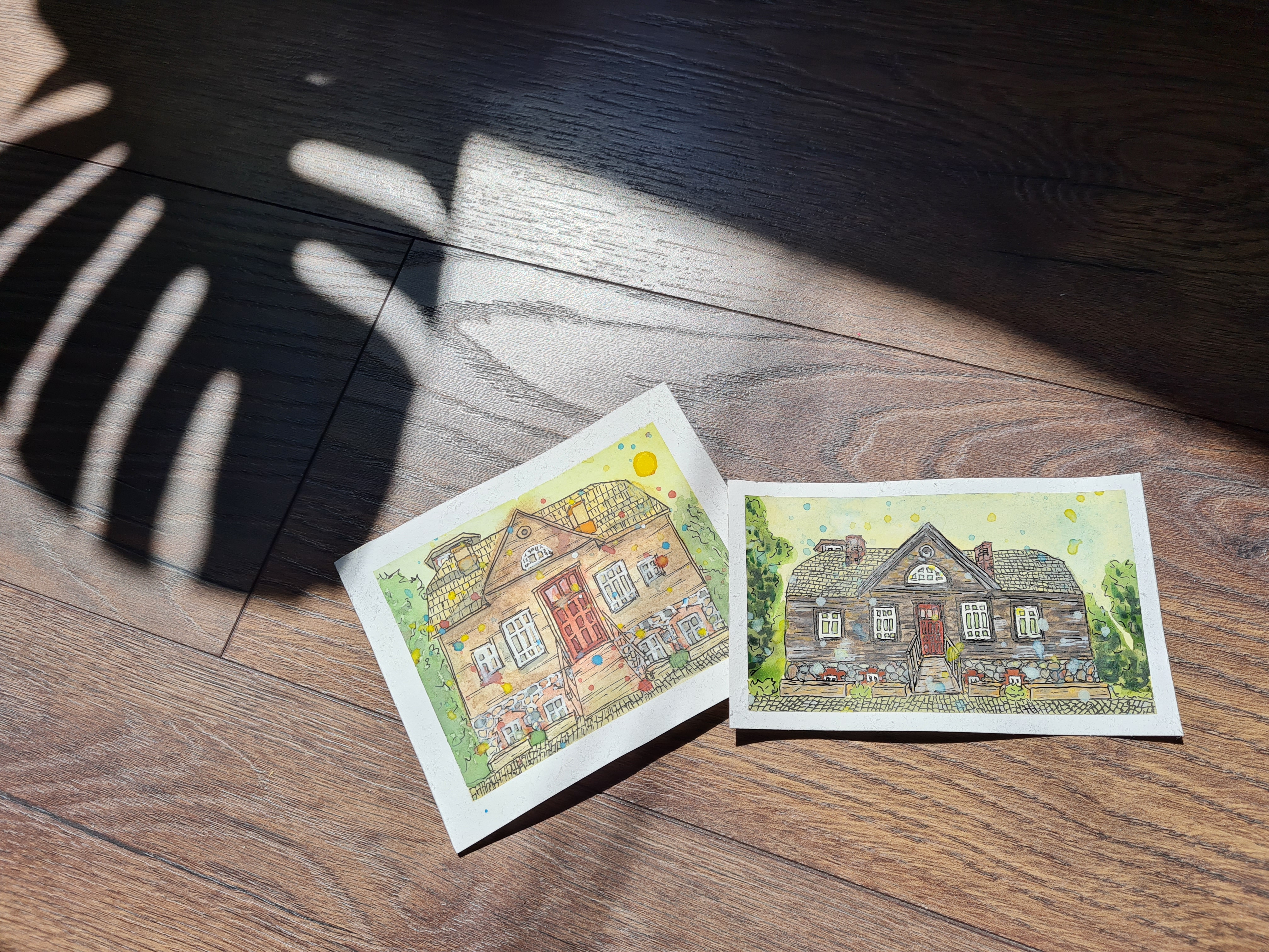
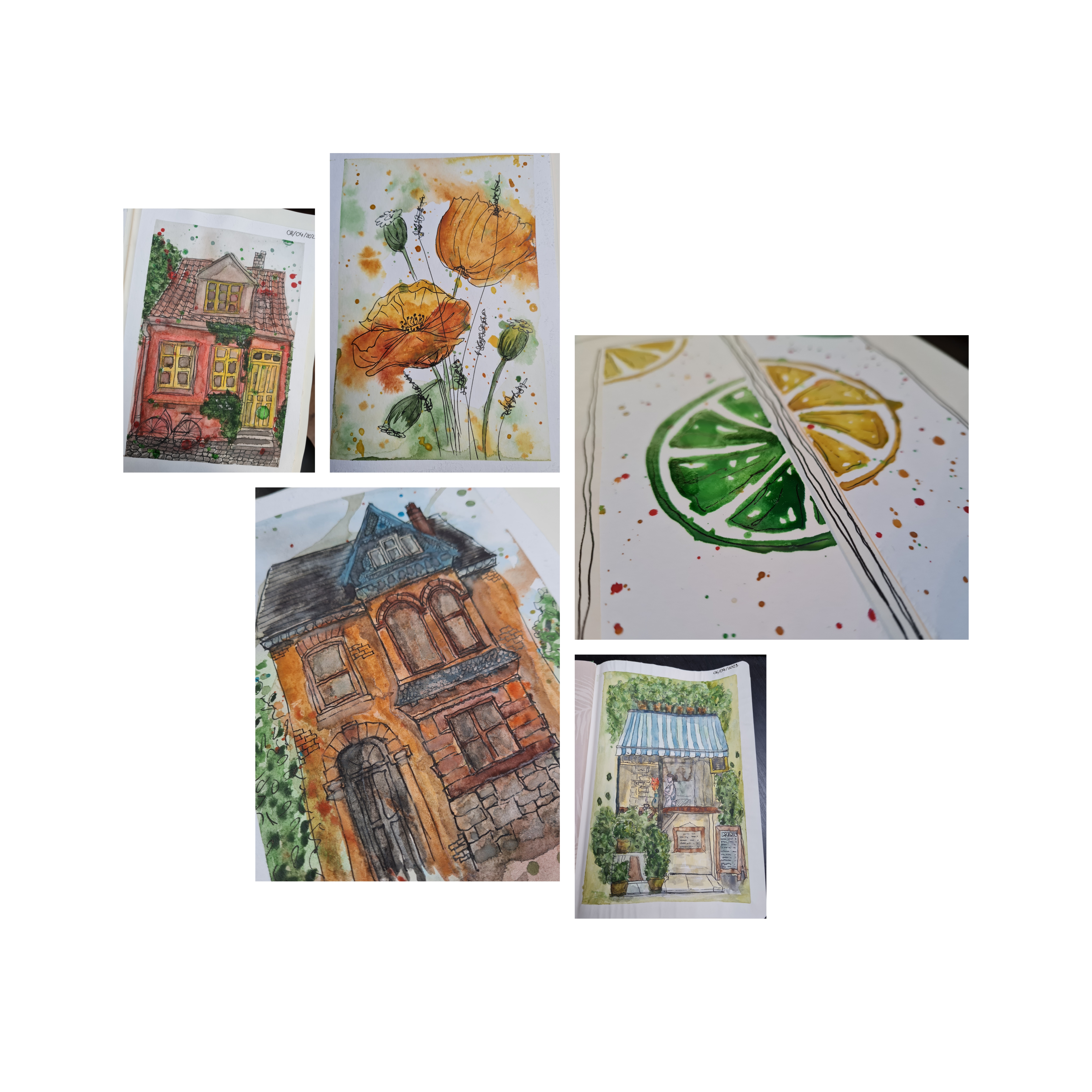
This is what I have there thus far..
These visuals are not original and unique, they are only for the purposes of my learning. References linked at the end of the post.
It is not a lot. Because I've been busy.. (with God knows what and what black hole does the time disappear in.) Aaand it's loose and messy ON PURPOSE! Because if I allow one inch of my perfectionism to creep into the process, I get petrified by fear of messing up and don't draw at all. So this style is like an antidote to that for me. It is meant to be imperfect. If it's too perfect it loses its charm.
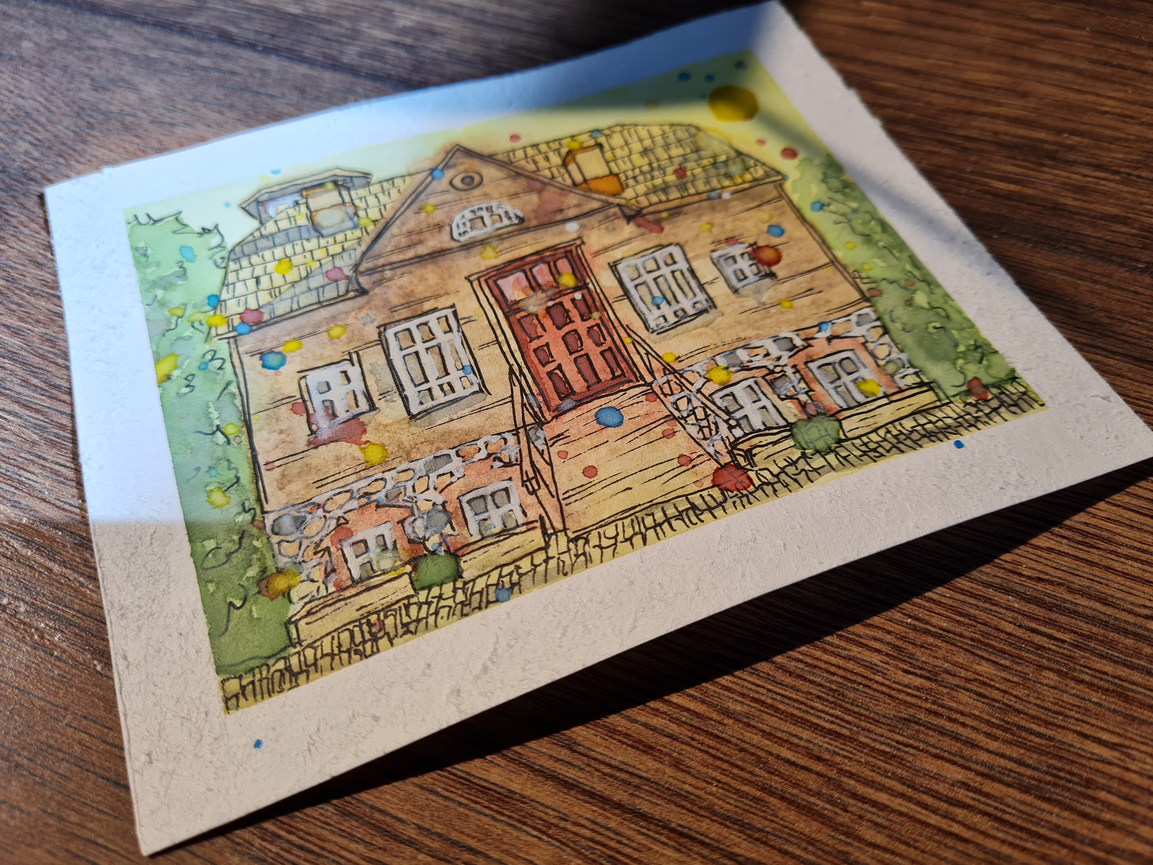
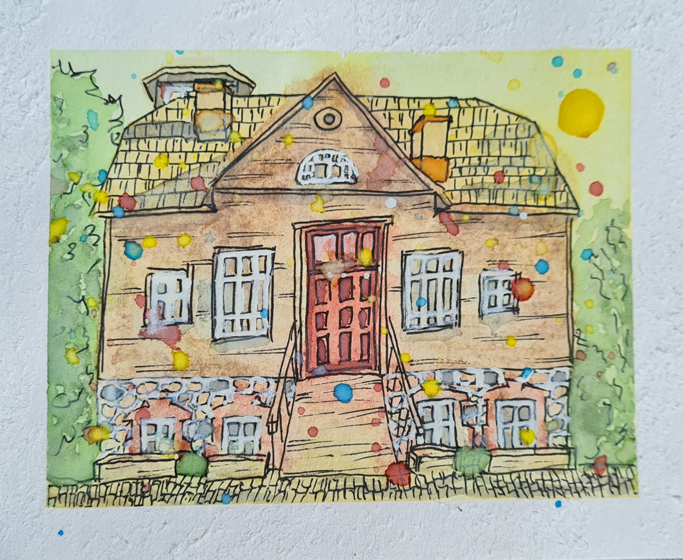
So why did I end up with two images of the same building, you may ask. Well.. at first I did it naturally in that loose, messy whimsical style, with no care in the world. It ended up the way it ended up, but the door seemed a bit too crooked to work even in this style and then noticing how also the proportions are way off I remembered that I had my new and fancy proportional divider, that @wulff-media recommended to me, so I decided to give it another go with correct proportions, to try out the tool.
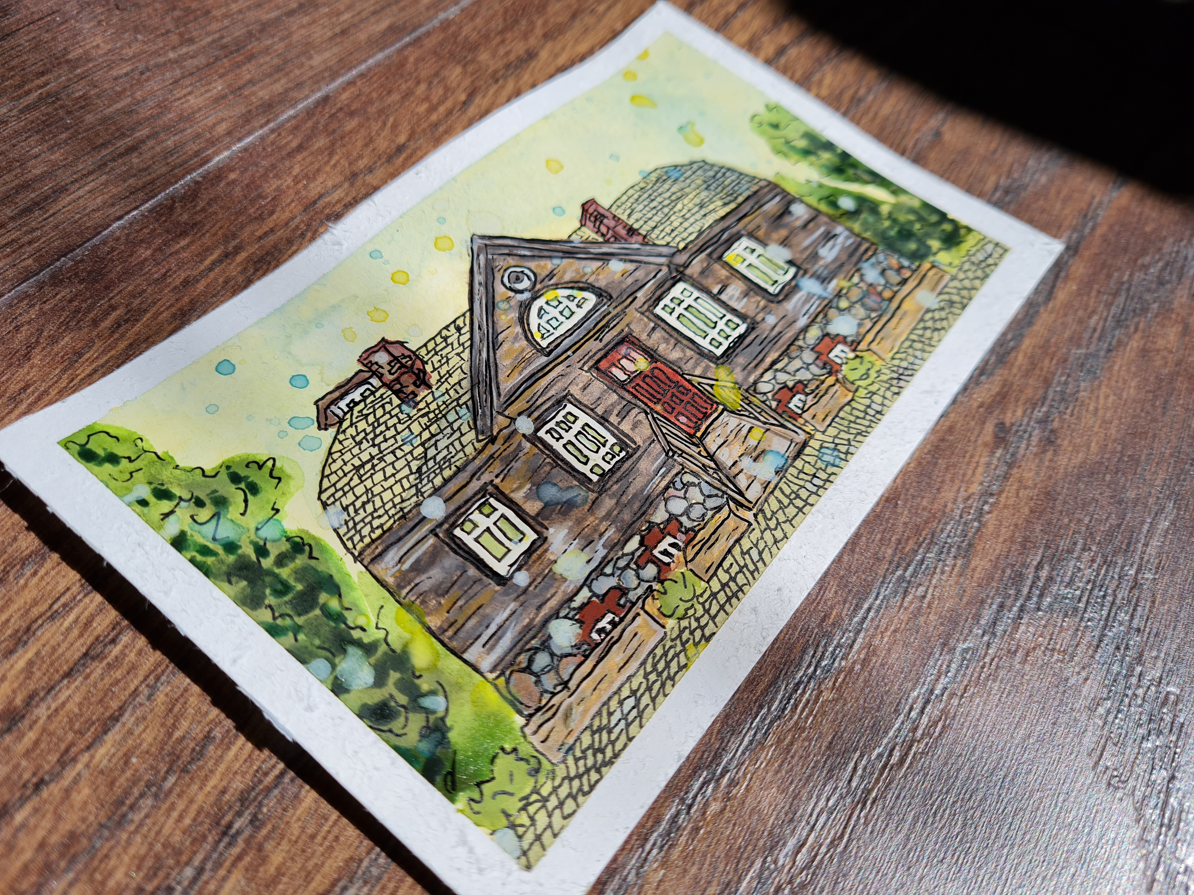
This one is with correct proportions:
It is however, as a result, a bit too constricted. A bit too correct and gives a whole different vibe. A more serious one. Not quite as much straight out of a whimsical children's book.

Which one do you prefer better? The more proper one or the more whimsical one?
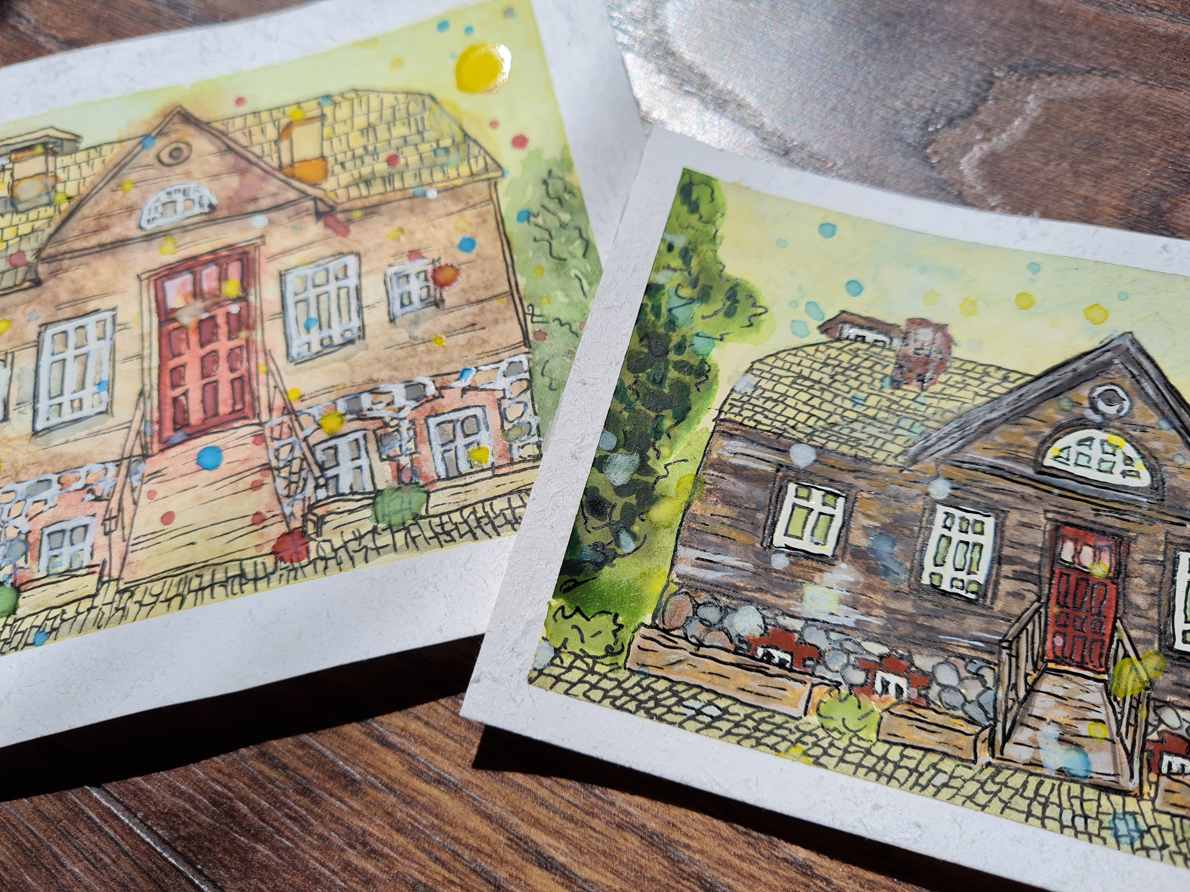
Surprisingly both mom and dad preferred the initial attempt better. Dad was actually quite surprised when I showed him these.. saying something along the lines of - You? And draw? And like this? xD
There's a whole backstory as to why I drew this particular building and why the title of the post does not seem to go together with the theme, but that is for some other time. To reflect back if/when needed.
Hope you have a great, sunny, and whimsical day yourself!
Thanks for dropping by and I'll catch you some other time. ^^

~Josie~
Visual references and tutorials that I used for my study drawings, as promised -
Pink house (youtube video tutorial)
The little French café (youtube video tutorial)
The brick house (youtube video tutorial)
Citruses (Pinterest picture reference)
Poppies (Pinterest picture reference)
i like the lighter-colored one
The 2nd house for me, maybe because l am a bit of a tradesman and I am reading and interpreting drawings all the time.
!LOL
!LUV
!HUG
I sent 1.0 HUG
(1/3)Dear @josie2214, you just got hugged. on behalf of @new.things.
(3/10) sent you LUV. | tools | discord | community | HiveWiki |
  NFT | <>< daily
lolztoken.com
A-one, a-two, a one-two-three-four!
Credit: reddit
$LOLZ
(3/10)
PLAY & EARN $DOOM
@josie2214, I sent you an on behalf of @new.things!LUV !HUG ^^
Thank you for the feedback! 😊
The second image did take me longer, but the process was just as equally engaging. But what I find interesting is how different they feel and not just look.
Hope you have an amazing day! ^^
Hugs&Coffee,
~Josie~
(2/4) sent you LUV. | tools | discord | community | HiveWiki |
  NFT | <>< daily
I sent 1.0 HUG
(1/2)Dear @new.things, you just got hugged. on behalf of @josie2214.
Really nice technique, I love it.
!LUV
Thank you, I like it how it allows me to produce cute images even with my lack of skills.
And as I already mentioned it cures my perfectionistic fears of messaging everything up.
Hugs&Coffee,
~Josie~
(1/4) sent you LUV. | tools | discord | community | HiveWiki |
  NFT | <>< daily
I like them both, but the first one has more charm indeed.
A proportional divider is designed to constrain the artist to what's in front of her. Just like the grid method, it's a copy tool to project a sketch of reality to the canvas, as close as possible.
This may not fit the intended art piece. A childrens' theme lives from everything being out of whack and in the brightest colors. That's piece #1. The poor "child" in piece #2 was told to strictly "stay within the lines" and thus hampered by that.
So your feeling is absolutely right. As with everything, the trick is knowing the right tool for the job. Leonardo da Vinci invented the proportional divider. He was a scientist first. Picasso, however, threw his in the trash after the first week of art school. Both were masters of their art. So there is hope for all of us ;-)
A big hug - F
The proportional divider is a nifty tool, thank you for the tip. I'm more than certain that it'll come in handy down the line on my learning curve, trying out different methods and styles. I'm looking forward to continuous growth and experimentation, but for now I'm exploring a bit more of this .. freedom from perfection. :)
Thank you for your support. It is invaluable especially at the very beginning of one's journey.
Have an awesome day! ^^
Hugs&Coffee,
~Josie~
Congratulations @josie2214! You received a personal badge!
Wait until the end of Power Up Day to find out the size of your Power-Bee.
May the Hive Power be with you!
You can view your badges on your board and compare yourself to others in the Ranking
Check out our last posts:
Congratulations @josie2214! You received a personal badge!
Participate in the next Power Up Day and try to power-up more HIVE to get a bigger Power-Bee.
May the Hive Power be with you!
You can view your badges on your board and compare yourself to others in the Ranking
Check out our last posts: