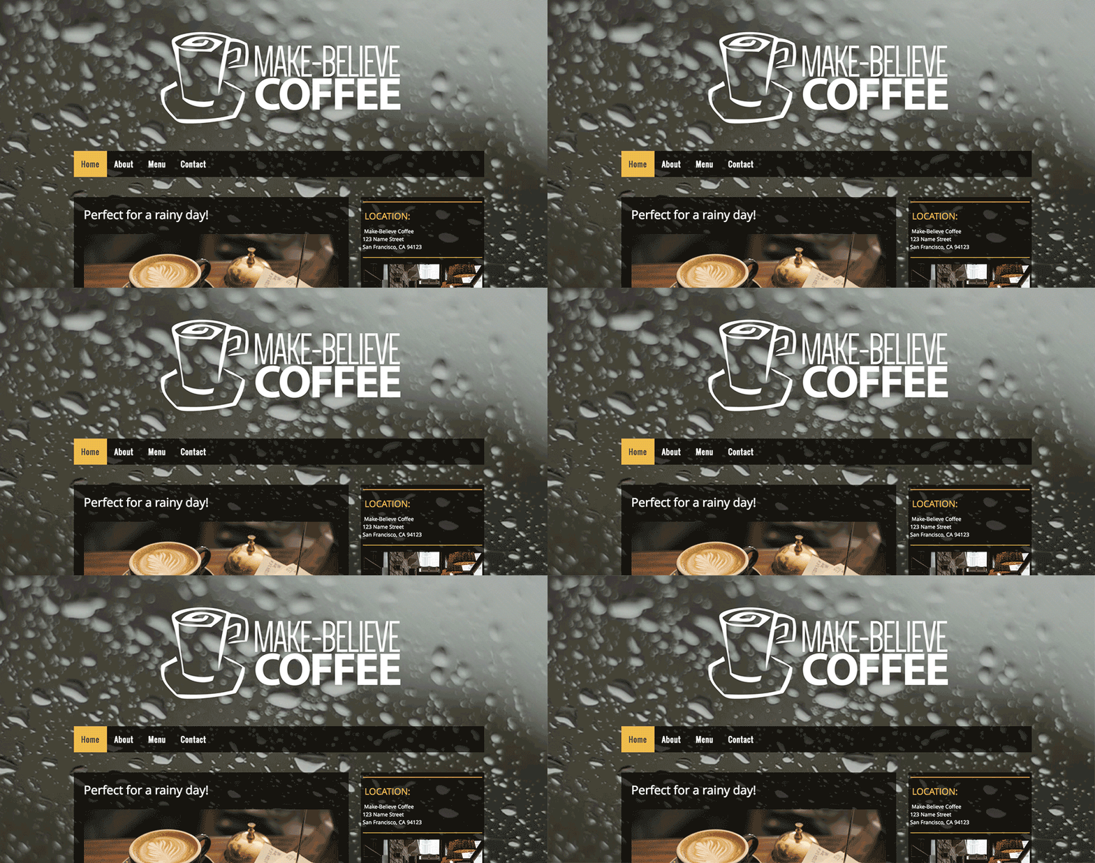
Astonishingly, WordPress powers over a quarter of all the world’s websites. As a result, you have access to a huge range of themes and plugins to choose from. It’s a superior and, perhaps, an overwhelming position to be in. Narrowing down to choosing the best theme and plugins are definitely the key issue for your website to have a distinct personality that still follows the latest design trends. In this post, we will take a look at some of the most important WordPress design trends of 2017. Let’s get started!
1. Single-Page Websites

[Image Source](

Less is more! Simplicity is the key to high usability. Single-page websites are a popular WordPress web design trend for companies and individuals specializing in a single product or service. Aside from being wonderfully straightforward, they are very efficient for storytelling and they are keeping visitors from getting distracted.
You may believe that single-page websites are not as popular as they used to be, but you would be wrong. A one-pager is most likely to be mobile friendly, it is very convenient to update, and it makes SEO (Search Engine Optimization) far easier because you can concentrate all the attention you receive on just one page. Finally, it is a piece of cake to make a website that has only one page look stylish and unique in terms of design and visuals.
2. Drag-and-Drop Content

Image Source
No longer are WordPress users tied to using specific layouts, thanks to the rising popularity of modular themes. Drag-and-drop content enables users to create a website with a professional design. This is made possible by dragging and dropping elements right into the web pages. With this feature, you can also integrate pictures, videos and more. In particular, this functionality enables you to retain complete control over most design elements without modifying your website’s underlying structure. Furthermore, these tools open up a world of possibilities for WordPress users without any web development background. Instead of relying solely on predefined sidebar layouts, users now enjoy much greater flexibility, thanks to drag-and-drop functionality.
3. Parallax Scrolling

Image Source
Parallax scrolling has been popular for some time, and it’s likely to remain a pervasive trend for the foreseeable future. It plays really well with single-page websites since it creates an immersive impression of depth. Also, some specialists claim that it increases engagement and reduces bounce rates, but these claims are rather difficult to prove. Either way, it’s impossible to deny that parallax scrolling – when used well – can make a WordPress website look magnificent.
A friendly word of advice: If you’re looking to implement this feature, pay special attention to how it impacts the readability of your site. Otherwise, it can cripple your site’s usability.
4. Typography

Image Source
Today, more and more companies are turning to big, bold typography elements to anchor their homepages. This twist works best when the rest of the page is kept minimal and clean.
Long gone are the days when web developers were restricted to a small selection of web-safe fonts. Dynamic fonts are now a standard element of web design, and stylized typography is commonplace. No doubts, expressive typography will continue to be one of the most important trends in the world of web design in 2017, with applications far beyond simple headers and basic body text. Furthermore, WordPress offers numerous typography-oriented plugins, and as the WordPress community is massive, and open source we can guarantee that there are always more plugins in the horizon!
5. Mobile First Themes

Image Source
As per the most recent insights, mobile phones now make up 51% of all traffic while desktop has tumbled to 49%. This makes cell phones the most used device to surf the web. On account of this, mobile first WordPress themes are playing one of the starring roles.
Providing the same design across various devices gives the same customer experience whatever device users are viewing your site on. Customer satisfaction and user experience is highly important and providing continuity help to seamlessly provide a fluid design and the same content.
Having a responsive website can not only benefit your customers but can reduce the workload for you too. Web developers will only have one set of code to manage, not only reducing developments costs but time as well.
6. Video Backgrounds

Image Source
The auto-playing sound is perhaps the most annoying trend on the web. But surprisingly, auto-playing video (with no sound) is a rapidly growing trend. You can spot this design on dozens of sites where a video background takes over the entire screen. This can be an eye-catching design detail. As long as the video relates to the site and doesn’t obstruct content.
Conclusion
The web moves fast these days and you can always expect new trends top pop up every year. Some of these trends have been around for a while, others are just starting to emerge and flourish. Just as design trends change very fast, so do the preferences of users. It is extremely important to stay up-to-date with your online presence because a design is not only the image of your brand, but also a way to keep your customers engaged, amused and, as a result, loyal.
Another excellent WordPress post! I am learning so much from you, thank you!
Thank you!